|
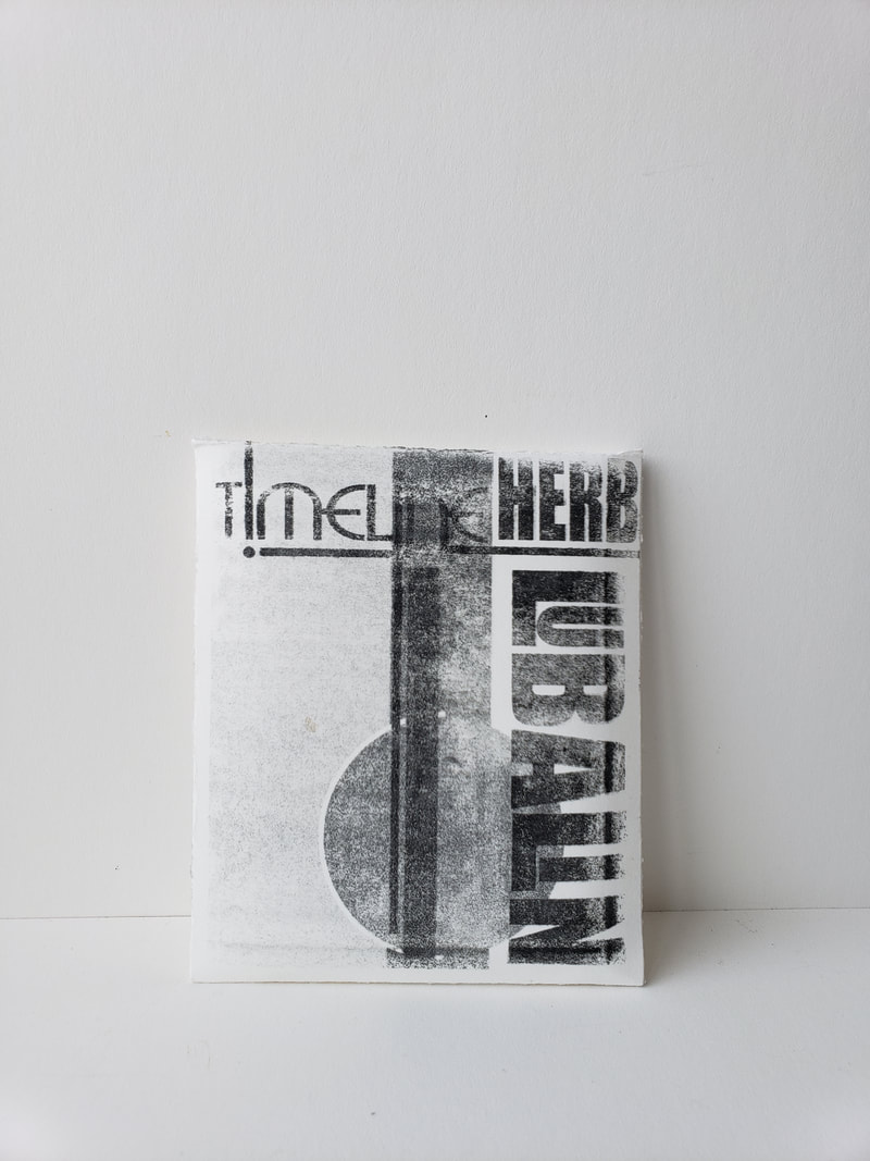
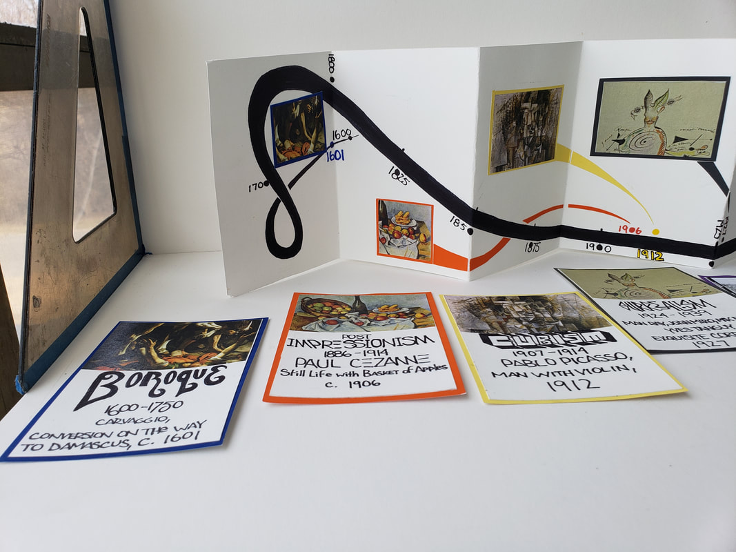
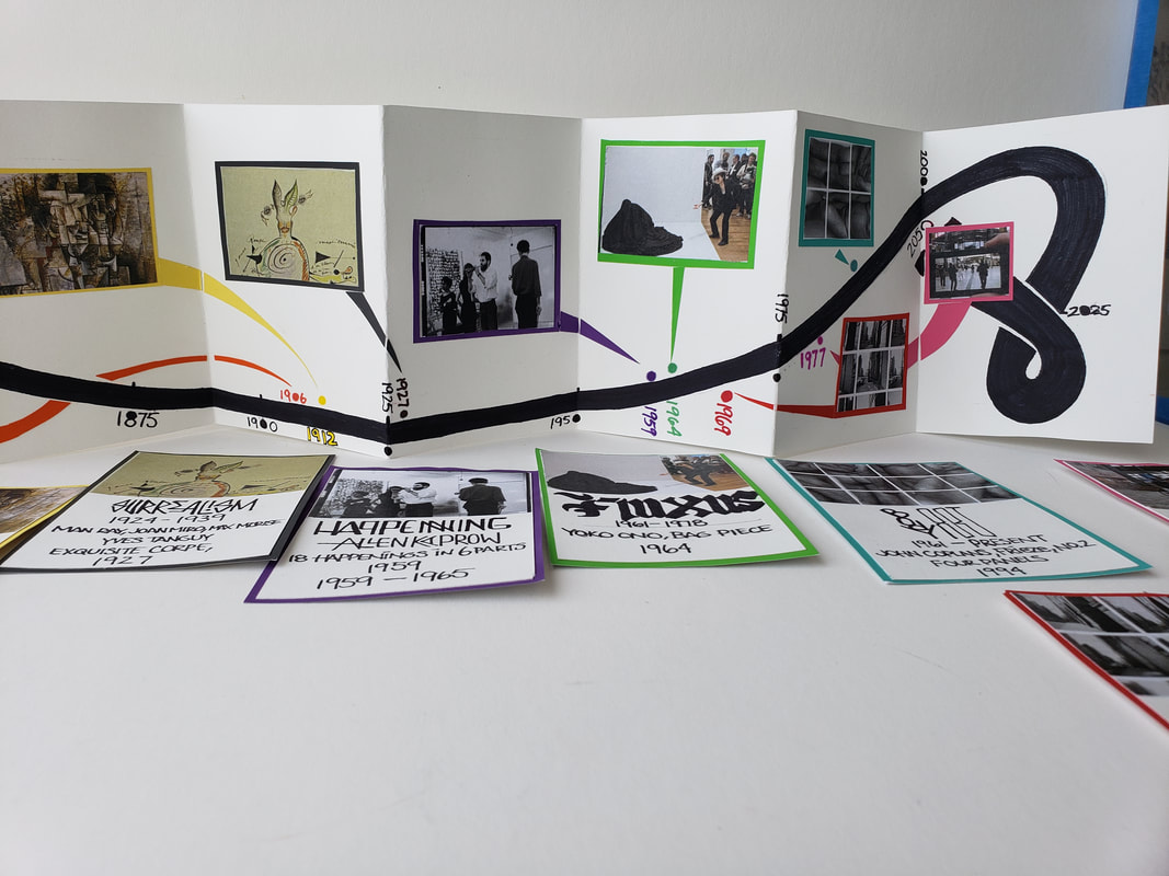
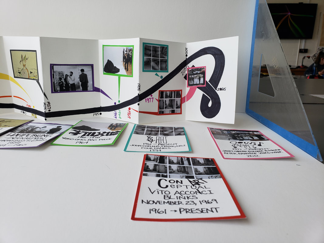
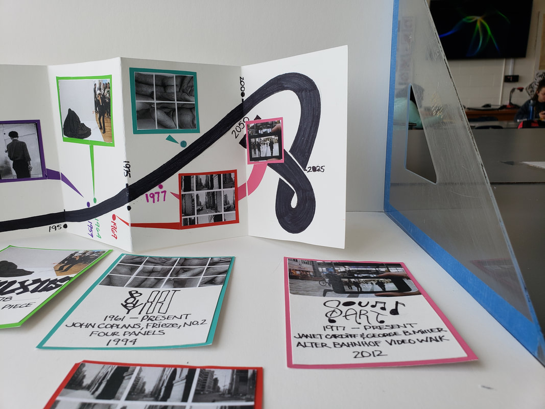
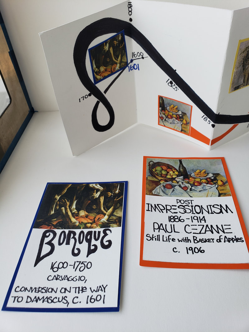
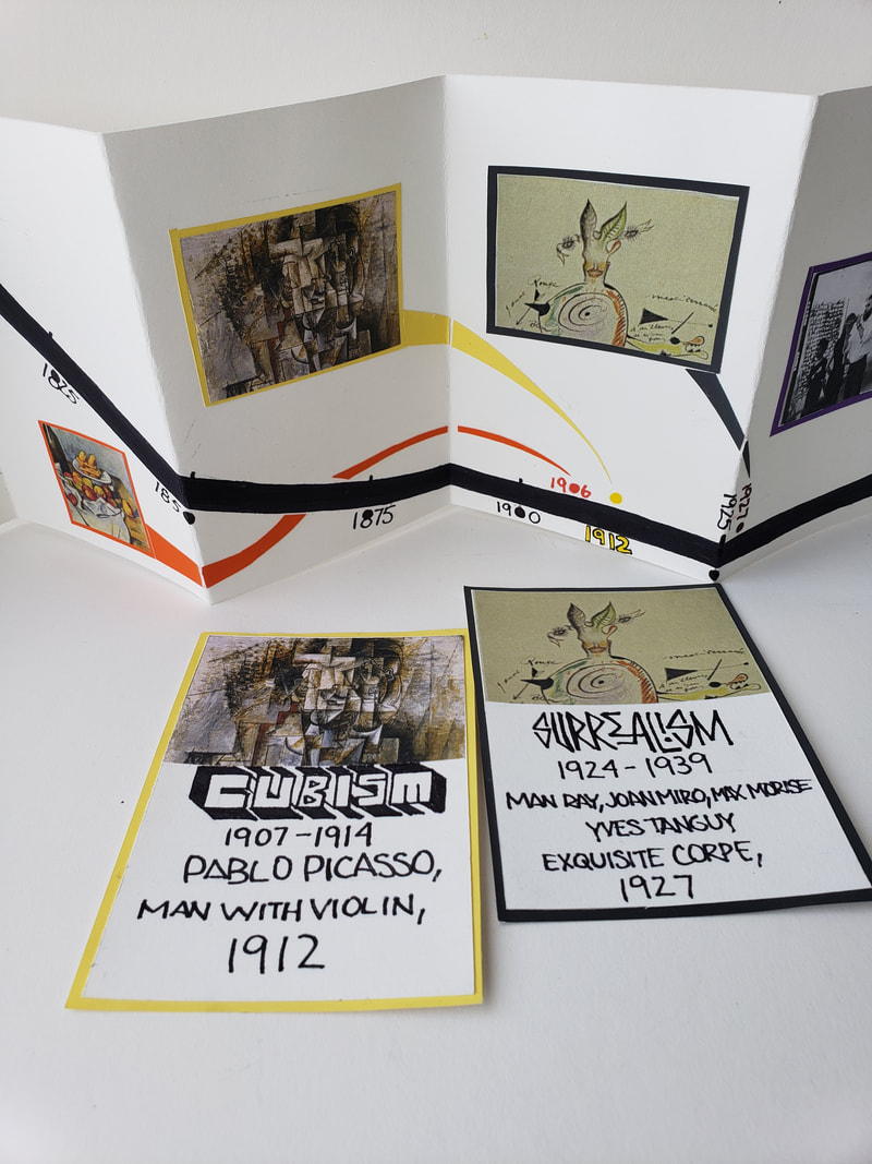
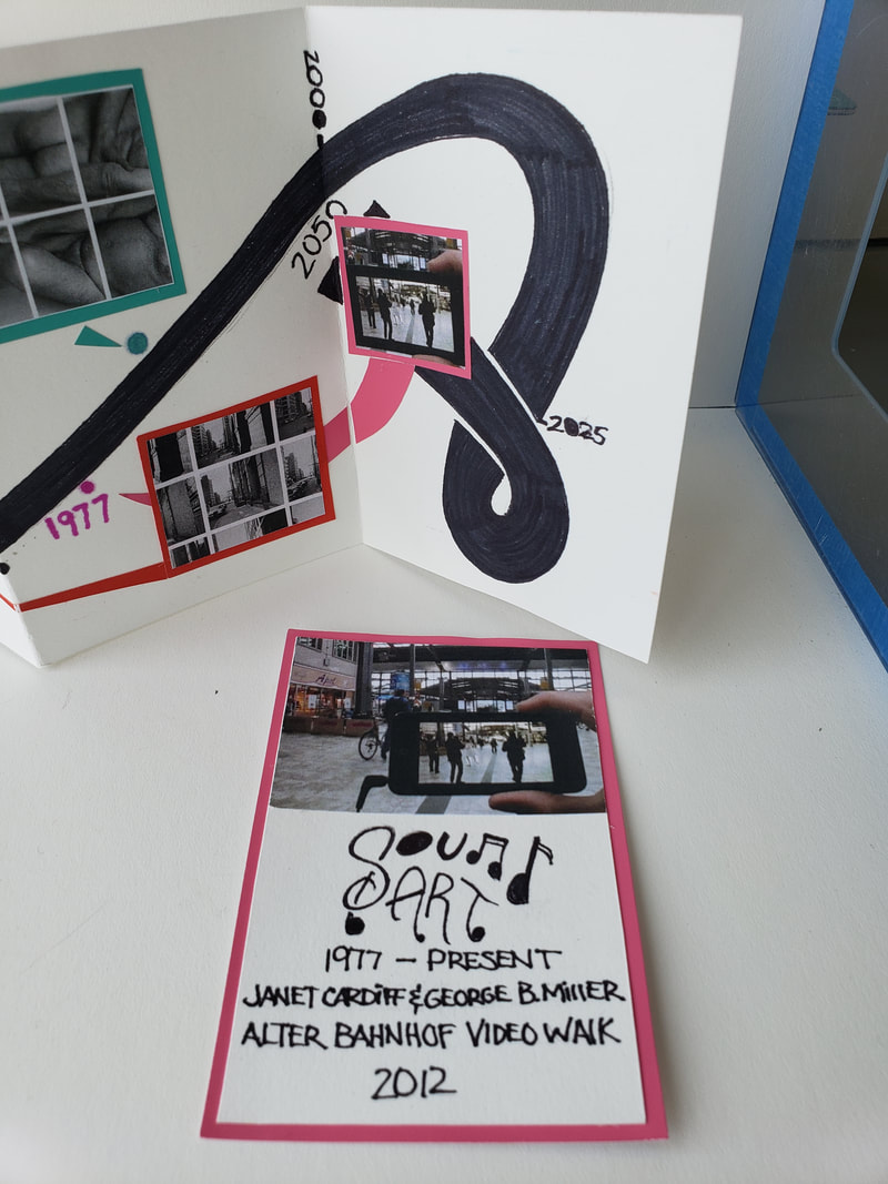
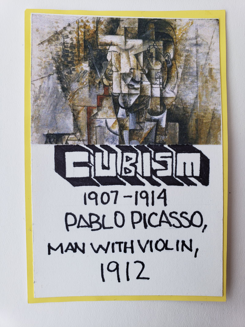
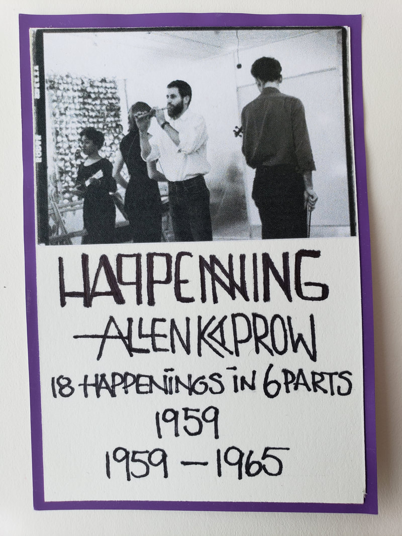
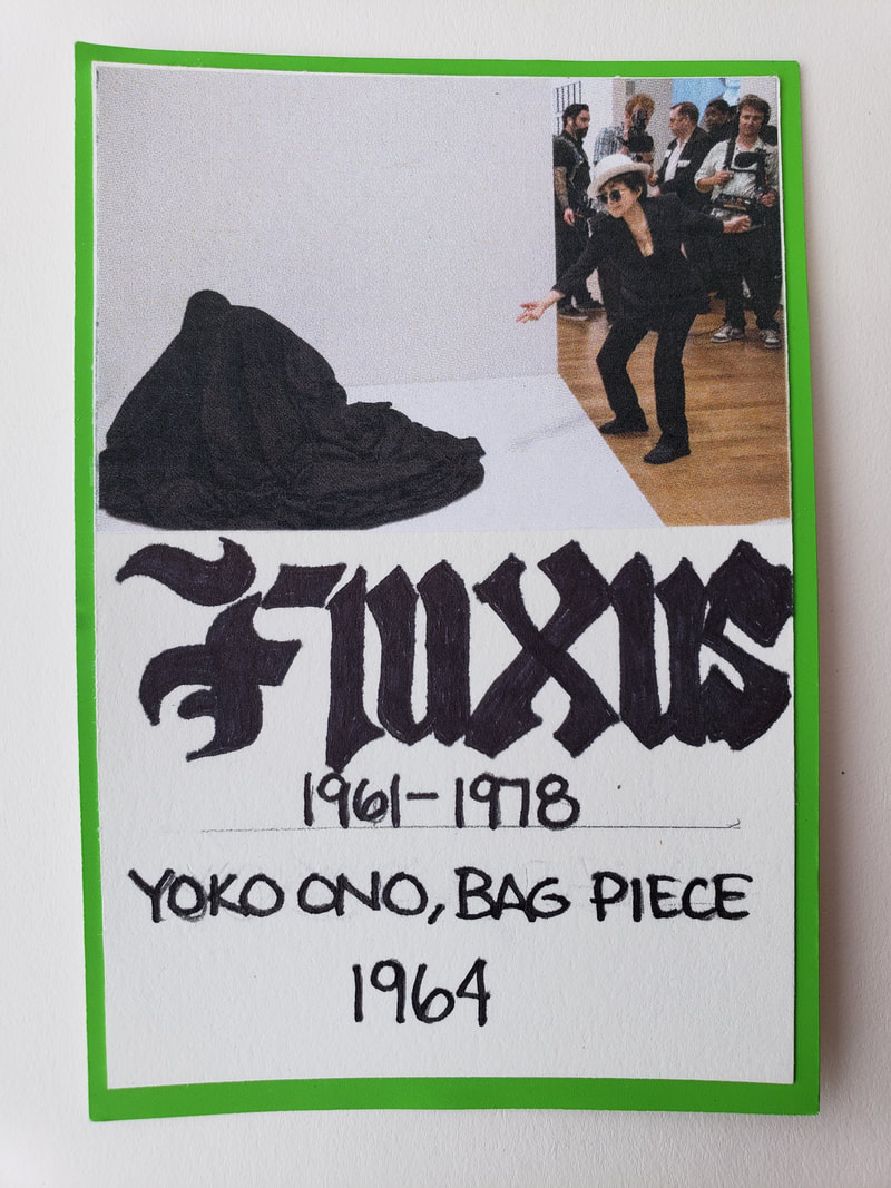
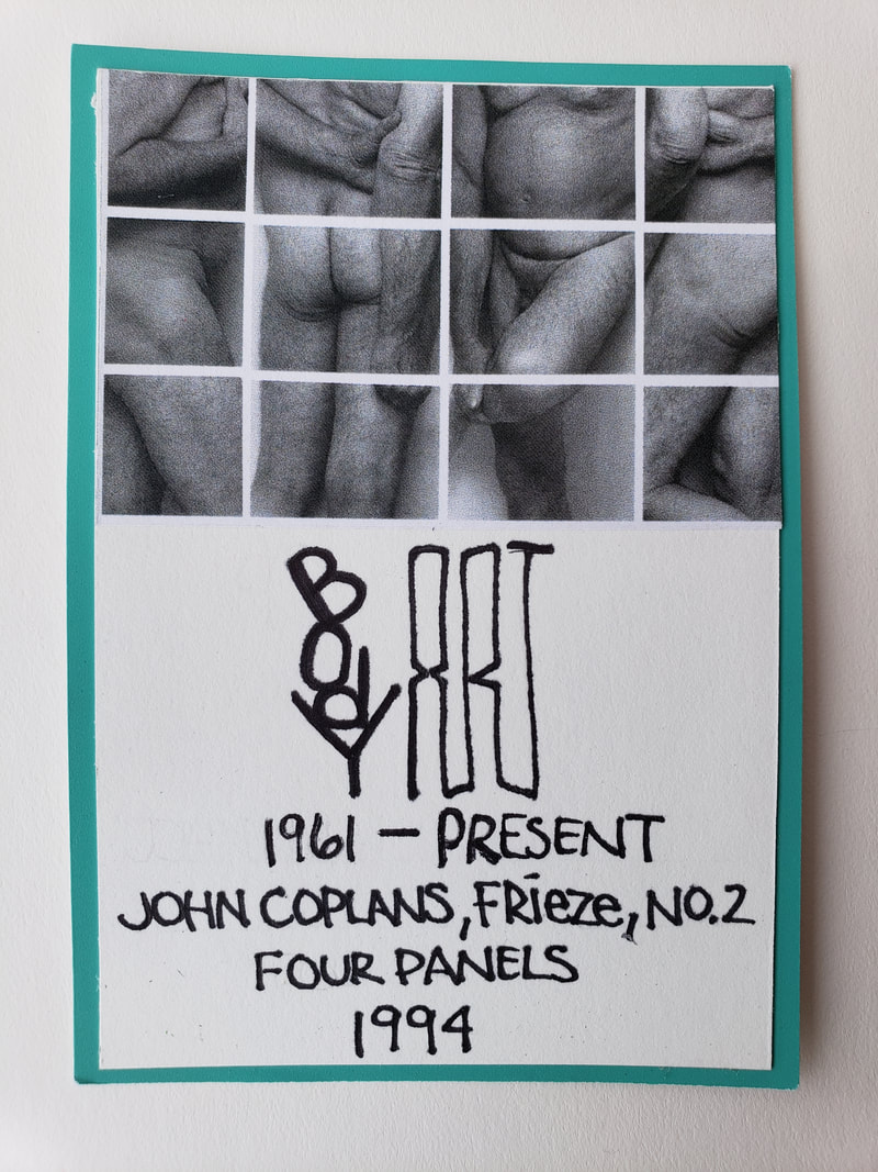
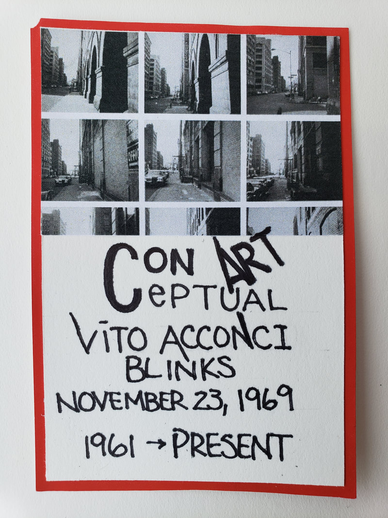
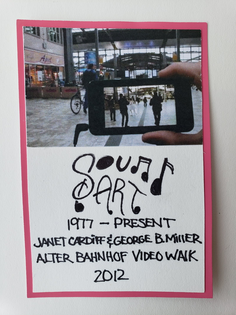
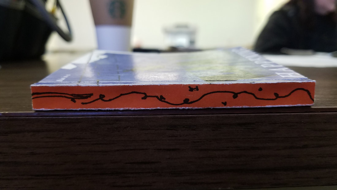
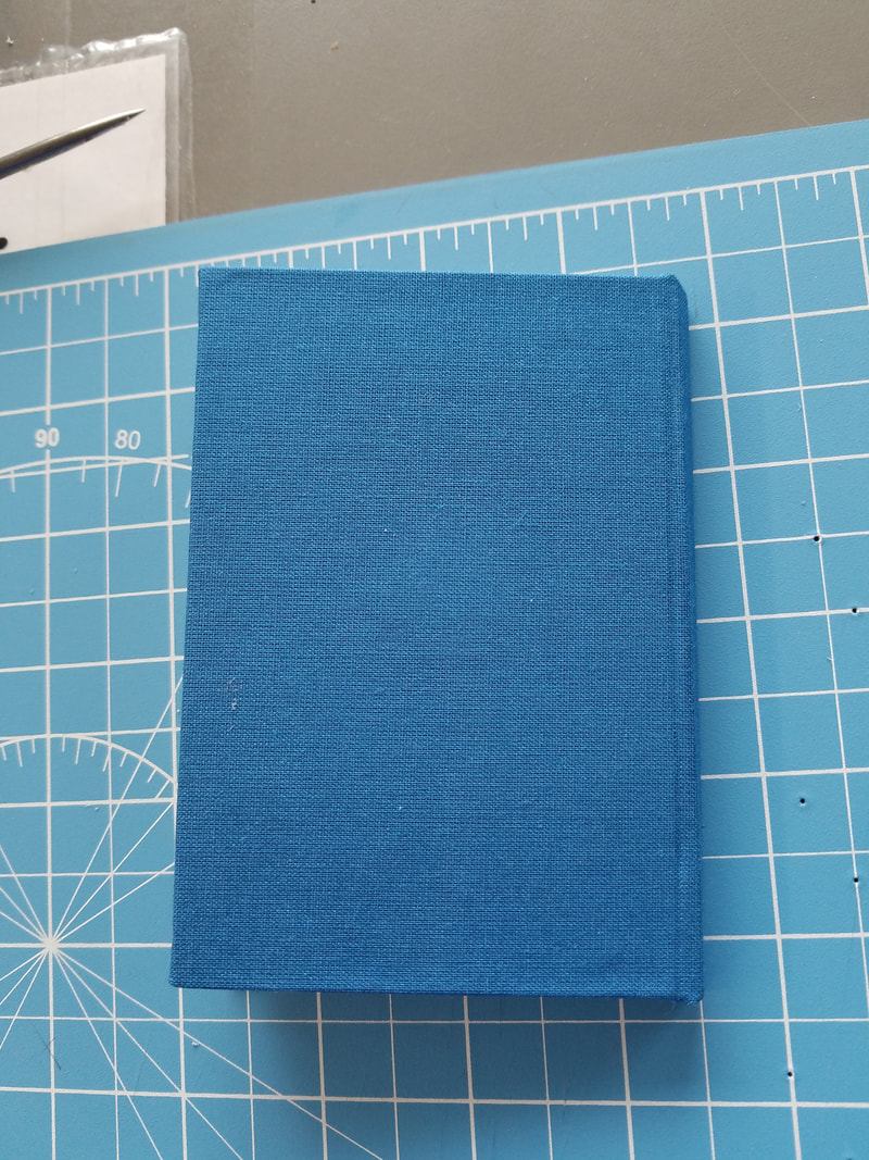
The timeline inspired by Herb Lubalin was what I had to create to show the different time periods of art that we have covered in Art107. We had to make a rough draft and a 2nd draft before moving on to the final version. The biggest challenge was to fit all of this within a 5.5 in by 30 in piece of paper. The book would be an acordian folded book.The timeline began from the 1600's to 2050. The difficulty was that there had to be balance even though from 1600 to 1885 the only period was the Boroque Period. The time line had to be represented equally across the entire 30 inch long piece of paper. Towards the end of the timeline there were about four periods that were very close to each other but still thinking about visual balance and always considering the Style of Herb Lubalin. The research of Herb Lubalin was easy, I could see that he focused on Typography, everything was clean and black and white. At that point once I could come up with a proper sequence to display my periods I then began to work on my final draft. I drew a ribbon and on the left side of the ribbon please notice how the line started under and then went over the line on the right. I was trying to represent time going forward from the 1600 to 2050. By using my method I was able to place a period on each fold and because there was 8 folds but there were nine periods. One period had two images on it. This was the best compromise to giving a visual balance along with showing all periods without cluttering or bunching it all together. The only part I felt that was not in the style of Herb Lubalin was the use of colorade paper. I wanted to use this to help me for my cards to show what images belong to which period. 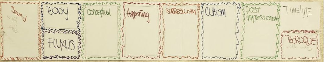 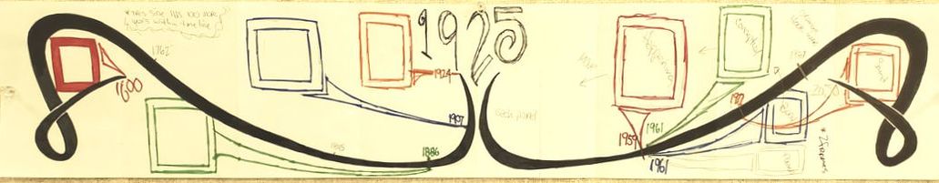 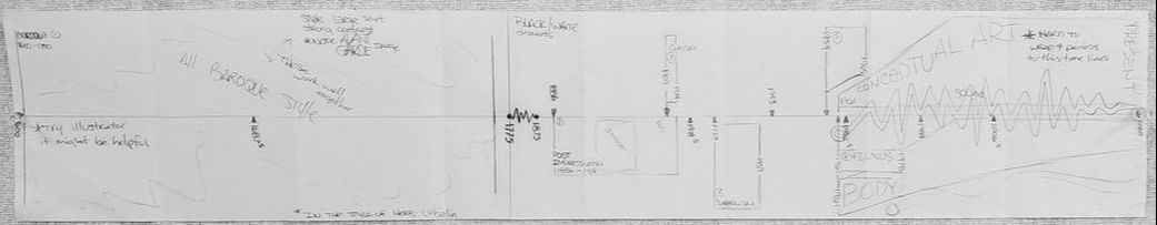
0 Comments
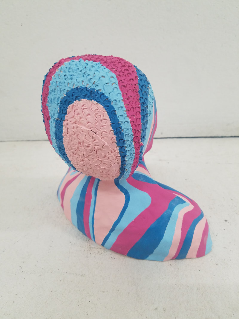
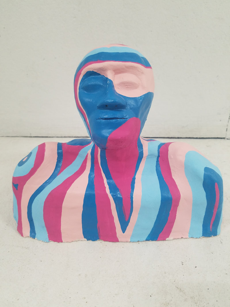
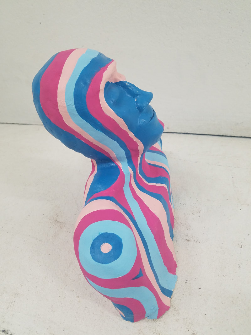
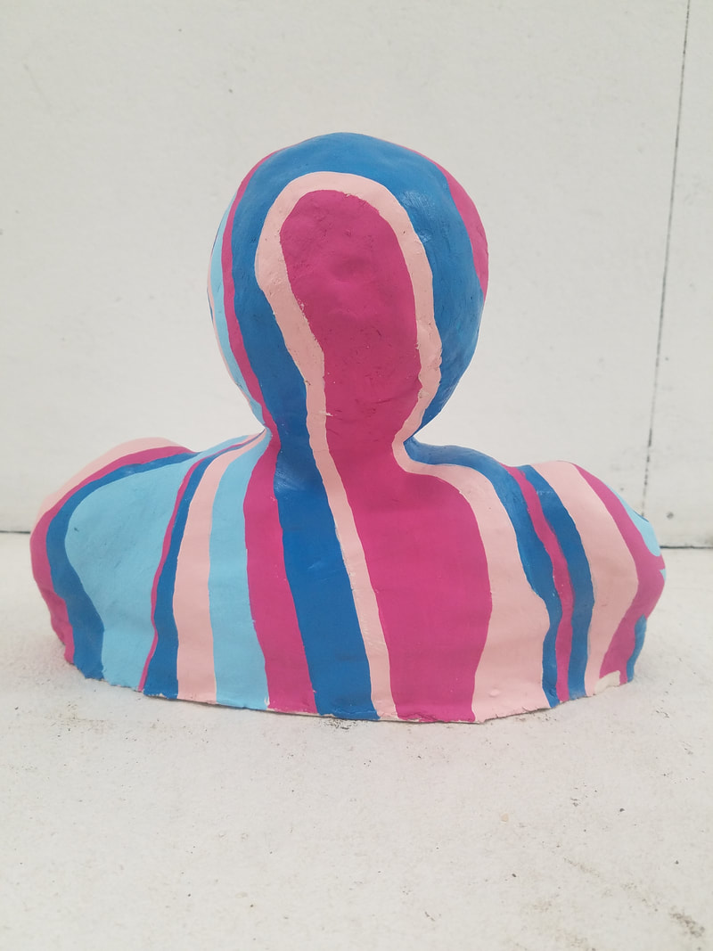
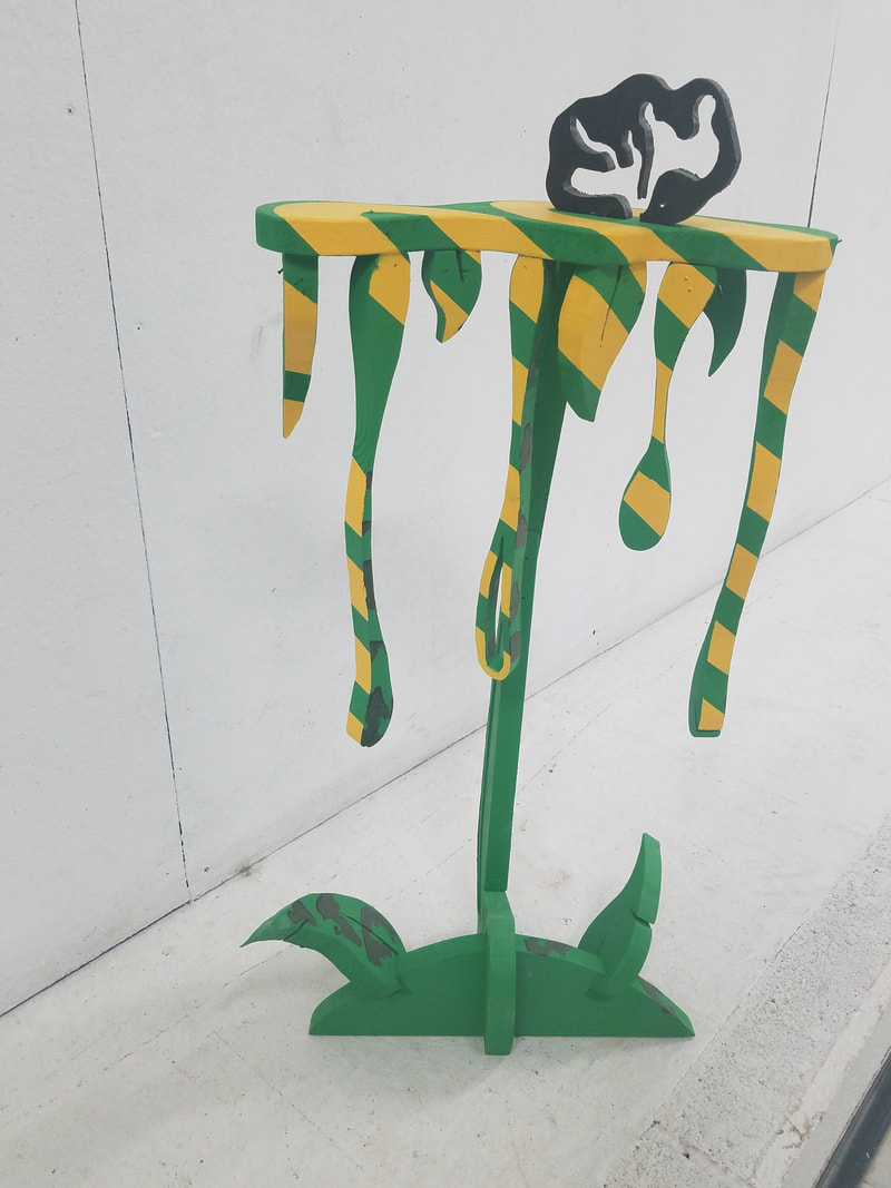
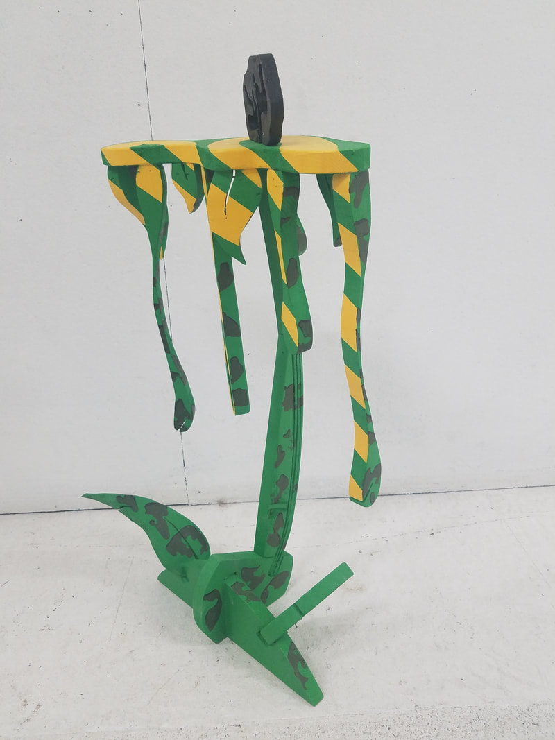
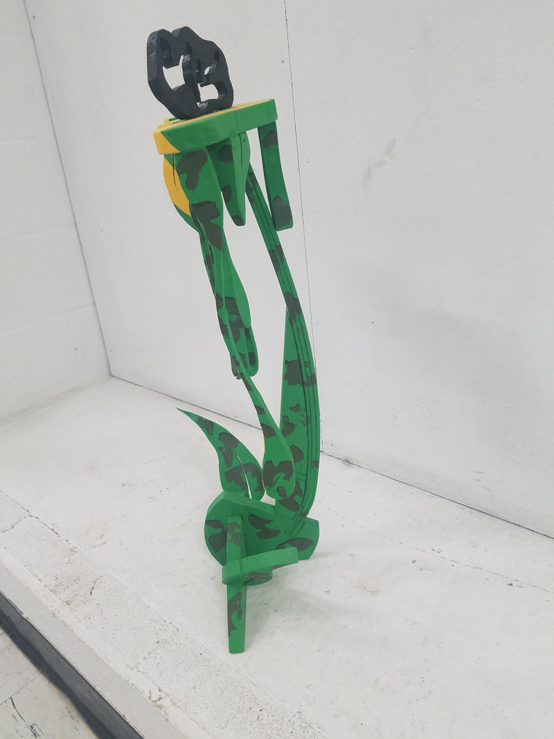
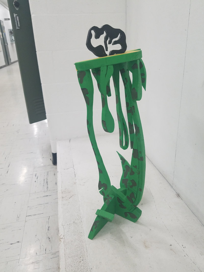
My 4 sketches for the design of the book cover. I had to make different sketches to try and find the right design that reflected my flip book. Mad helped me with a concept that reflected my flip book with changes made to making some of the words look like tape and the word WALL look like it was written on tape. I chose to write my letters with a San Serif with wide lettering and the word WALL done in black with shading towards the bottom. Instead of writing the word fly I chose to draw a fly instead. Let me point out that this was a long process of taking photos of these images and creating a book out of the 40 images. Each of these photos were done with a app that allowed up to take it in video format but slowed the frame rate down to grab each image. Once my cover was finished, I bounded the book with PVA glue. I collated and clamped the pages together and filed score marks across the side of the spine and used PVA glue to secure them together. This is called a perfect bind. Once it was fully assembled and you flip through the book like in the video, you can see the persistence of vision, you can sense the flow, like a video. Just like time lapse photography, where you take so many images per second. This is one of the books I have learn to make. Its a lot of work but a skill worth learning and something to appreciate in books that I see in the future.  This is a inspired piece from Hockney's Joiner. I worked on this with Kendall, we had to review how to do this and I took about 60 photos to get this final piece. I was able to take a quicker approach by setting up my Photoshop file better. I created a matte with all the 3x3 cut outs and I was able to place photos underneath that layer. This allowed me to arrange them in the correct way that looked aesthetically pleasing. That gave me more unity and variation that looked scanned across. Craftsmanship was equally important, the layout on the paper meant no gridded pencil lines could show, which was difficult because of using PVA glue. The most difficult part of this project was trying to achieve a Chiaroscurro lighting effect. We had one light source to use but others in Gallery 10 also had lights that filled in the shadows to Kendall. While I know there are many projects to do, since this involved photography, I felt very comfortable with this. Some of the vocabulary learned was: Line, Shape and Form, Space and Perspective. All of which you can see were important aspects to this project. *Not knowing how to enter information and getting use to Weebly, this was not entered on time. 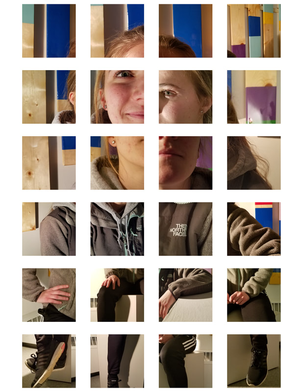 This was my first hands on class. I got a chance to explore other type of art work instead of Graphic Design. I did enjoy this class a lot. I knew I could express myself with other materials and I am glad I had a chance to test it out. I plan on doing more with wood when summer approaches. What really has me excited is that I get to share this with my Granddaughter Mya, who also is very artistic. More photos coming soon... 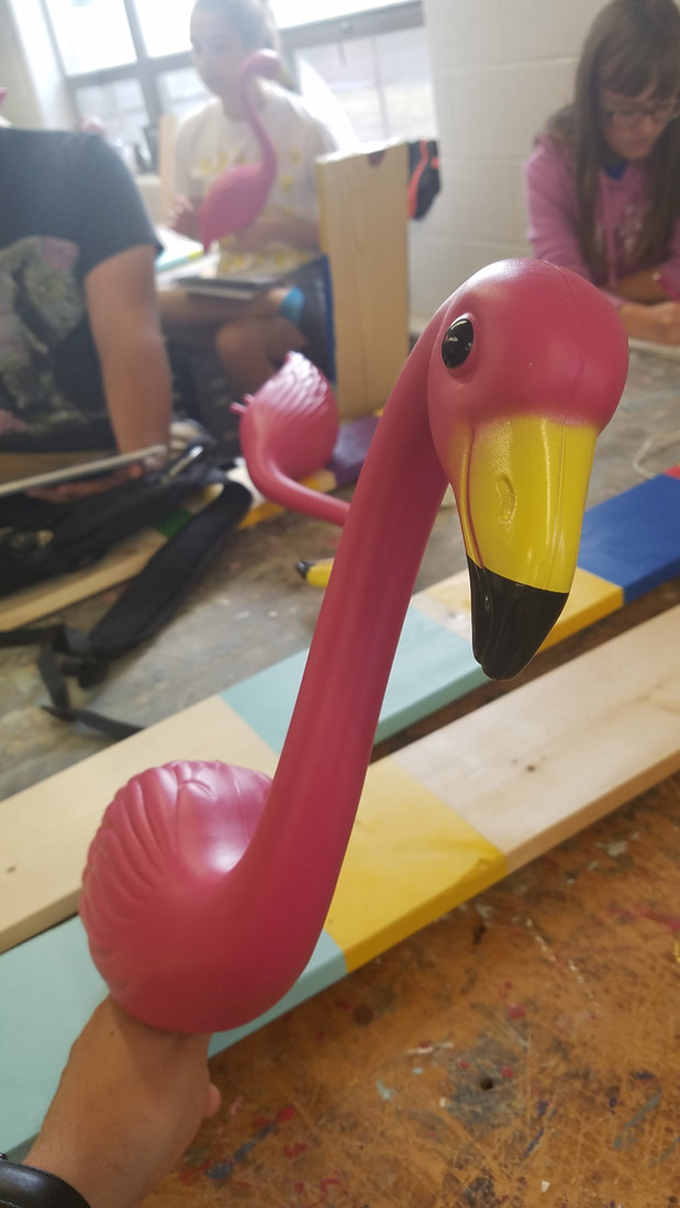 Had to convert flamingo to something else. I tried the dragon but I didn't understand how clay would dry, so I ended up doing something else with Styrofoam. It still looked cool. 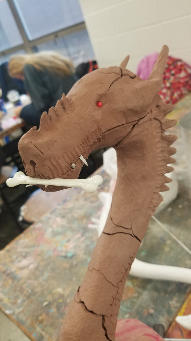 Another project from sculpture class. It represented us as numbers. Our Siena Heights student identification numbers. Guess which one I am? You cant "WE ARE ALL NUMBERS!" hahaha. 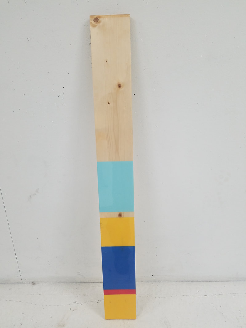 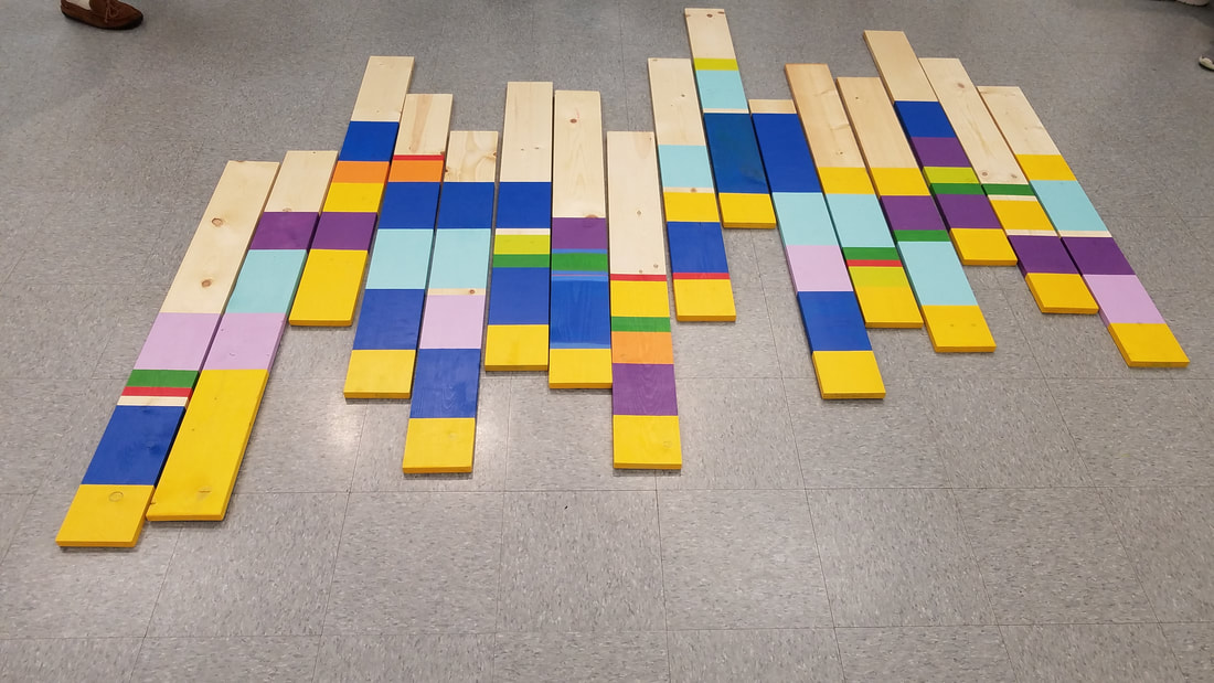 2 Head bust assignment. 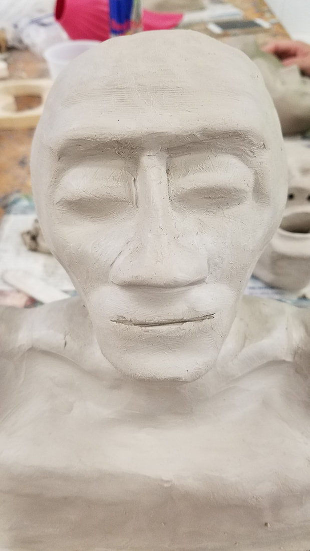 Wood sculpture process. |
AuthorMy Name is Steve Gonzalez, coming back to school after a lot of years. I am determined to get this done. Sometimes I wonder if I will make it. Archives
November 2018
Categories
All
|


 RSS Feed
