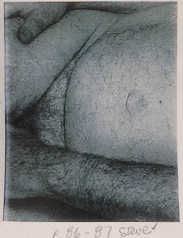
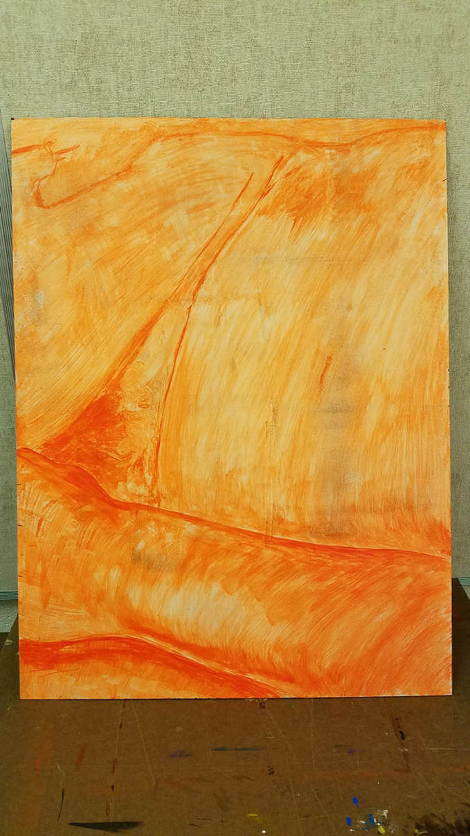
  The assignment starts off with getting a section from John Coplans reclining figure, page 86-87. We painted a orange undertone to get the outline of the figure and tonal shading. The panels next to me on my left and right all had to line up so that unity was felt across all of the panels. with the body image. I was absent that day and my two classmates that were assigned on each side of me hashed marks with pencils to help me know where the arm and hands were. I then gridded my image and I gridded my medium to scale the drawing on to it to keep it proportion. *Note, just like with the other things we have done in all classes, we had to erase all pencil marks, to keep the image clean. 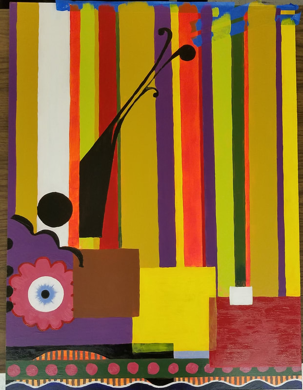 Each student received a different artist to mimic and use the artists style on their panels. This should look really cool because of the variety. The Artist I was assigned was Beatriz Milhazes. I had to mimic her style but keep the continuity of the body so it could still line up with the panels next to me. This had some challenges because of her style with geometric shapes. I had to research many different examples of her work to find the right elements she used to give the implied lines so my painting would match the other panels next to me. Beatriz Milhazes used vivid colors that had strong saturation. She did use white and blacks in her paintings also. This helped me to try to use those colors to form the implied lines of the lower section. I used Acrylic, which I thought was helpful to maintain vivid colors easier, it felt easier to mix. Finished work below. 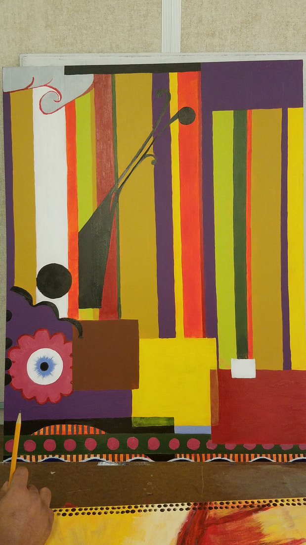
0 Comments
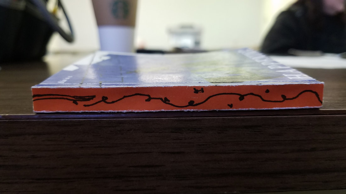
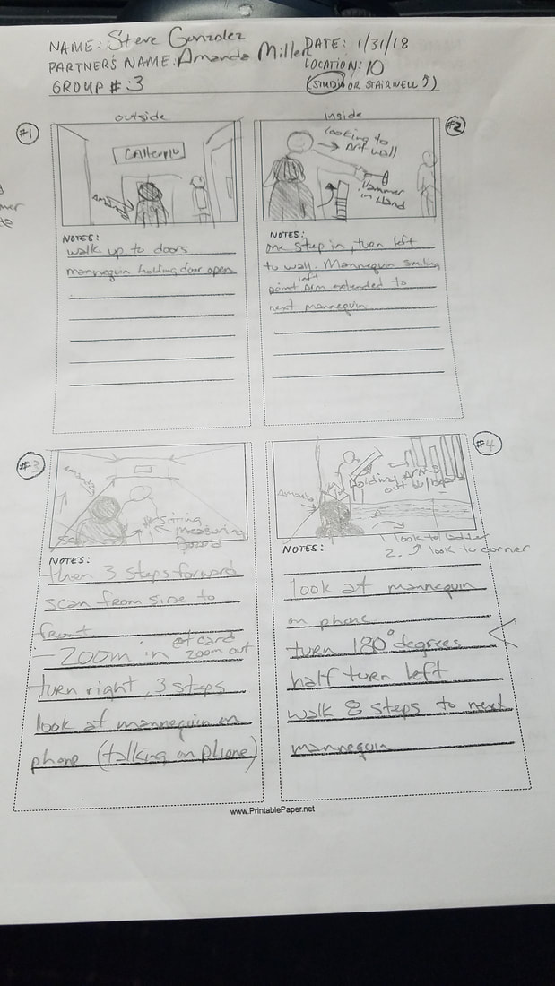
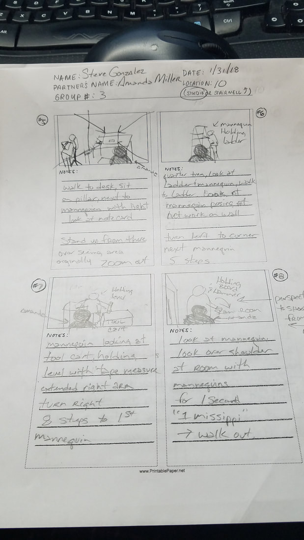
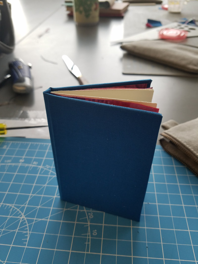
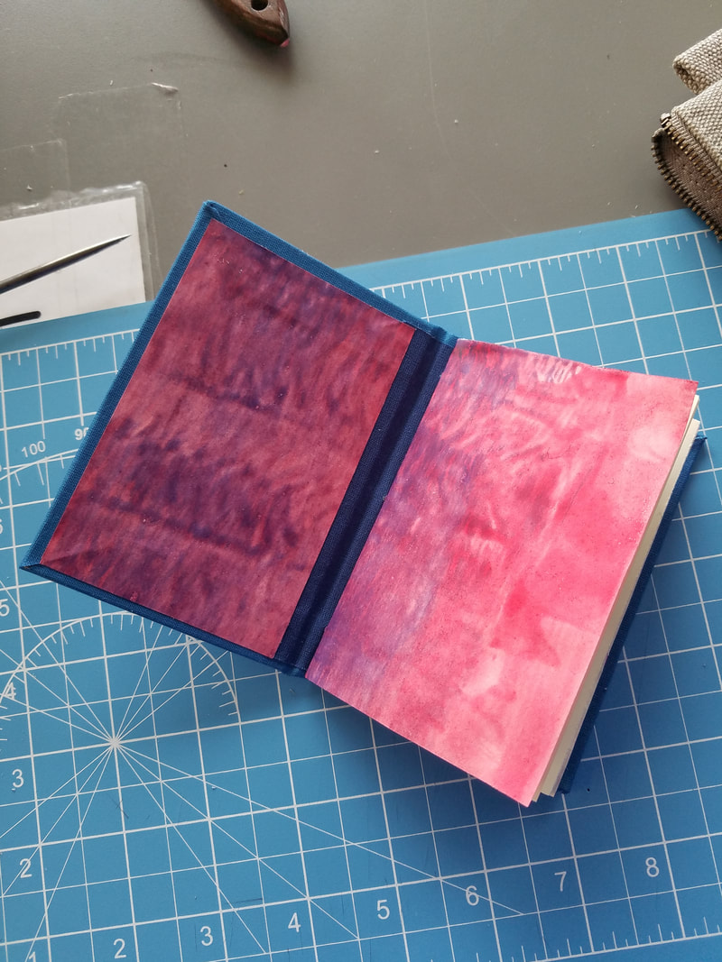
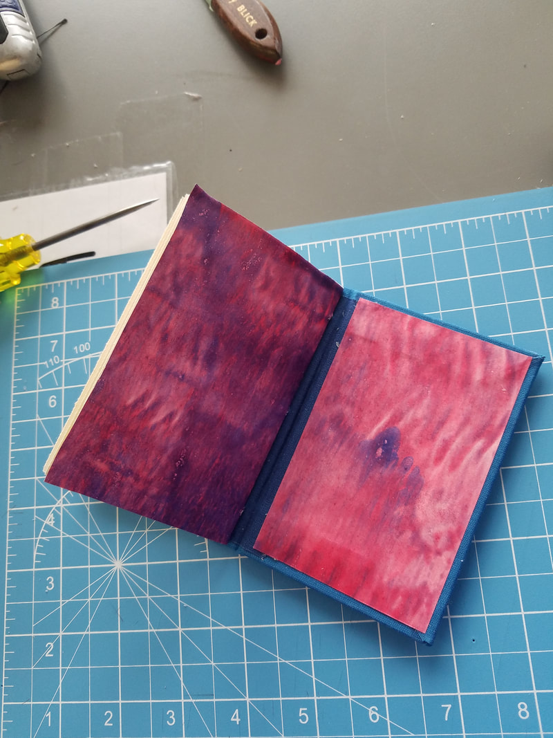
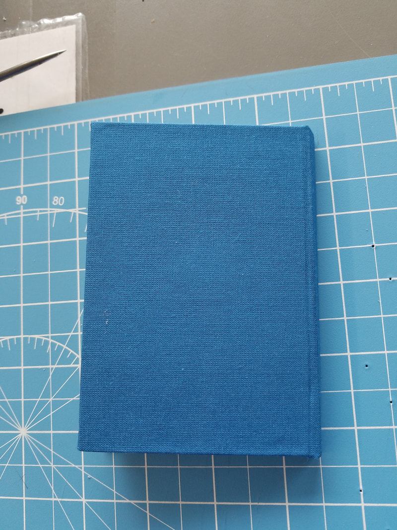
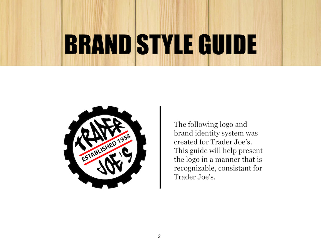
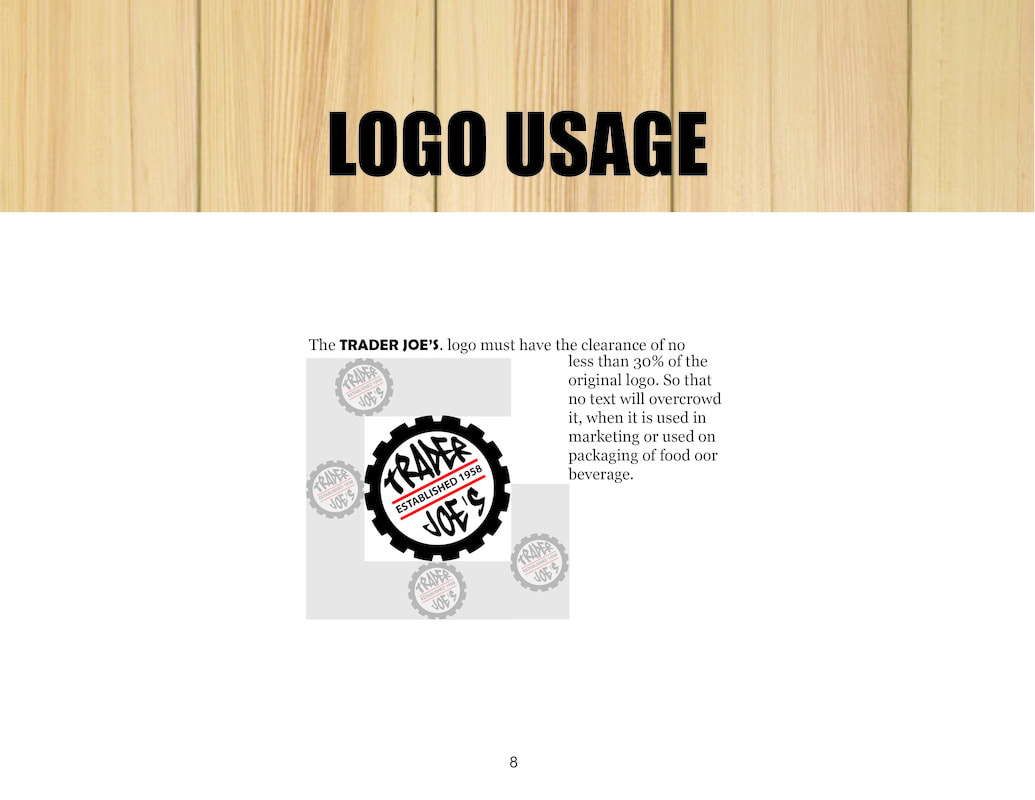
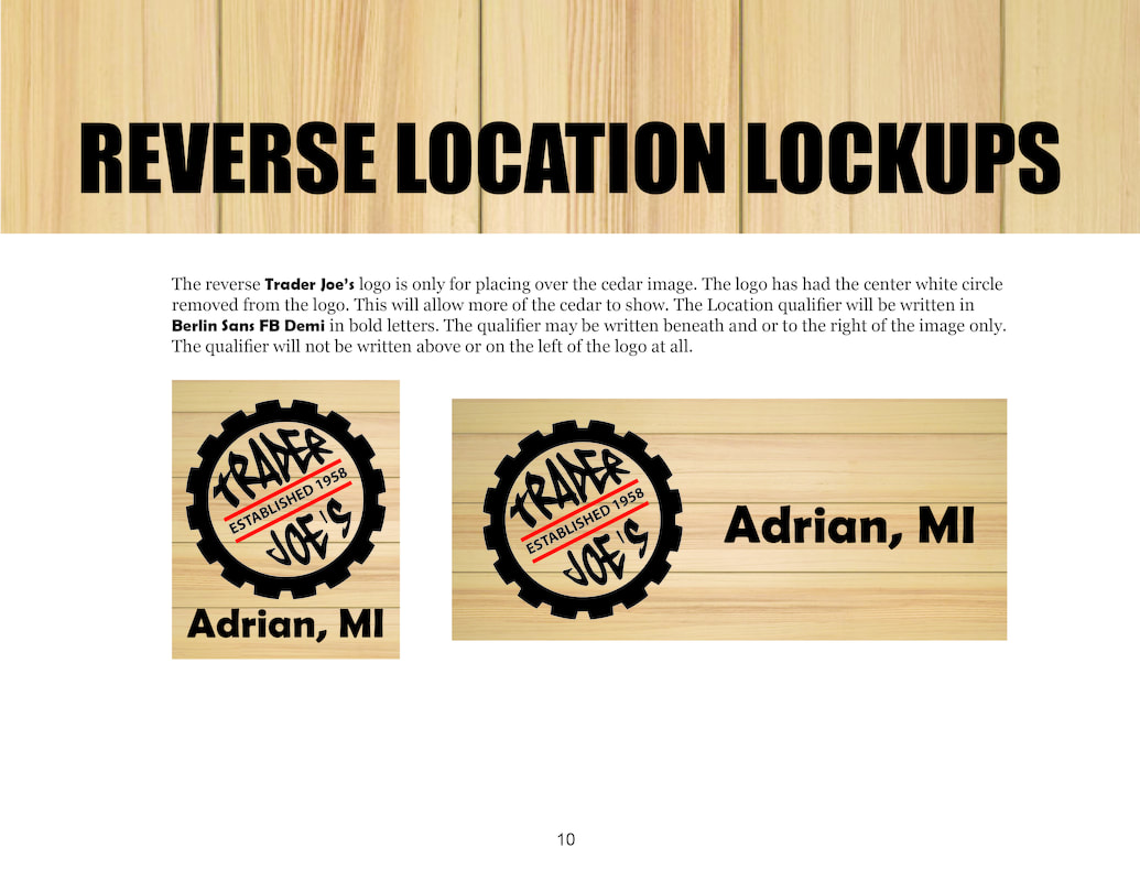
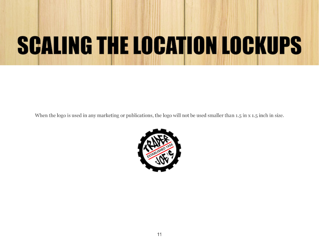
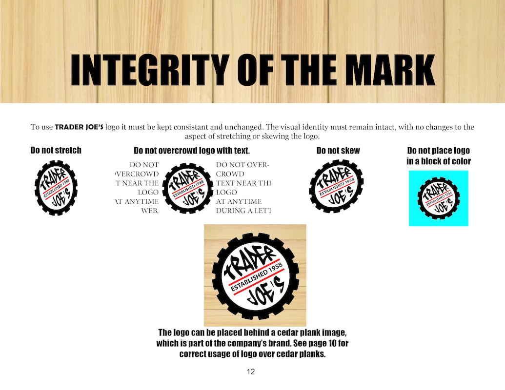
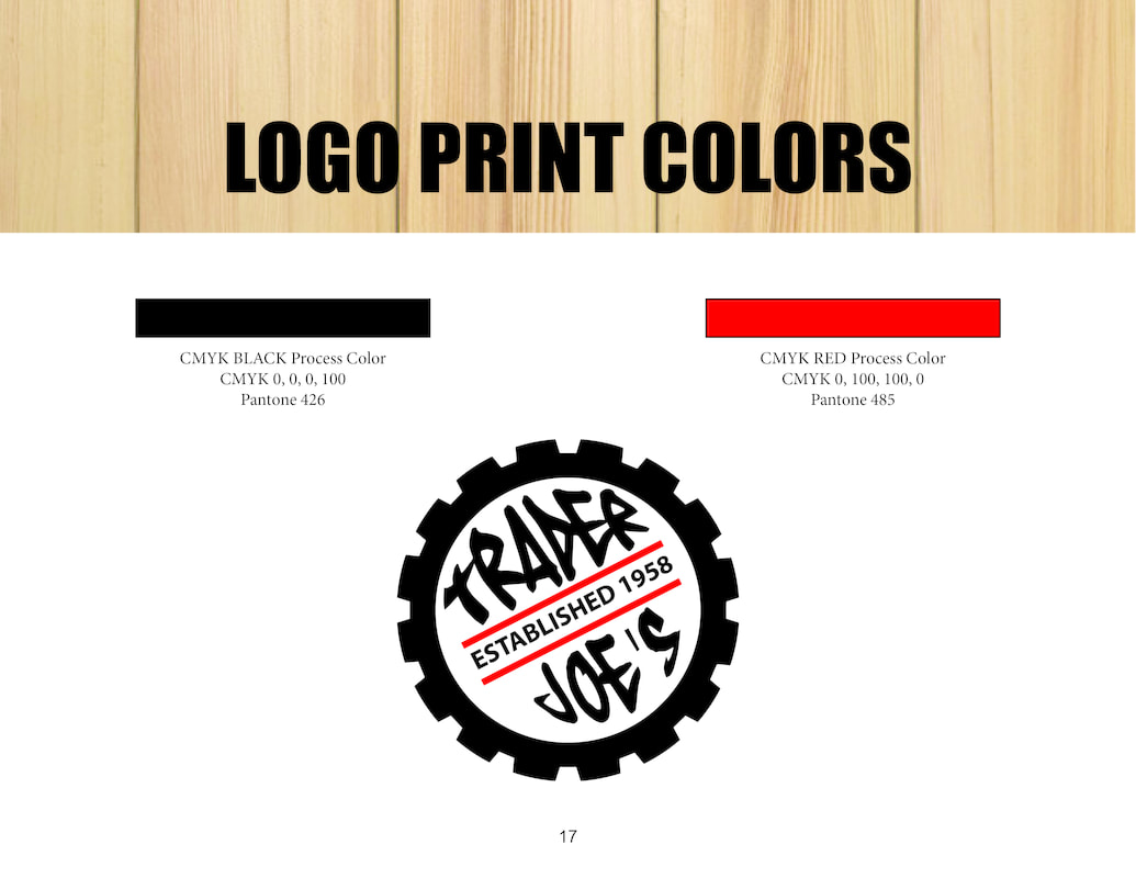
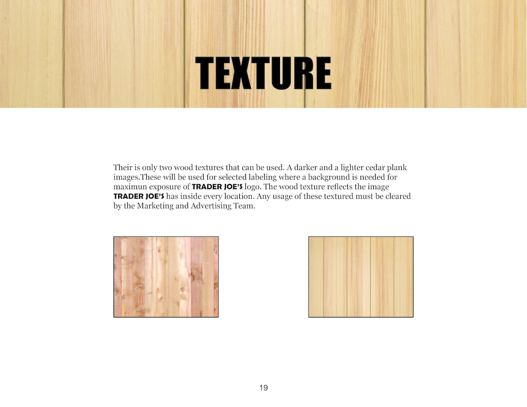
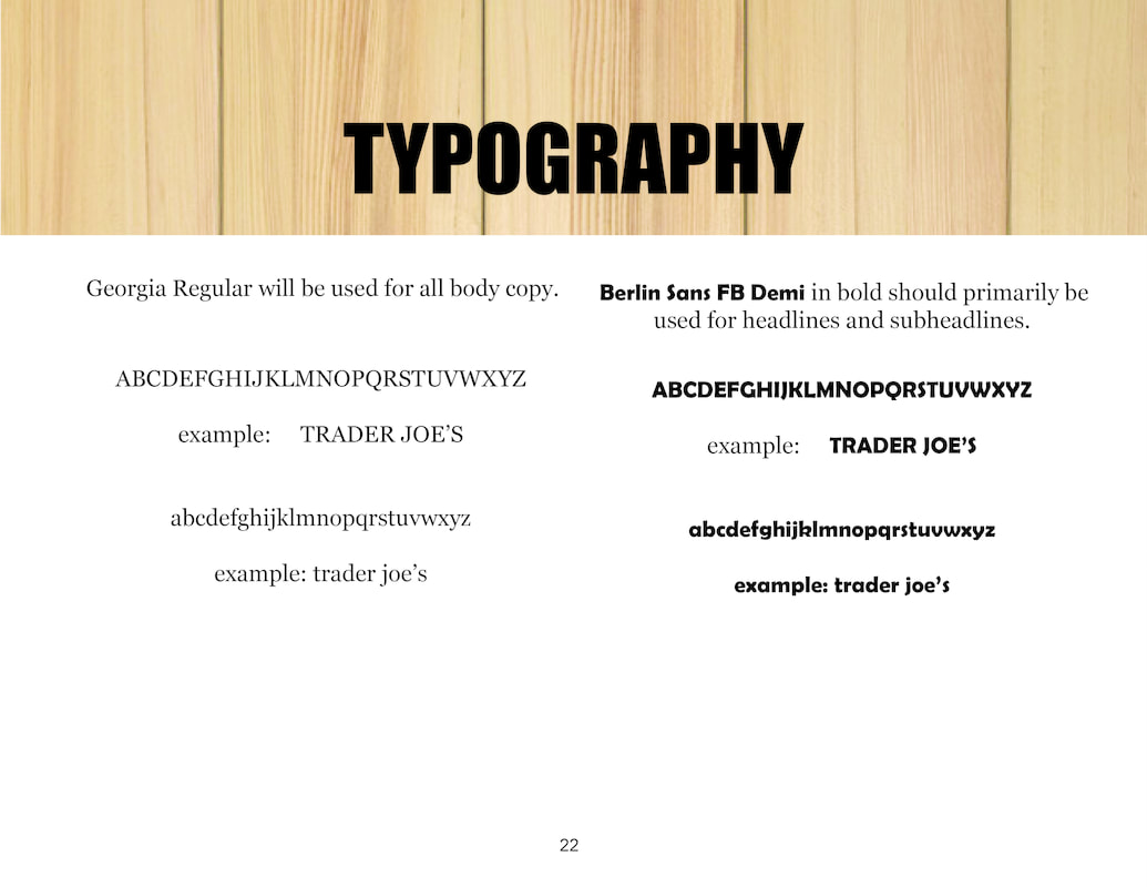
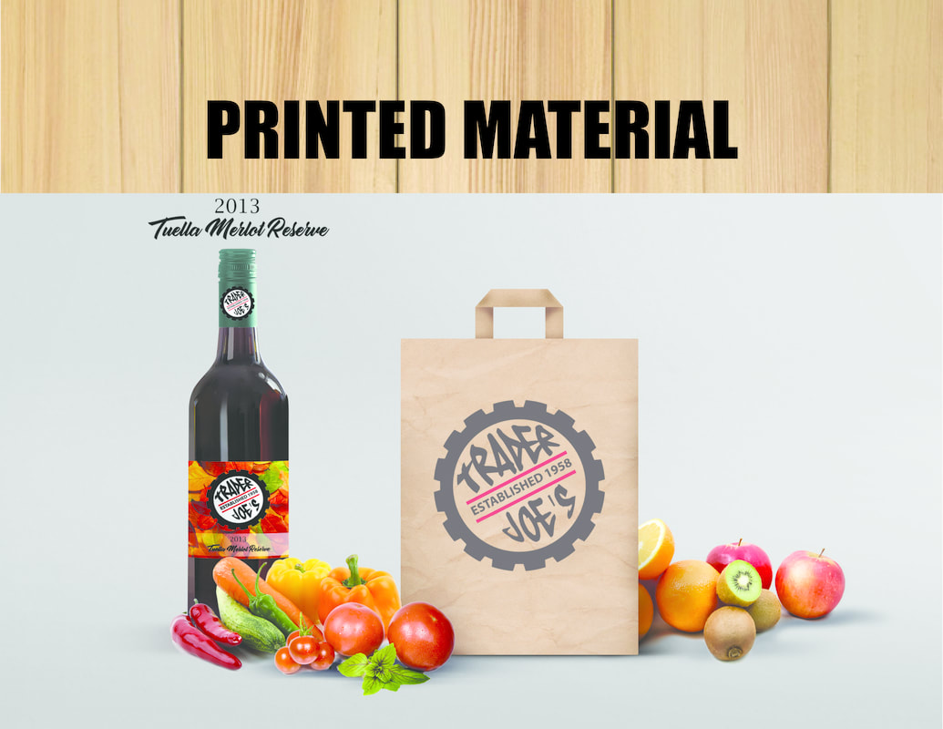
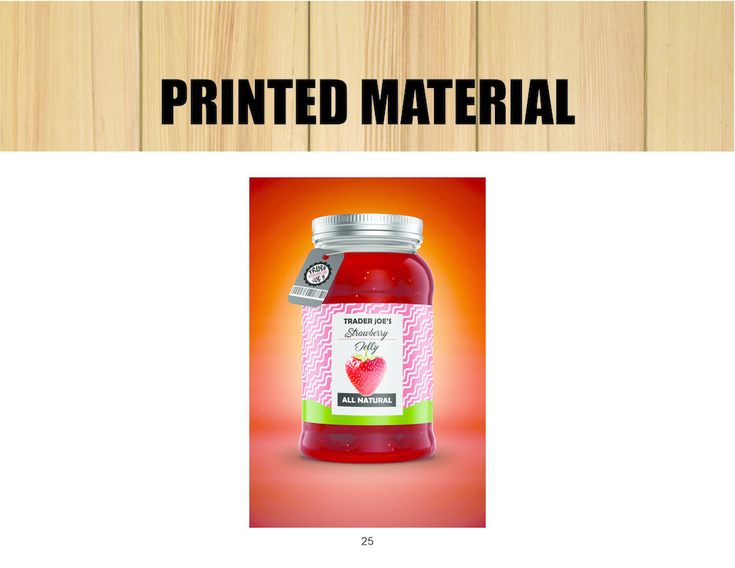
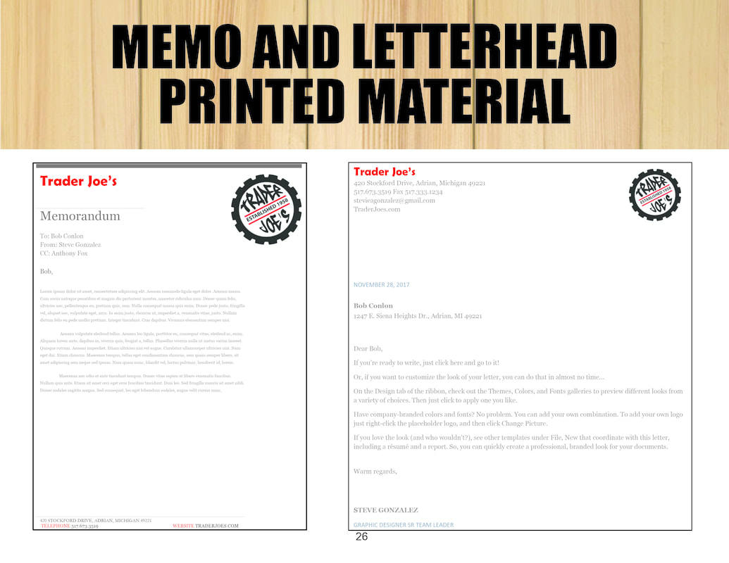
My 4 sketches for the design of the book cover. I had to make different sketches to try and find the right design that reflected my flip book. Mad helped me with a concept that reflected my flip book with changes made to making some of the words look like tape and the word WALL look like it was written on tape. I chose to write my letters with a San Serif with wide lettering and the word WALL done in black with shading towards the bottom. Instead of writing the word fly I chose to draw a fly instead. Let me point out that this was a long process of taking photos of these images and creating a book out of the 40 images. Each of these photos were done with a app that allowed up to take it in video format but slowed the frame rate down to grab each image. Once my cover was finished, I bounded the book with PVA glue. I collated and clamped the pages together and filed score marks across the side of the spine and used PVA glue to secure them together. This is called a perfect bind. Once it was fully assembled and you flip through the book like in the video, you can see the persistence of vision, you can sense the flow, like a video. Just like time lapse photography, where you take so many images per second. I had to find an idea that was time based and create an informational design. I chose to do the moon cycle with dimensions of 24x36 inches. This has been my process, so far. 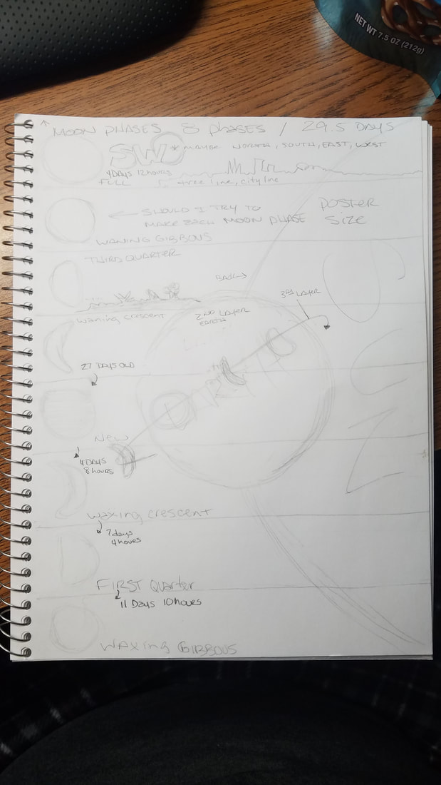 Here is the video link to the video for the Mannequin Challenge, done with Amanda Miller. I also did video with Maddie Laroy. A story board had to be created that had enough details to understand the flow of each scene. It is surprising how much information can be added. It took 8 panels to display what was needed. Some of the things that I learned about this type of video from the perspective of shooting was retracing my steps. Very hard because of the gallery room size and keeping proportion in a tight room was hard to work around Amanda. We had to be creative and use the ladder. There was not enough texture to get that sense of touch to hit a 3 minute minimum time. By using the ladder, it did. This made the timing more difficult. A tough challenge. I also assisted Maddie Laroy with hers too. I did not create a story board for hers because I was not part of the initial day we worked on that. Maddie was missing a partner that day I think. Worked on this project with Kendall. She is a good partner, just saying. So after reviewing Yoko Ono and Allan Kaprow, we created a 40 photo video with Mad and Peter's help. We created actions and did a classroom selection to narrow down the pieces we will use. The Action I was given Tape a fly to the whiteboard. Then mourn. The four actions I wrote were: Music Look at a pretty scene, Close your eyes and take a picture. Open Palm Make a fist, see the mountain and valleys. Open your hand and recreate. The Camera Look at something beautiful find a flaw then zoom out. Erase the Ugly Draw lots of lines erase the ugliest first until one remains. This had to involve the human body, take less than 10 seconds to perform, be associated with life more than art, require no props or very simple props and must be able to be performed by anyone. Some of the vocabulary learned was Frame rate, Persistance of vision, Time Lapse, Shape in reference to video work, Point of viewProportion, and scale. Many steps to this project. I could not upload my video as directed but found out in class that there were issues with Weebly. I still can not upload to view yet. I recreated my previous YouTube account and my video is still being processed as I wrote this. VIDEO LINK BELOW This is one of the books I have learn to make. Its a lot of work but a skill worth learning and something to appreciate in books that I see in the future. 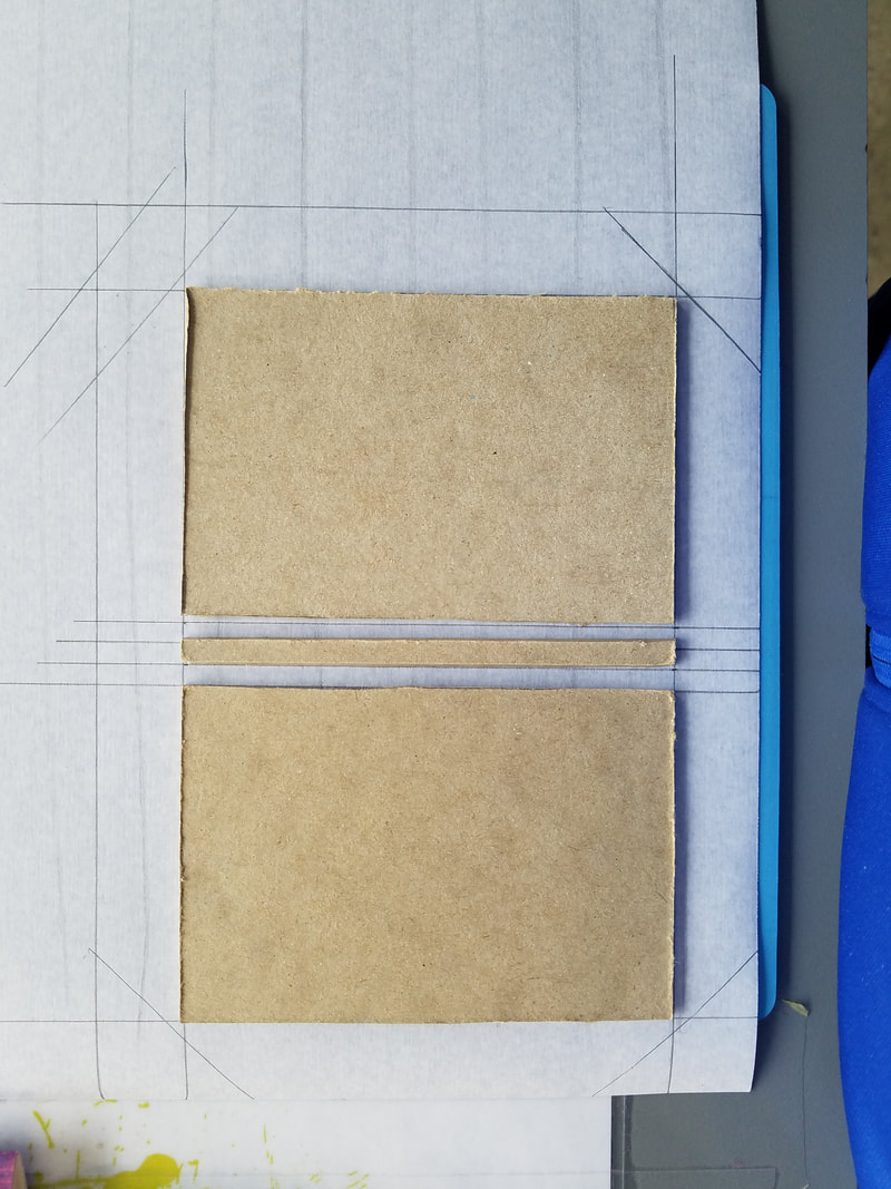 This is a inspired piece from Hockney's Joiner. I worked on this with Kendall, we had to review how to do this and I took about 60 photos to get this final piece. I was able to take a quicker approach by setting up my Photoshop file better. I created a matte with all the 3x3 cut outs and I was able to place photos underneath that layer. This allowed me to arrange them in the correct way that looked aesthetically pleasing. That gave me more unity and variation that looked scanned across. Craftsmanship was equally important, the layout on the paper meant no gridded pencil lines could show, which was difficult because of using PVA glue. The most difficult part of this project was trying to achieve a Chiaroscurro lighting effect. We had one light source to use but others in Gallery 10 also had lights that filled in the shadows to Kendall. While I know there are many projects to do, since this involved photography, I felt very comfortable with this. Some of the vocabulary learned was: Line, Shape and Form, Space and Perspective. All of which you can see were important aspects to this project. *Not knowing how to enter information and getting use to Weebly, this was not entered on time. 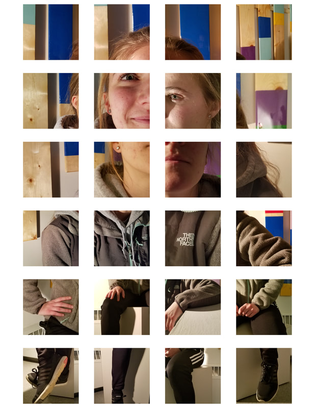 Here is a project that took the entire class to complete, we reviewed elements of each page with Bob. Figured a way to apply some of those items to our Style Guide. I used my logo that I created in another class for Trader Joe's Style guide. |
AuthorMy Name is Steve Gonzalez, coming back to school after a lot of years. I am determined to get this done. Sometimes I wonder if I will make it. Archives
November 2018
Categories
All
|


 RSS Feed
