|
In creating this design I had to create a theme around the final project.The assignment focused on Jasper Johns "Take an object/Do something to it/DO something else to it. [REPEAT]
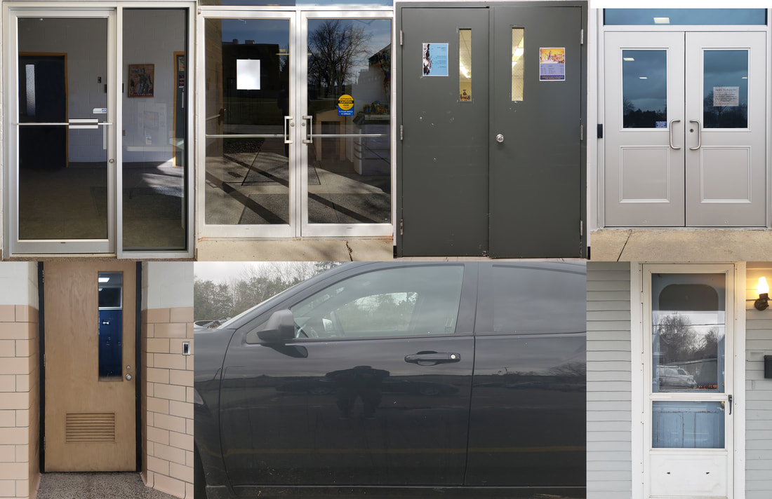
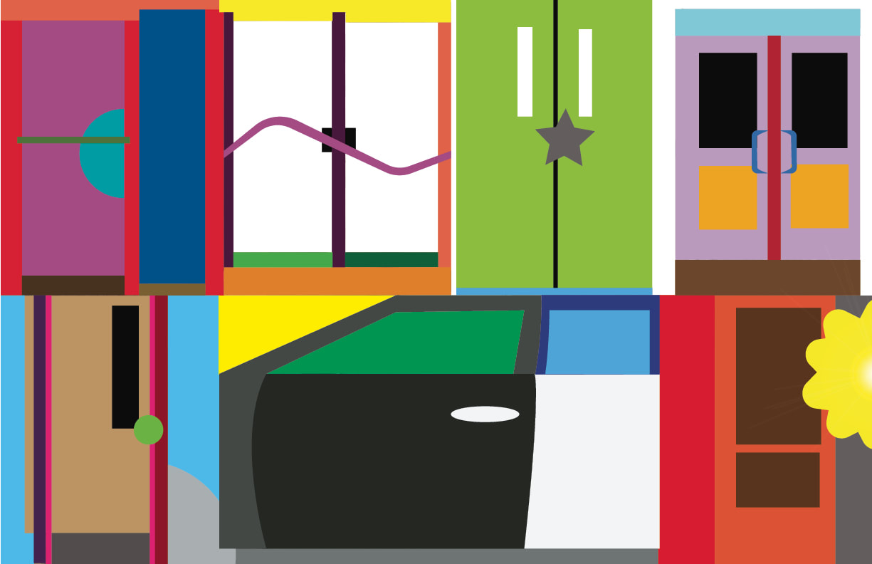
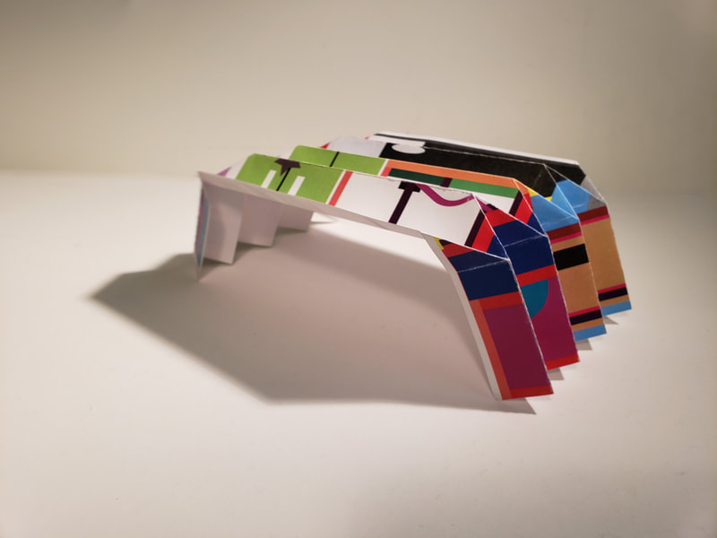
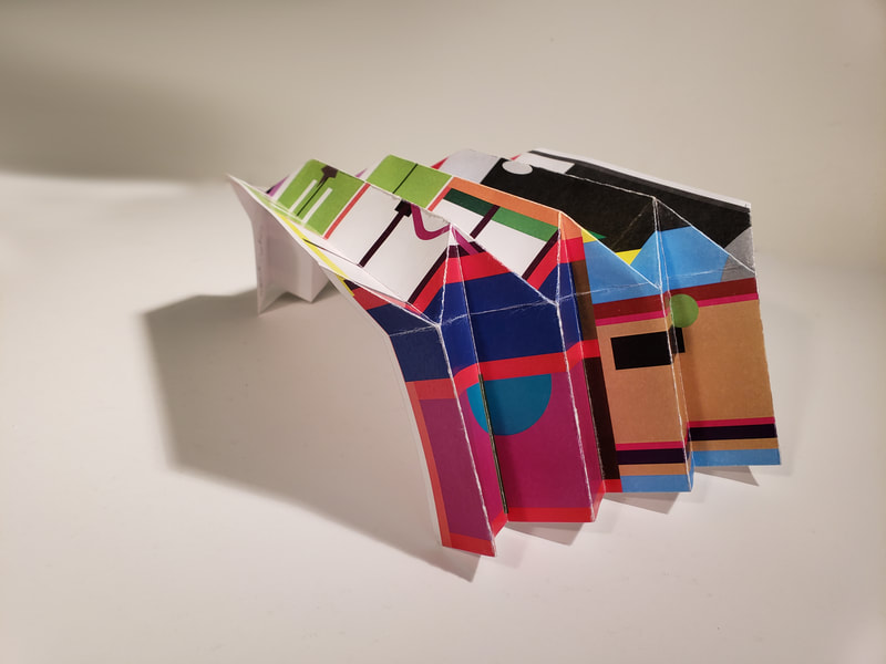
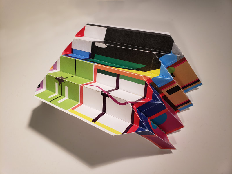
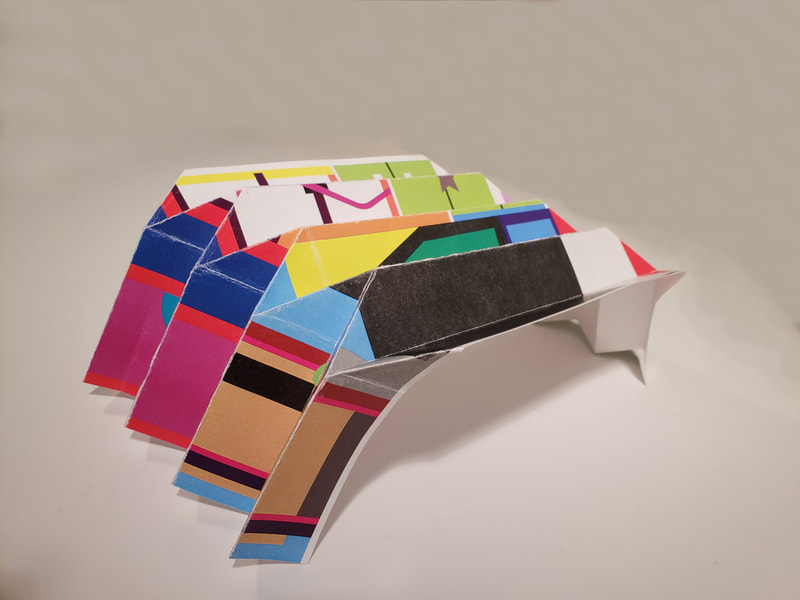
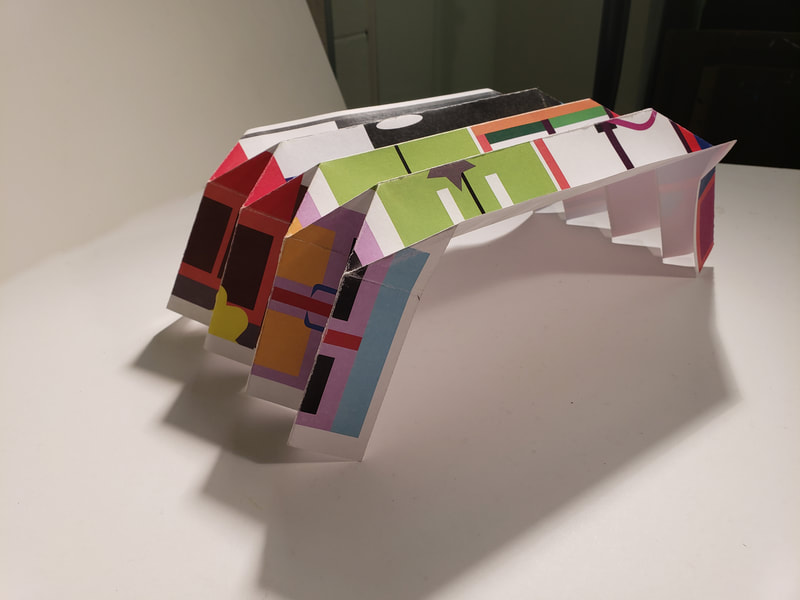
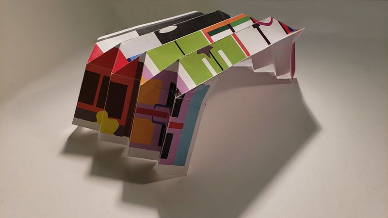
For this assignment we only had to transform the project into something else once. My theme revolved around my show and I did this project on deciding what doors I would use, these doors to me represent the options or choices of do something or not. These doors are what matter to me because the care my home front door, my vehicle, my work doors, and the classrooms that matter this semester. I created a photo collage of the doors. as you can see in the photo. This photo collage is 11x17 inches. The second part was to find a way to incorporate an artist style that we liked. I wanted to revise an artist I learned about last year, Beatriz Milhazes. I enjoyed her collage of colors so I created the doors as geometric shapes but left details vaugue. I decided to go beyond and do something else to it again it and try to make a folded paper sculpture. In essence I took photos of 3D doors to flat paper and then transformed them. Then I turned them into the folded sculpture. I had to practice on a thinner sheet to see how I could make it. I wanted to do something that was different and not using the templates we practiced with earlier in the semester.
0 Comments
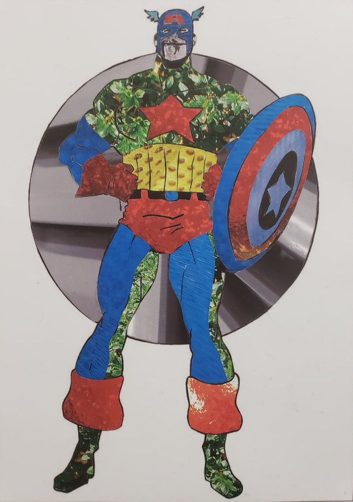
With this project we took what we just learned from the previous assignment and expanded on applying those techniques of Collage and photography. Our project was to sit with Peter and pick a cartoon character we would like to collage. I chose Captain America.
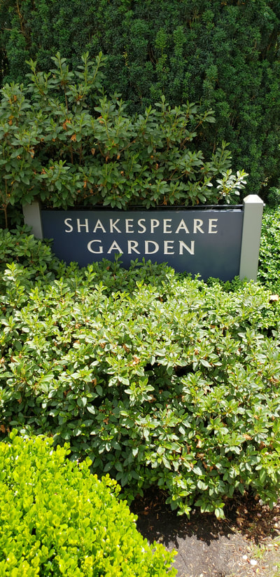
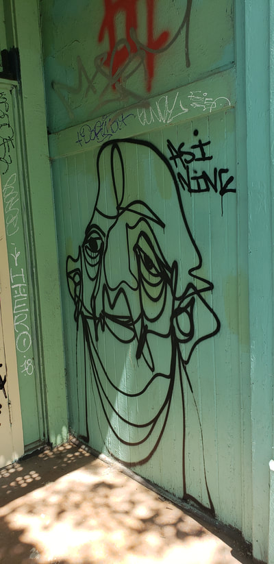
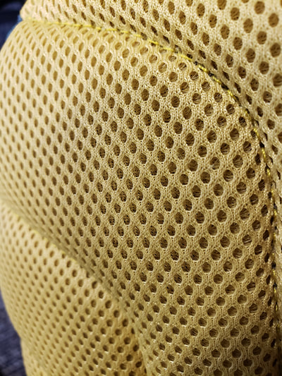
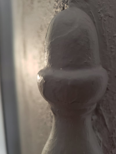
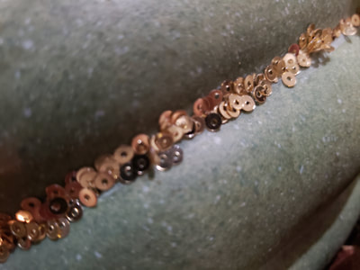
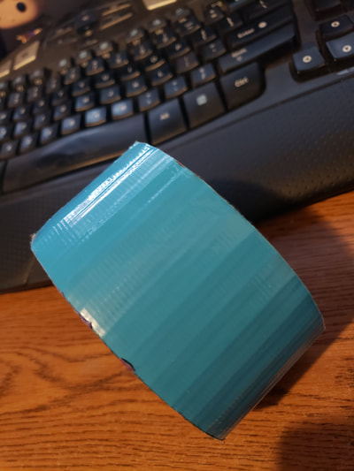
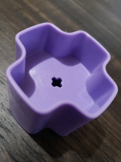
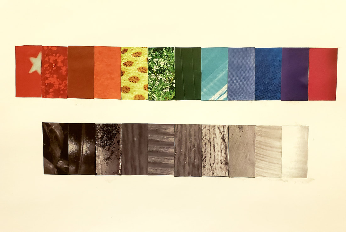
This was from the idea of the assignment that the artist Jeff Koons did with Popeye. The other artist we leaned about was Andy Warhol. Applying those Elements and Principles we used our photos of textures and created our collage, using tonal grey. scale and color. I wanted Captain America to be partly in a camouflaged look. This is not how he is normally appears. I wanted to merge his cliche look with my version of what his identity should be. By converting him from what he normally appears and timing it to my personal views of being a veteran gave him more meaning to me. This assignment we had to take photos of various items that were personal to me. So I had to find textures in black and white to have a tonal value scale of 10 images. This was a bit tricky because of how light hits a texture and for it to still show detail. Then to be able to find the right tonal value within it to use.
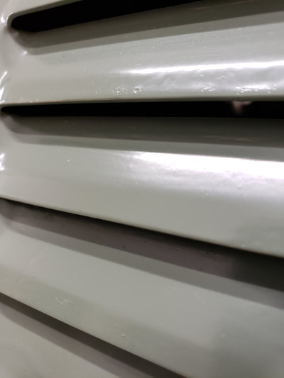
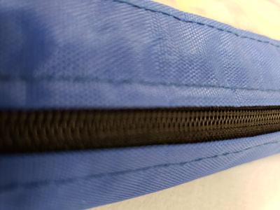
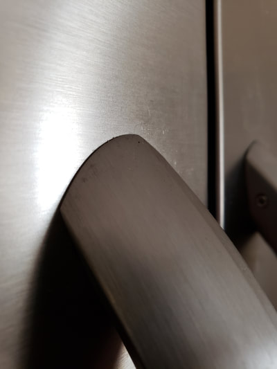
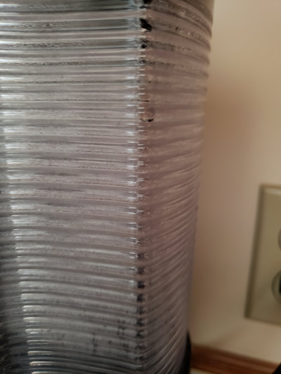
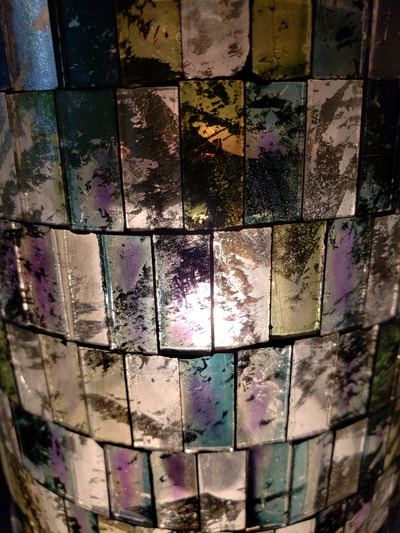
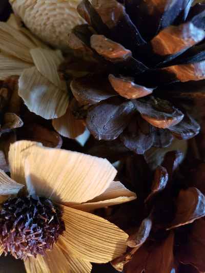
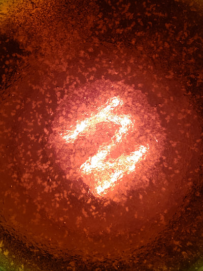
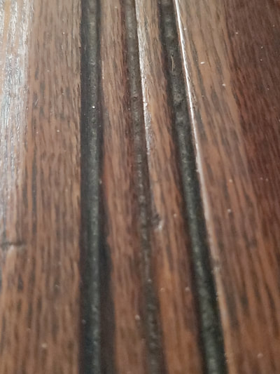
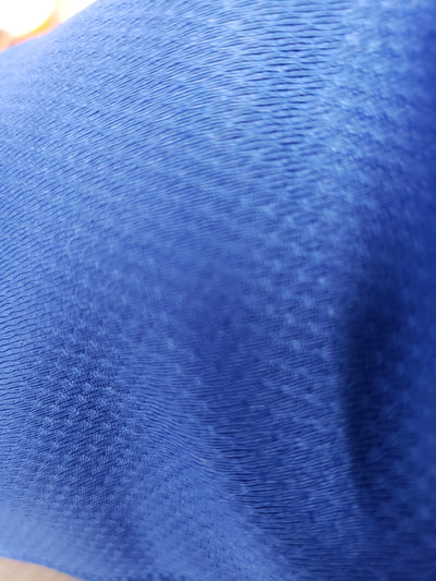
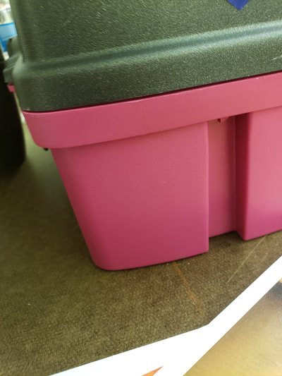
The next part of this assignments to create another scale and use the 12 main hues from more personal items and take more photos. When we reviewed these two artists, Fred Wilson and Byron Kim, I was able to see and understand their theme. Then with doing this assignment take pictures and focus on Macro look of my textures to make this assignment successful. Some of the elements and Principals used to create and understand this were Texture, hue, Tone, Value, Monochromatic, Symbol, detail, primary, secondary, and tertiary colors. The next step was to cut our pieces into one inch by two inches in size and arrange them according to tonal scale and to the color wheel. These were the images that I used to create this layout. |
AuthorMy Name is Steve Gonzalez, coming back to school after a lot of years. I am determined to get this done. Sometimes I wonder if I will make it. Archives
November 2018
Categories
All
|

 RSS Feed
