|
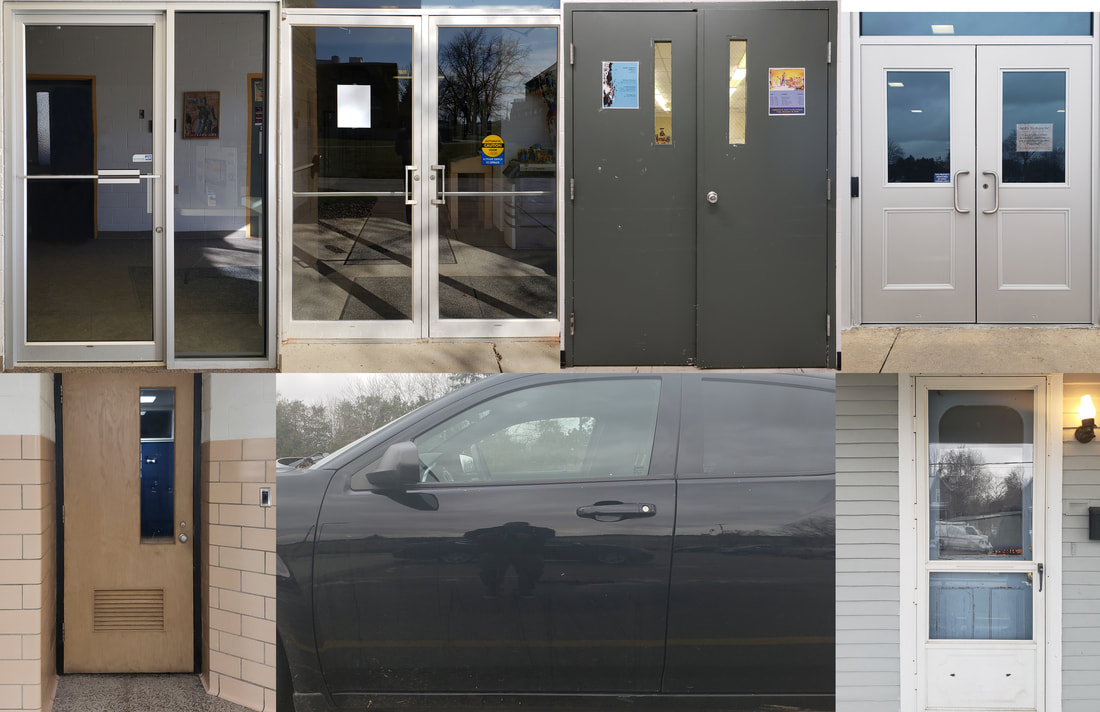
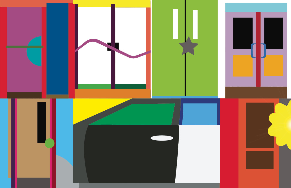
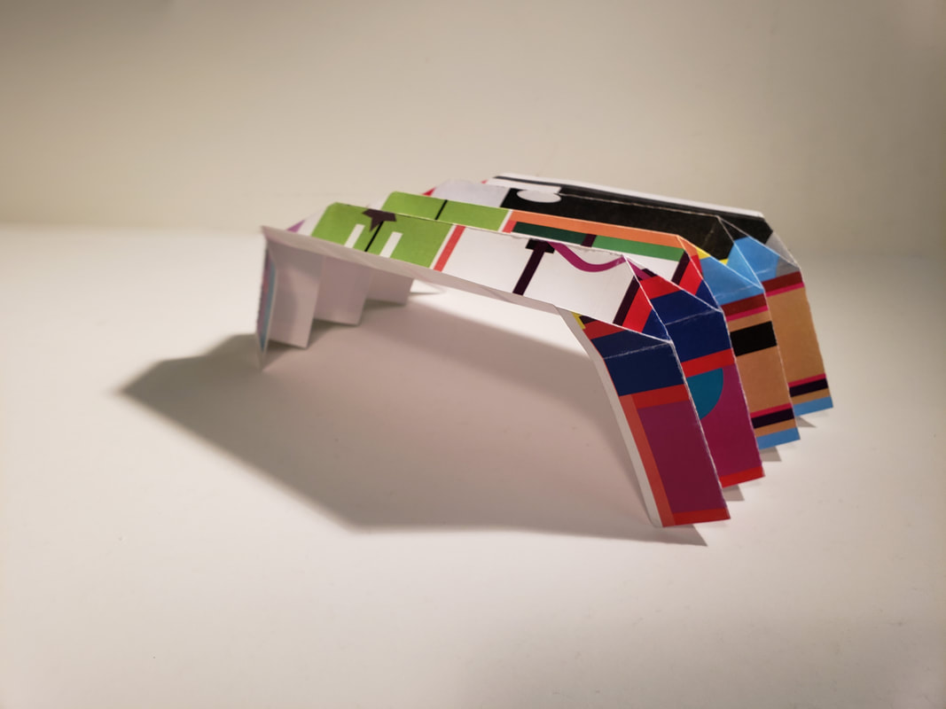
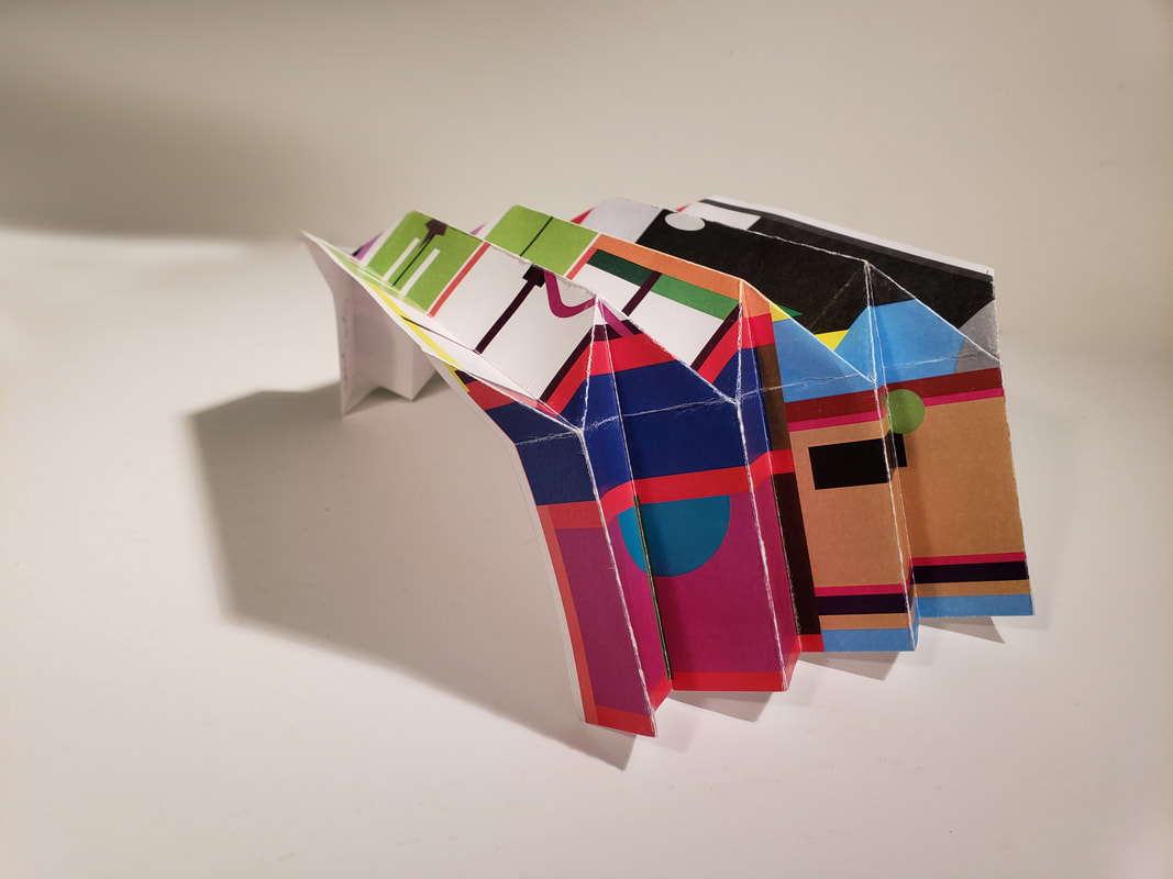
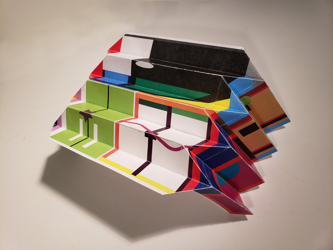
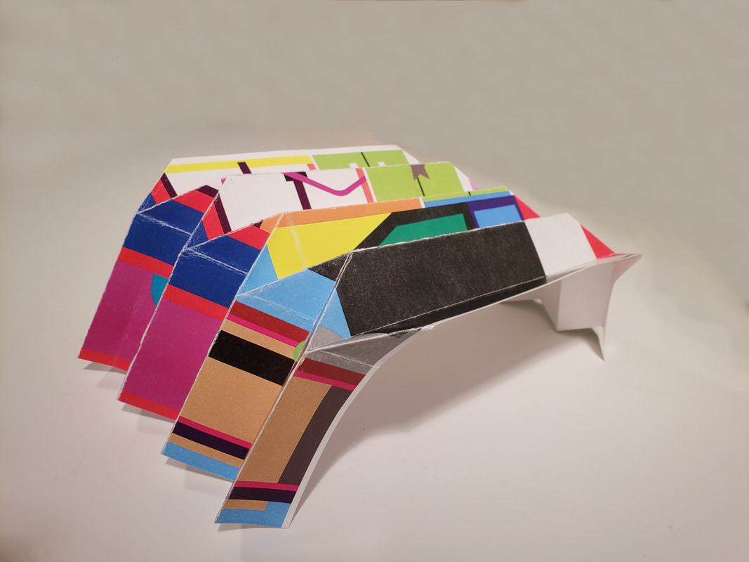
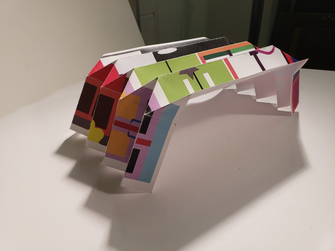
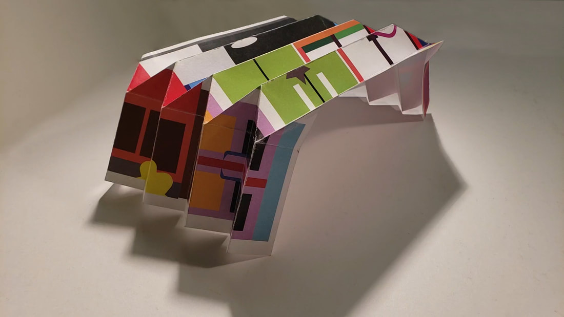
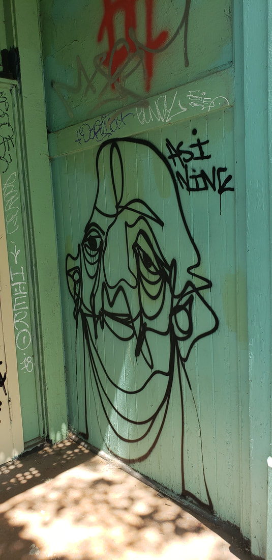
In creating this design I had to create a theme around the final project.The assignment focused on Jasper Johns "Take an object/Do something to it/DO something else to it. [REPEAT] For this assignment we only had to transform the project into something else once. My theme revolved around my show and I did this project on deciding what doors I would use, these doors to me represent the options or choices of do something or not. These doors are what matter to me because the care my home front door, my vehicle, my work doors, and the classrooms that matter this semester. I created a photo collage of the doors. as you can see in the photo. This photo collage is 11x17 inches. The second part was to find a way to incorporate an artist style that we liked. I wanted to revise an artist I learned about last year, Beatriz Milhazes. I enjoyed her collage of colors so I created the doors as geometric shapes but left details vaugue. I decided to go beyond and do something else to it again it and try to make a folded paper sculpture. In essence I took photos of 3D doors to flat paper and then transformed them. Then I turned them into the folded sculpture. I had to practice on a thinner sheet to see how I could make it. I wanted to do something that was different and not using the templates we practiced with earlier in the semester.
0 Comments
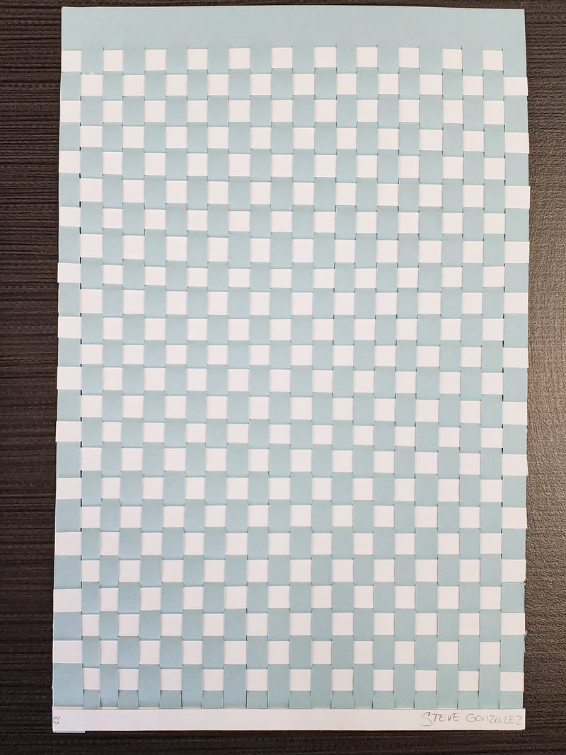
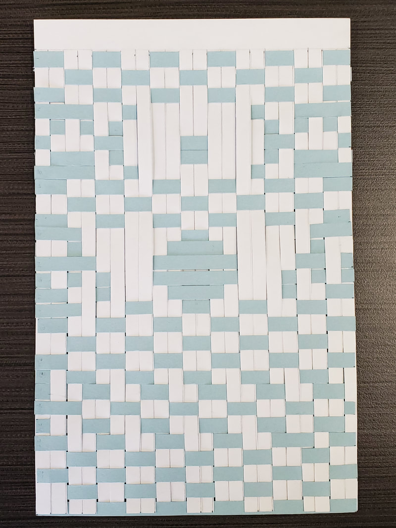
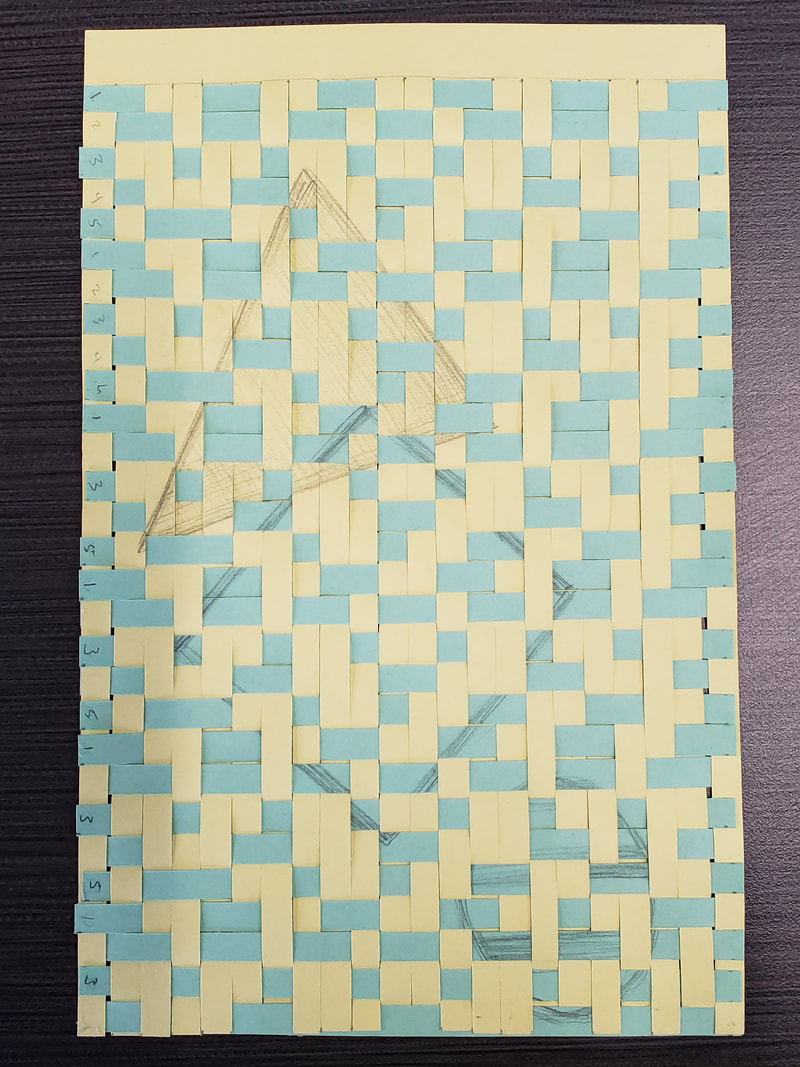
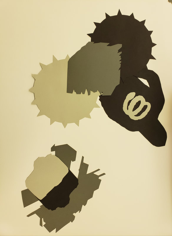
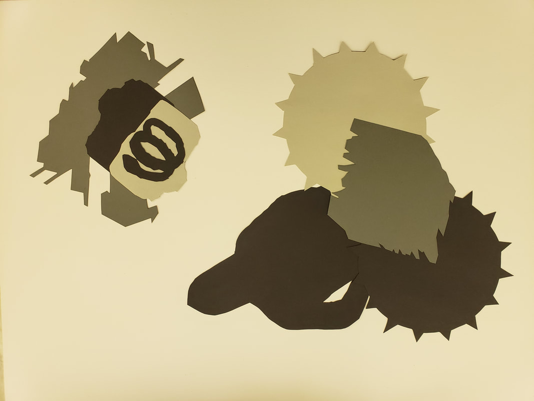
With this project we took what we just learned from the previous assignment and expanded on applying those techniques of Collage and photography. Our project was to sit with Peter and pick a cartoon character we would like to collage. I chose Captain America. This was from the idea of the assignment that the artist Jeff Koons did with Popeye. The other artist we leaned about was Andy Warhol. Applying those Elements and Principles we used our photos of textures and created our collage, using tonal grey. scale and color. I wanted Captain America to be partly in a camouflaged look. This is not how he is normally appears. I wanted to merge his cliche look with my version of what his identity should be. By converting him from what he normally appears and timing it to my personal views of being a veteran gave him more meaning to me. 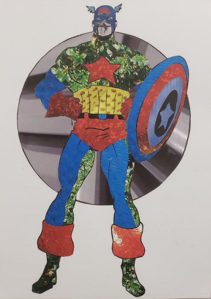 This assignment we had to take photos of various items that were personal to me. So I had to find textures in black and white to have a tonal value scale of 10 images. This was a bit tricky because of how light hits a texture and for it to still show detail. Then to be able to find the right tonal value within it to use. The next part of this assignments to create another scale and use the 12 main hues from more personal items and take more photos. When we reviewed these two artists, Fred Wilson and Byron Kim, I was able to see and understand their theme. Then with doing this assignment take pictures and focus on Macro look of my textures to make this assignment successful. Some of the elements and Principals used to create and understand this were Texture, hue, Tone, Value, Monochromatic, Symbol, detail, primary, secondary, and tertiary colors. The next step was to cut our pieces into one inch by two inches in size and arrange them according to tonal scale and to the color wheel. These were the images that I used to create this layout. 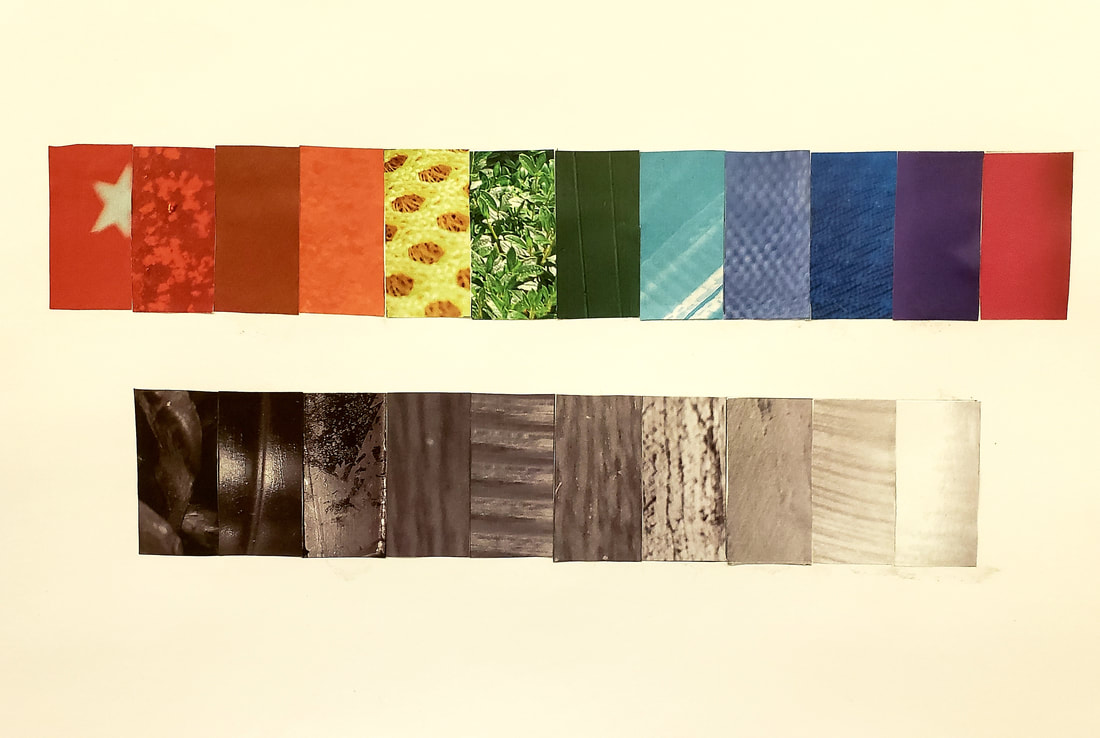 This assignment focused on Dihn Q Le works of art. We learned the process the work of weaving and learned quite a few new vocabulary terms. Weaving: warp and weft Repetition Pattern: simple pattern, and complex pattern Emphasis Shape integration This project took several class hours to complete the 3 type of practice patterns. I felt that weaving came easy to me in seeing the pattern I wanted to create. The first pattern on the left was just to get used to weaving, the second was making a spot stand out among the pattern. With this one I tried to make an eyeball and large circle teardrop. This is where I learned to do a teardrop I would need to do finer warps and smaller wefts to get that pattern. The third weave I drew on the yellow paper a triangle and on the blue paper I drew a square and a circle. By the time I got to the third assignment I started to figure out other problems like having left over wefts, when weaving you do not use them all because of the small gaps. So I wanted to merge my shapes and I removed some strips to make the triangle and square overlap. Then I realized I needed to take one more out to make sure my circle would stay on the image completely.
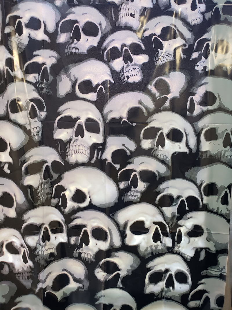
Going this far we then had to give Tim 2 images, one in color and one in black and white to have printed for our 3rd class and to put into practice the techniques we have learned into our final project. So in keeping Halloween and thinking of the assignment of the future, I figured I could be dead in 20 years so this seemed to be appropriate. This assignment was a lot of fun for me.
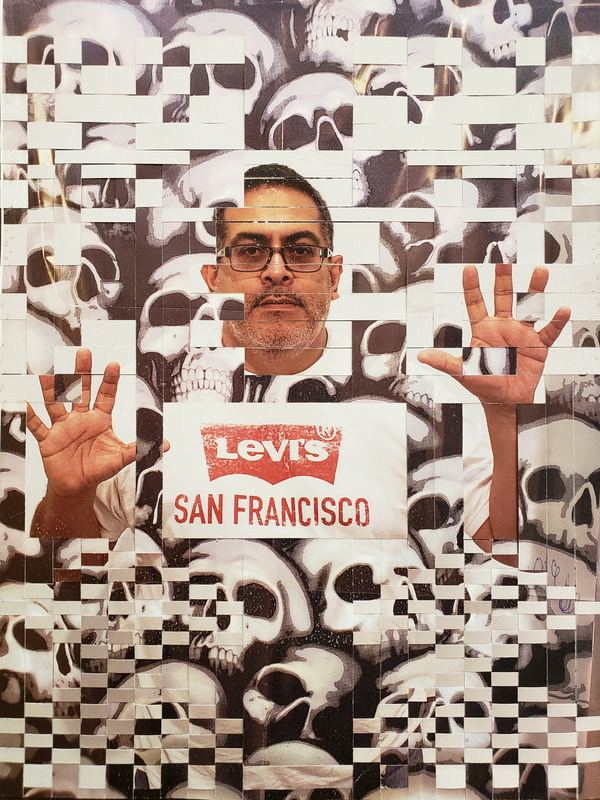 Here is this final combine image, I worked with making three large warps and three different weft sizes. I wanted to show the presence of feeling trapped and using the smaller wefts to give a smoky feeling of rising through the skulls that represented death, never really gone.
This is a continuation of working with color and seeing the monochromatic and analogous color schemes. I went to the grocery store and played with the variation of colors, I took several photos or variations until I found a pattern and design I liked. When it came to the Dr. Peppers I really wanted to stack them taller. The problem was that the 12 packs would not stack taller and would fall. The traditional packs are not sold and there were not very many to use. Then I combined two liters of the same. 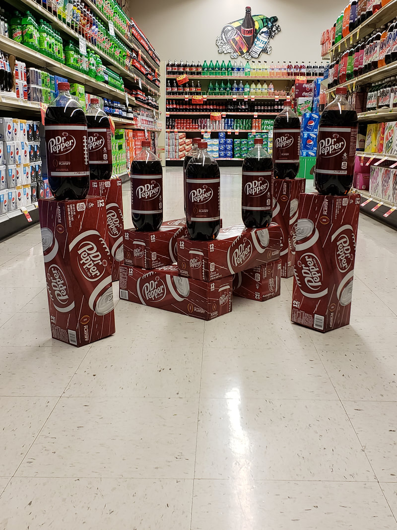 This one I used an Analogous scheme and I did not have many options available, next time don't try to do this after a weekend. I was nice to see that at the same time the other pop and brands on the shelfs helped these images and it might have been worth getting a photo of just the aisle in itself. 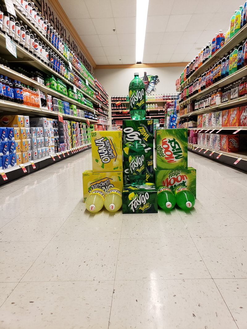 This was a fun assignment that extended the color theory lessons a little deeper. I think it might have helped to do this before the other assignments as a foundation to understanding this a little better.
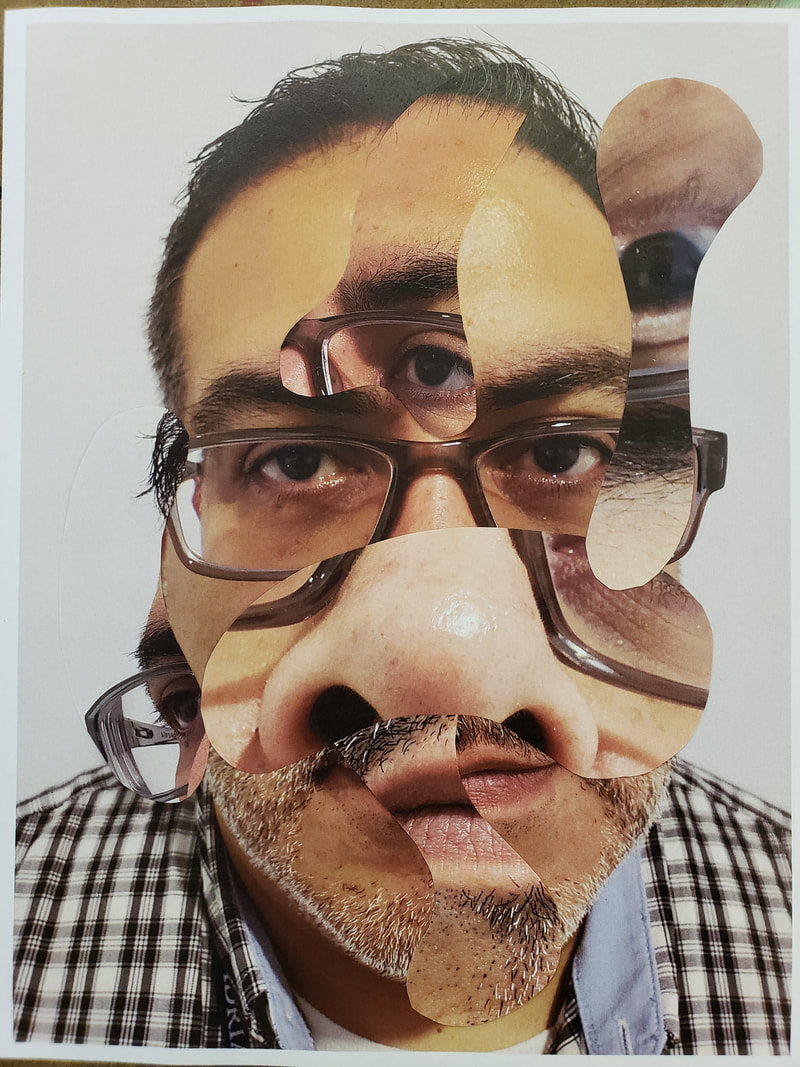
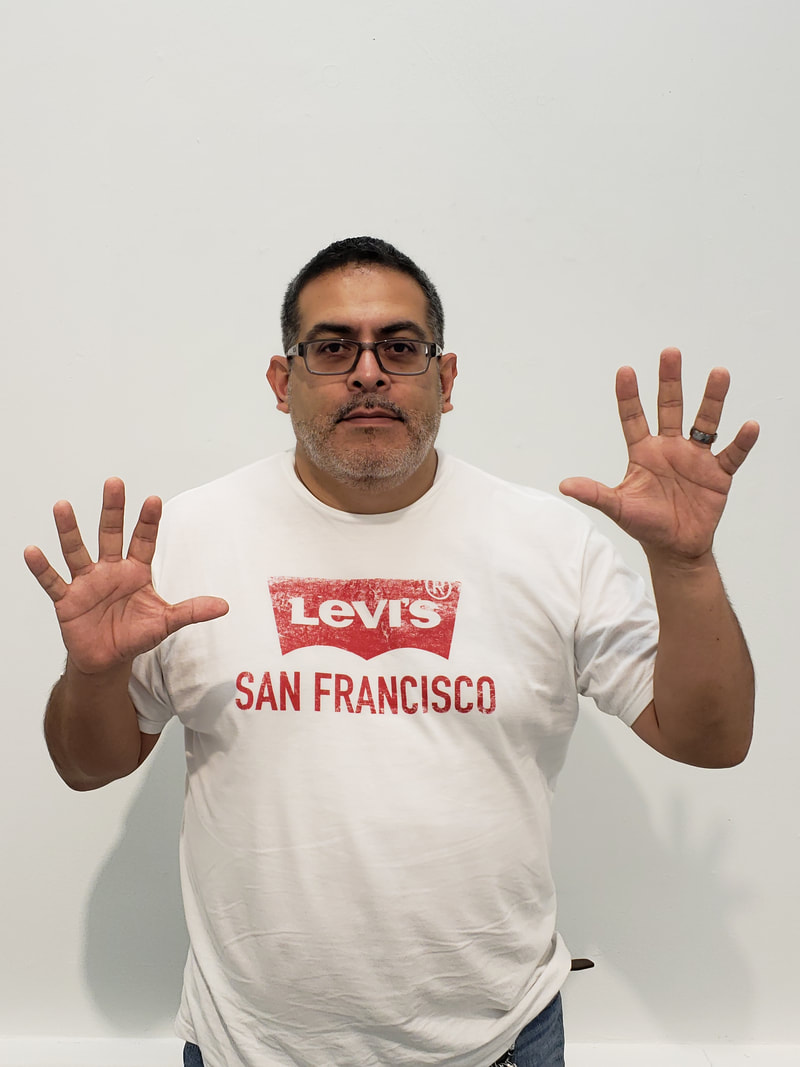
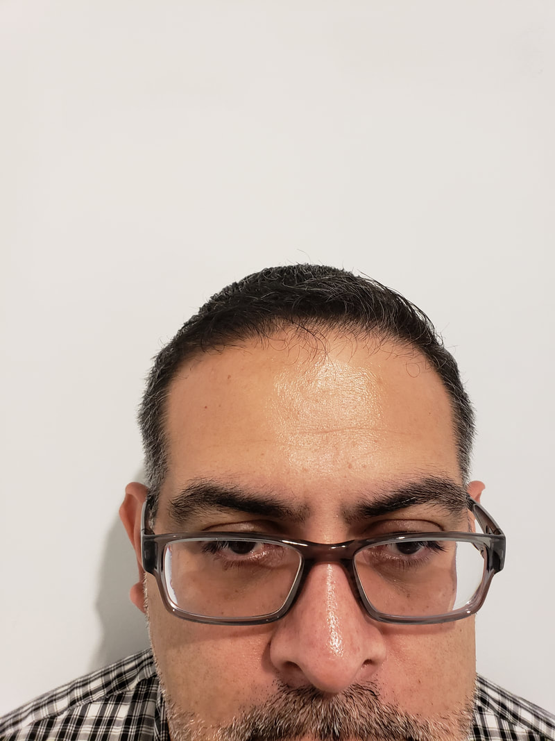
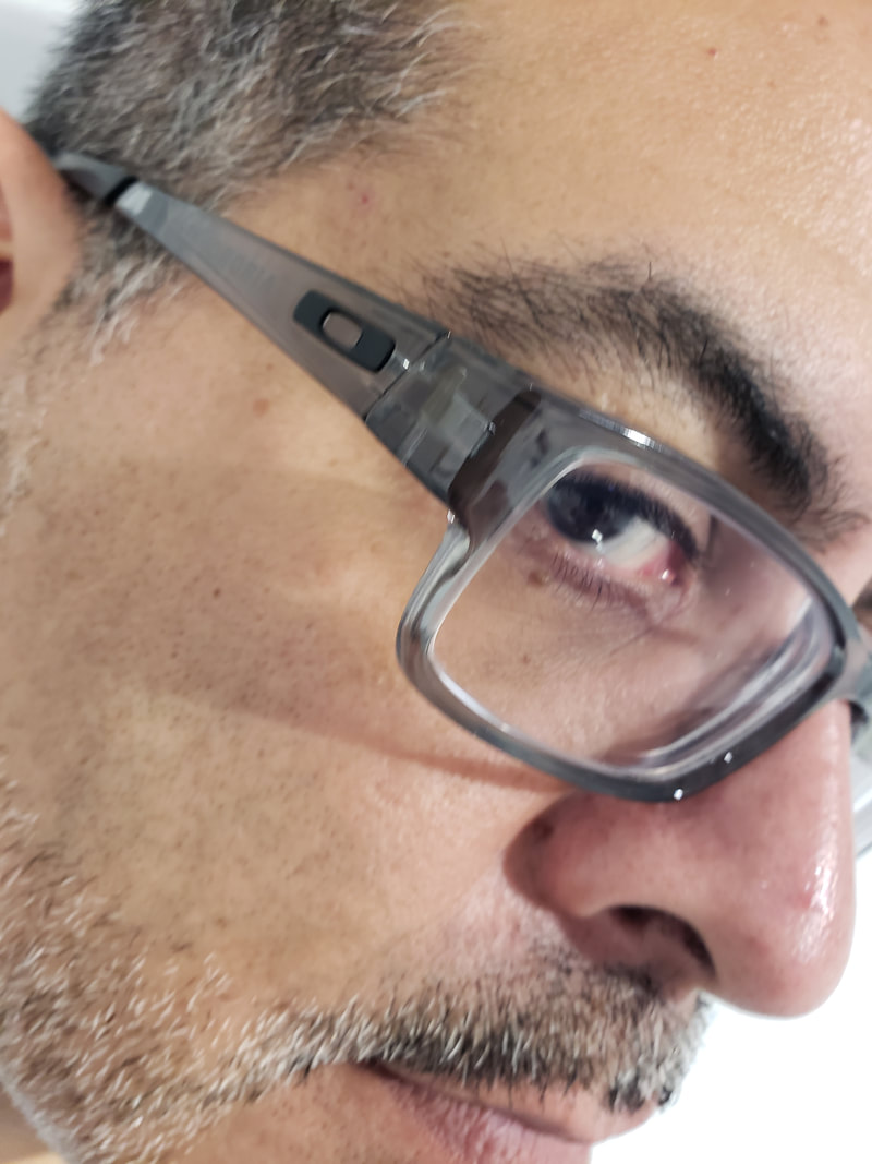
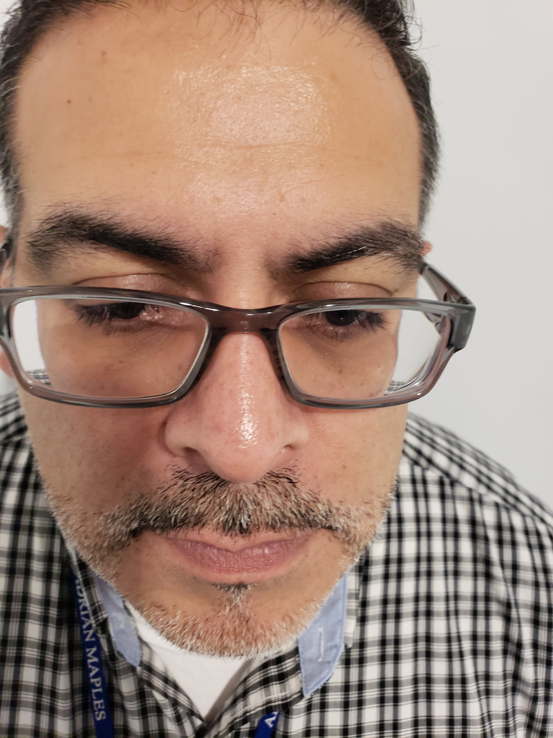
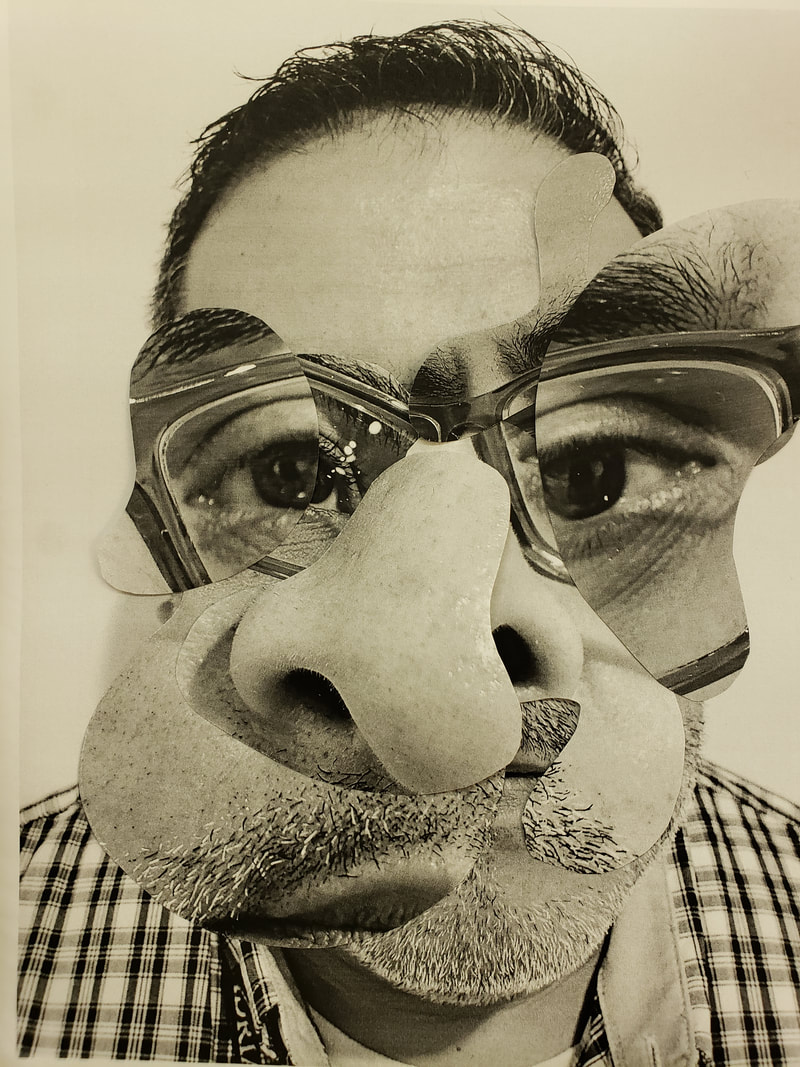
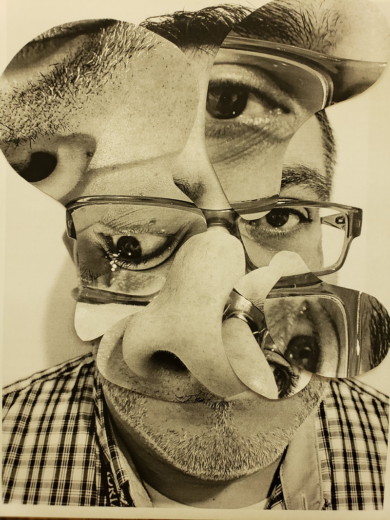
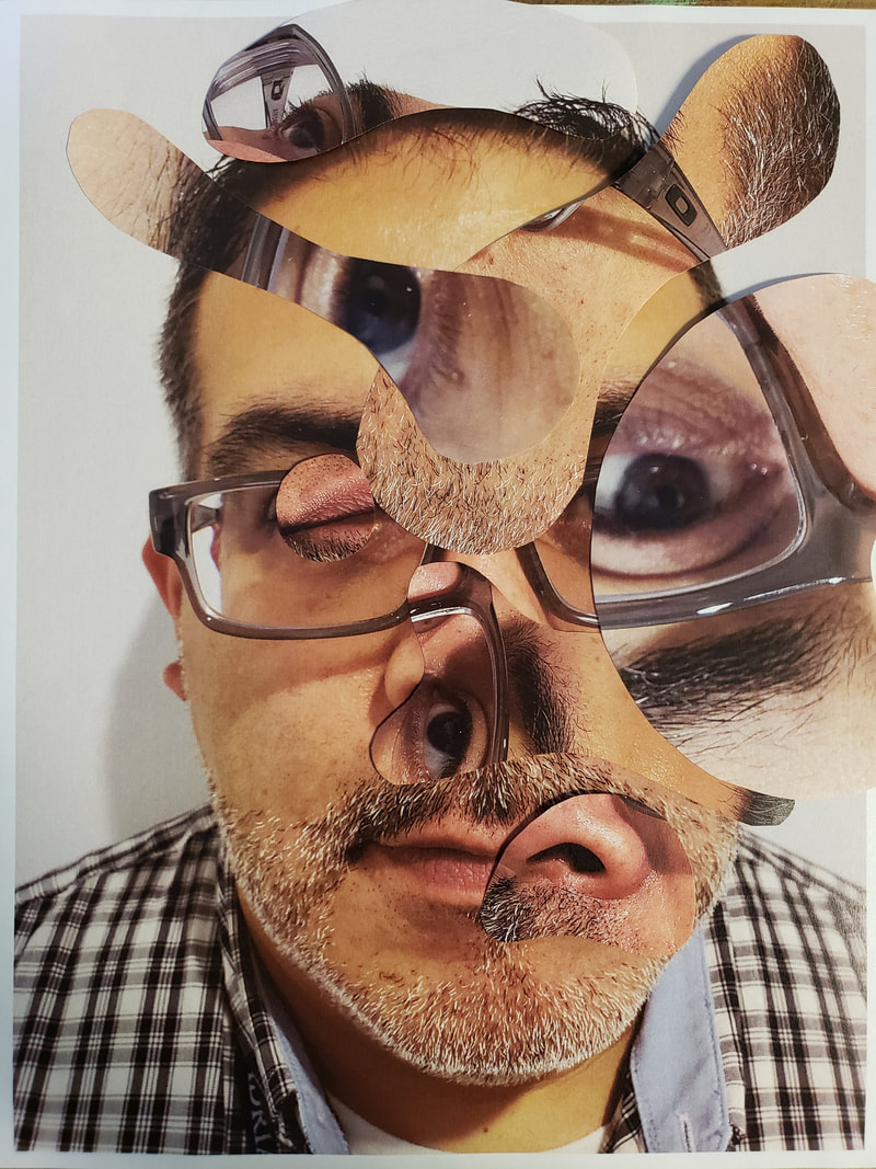
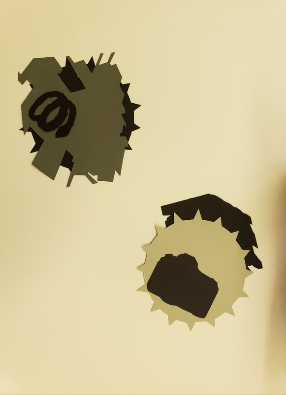
Let me say that I really liked this idea of art, I feel a connection with this and what I hope to pull off in my show, kind of at least. The hardest part of this assignment was to draw the biomorphic shapes with not looking at the front. This as an artist I felt left too much for chance. Yet on the other spectrum with past assignments too many constraints felt like my hands were tied. I think its funny because we want the right amount of chaos and guidelines in making art. Well at least I do. New vocabulary learned was Biomorphic Unity Chance operation Repetition Fragment Below are the photos I took of myself with one close up that I would use as my base. I used 3 other photos and turned them over and created my biomorphic shapes and then cut them out. I did this in black and white and in color.
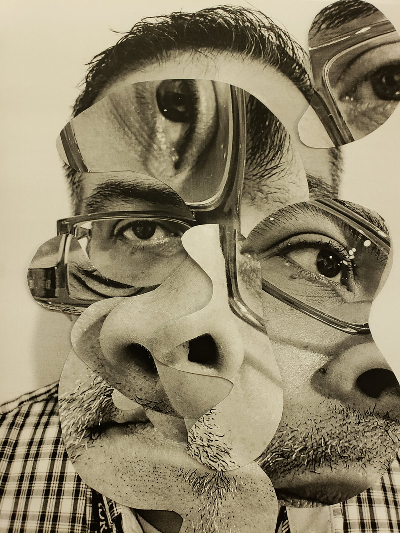
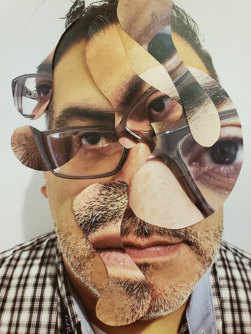
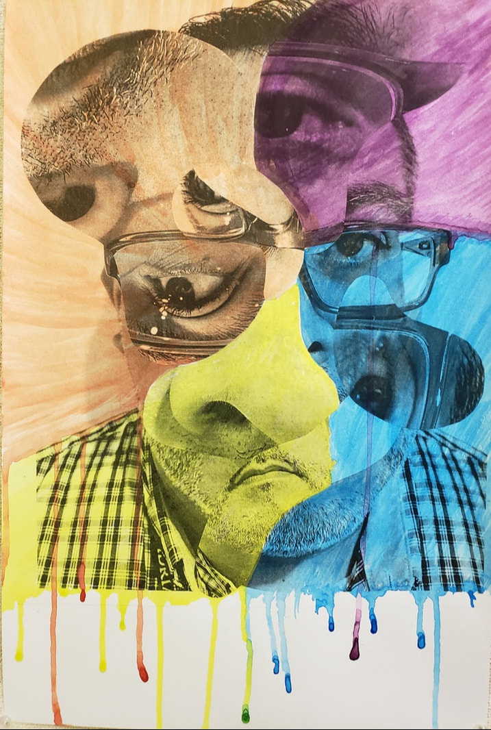
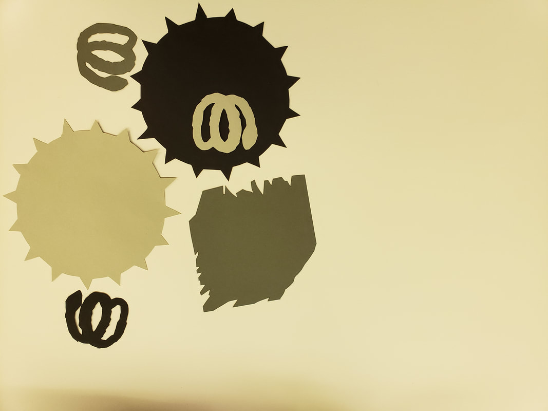
The images above were my black and white iterations that I created with my shapes. By doing this over 3 times I found one that I preferred over the other one. 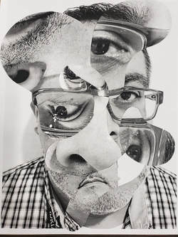 The image above was the one I used and used double sided tape to hold my shapes in place. The photos below are my color iterations.
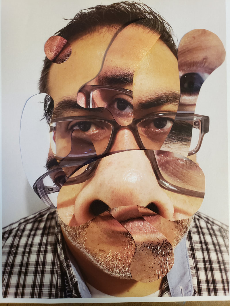
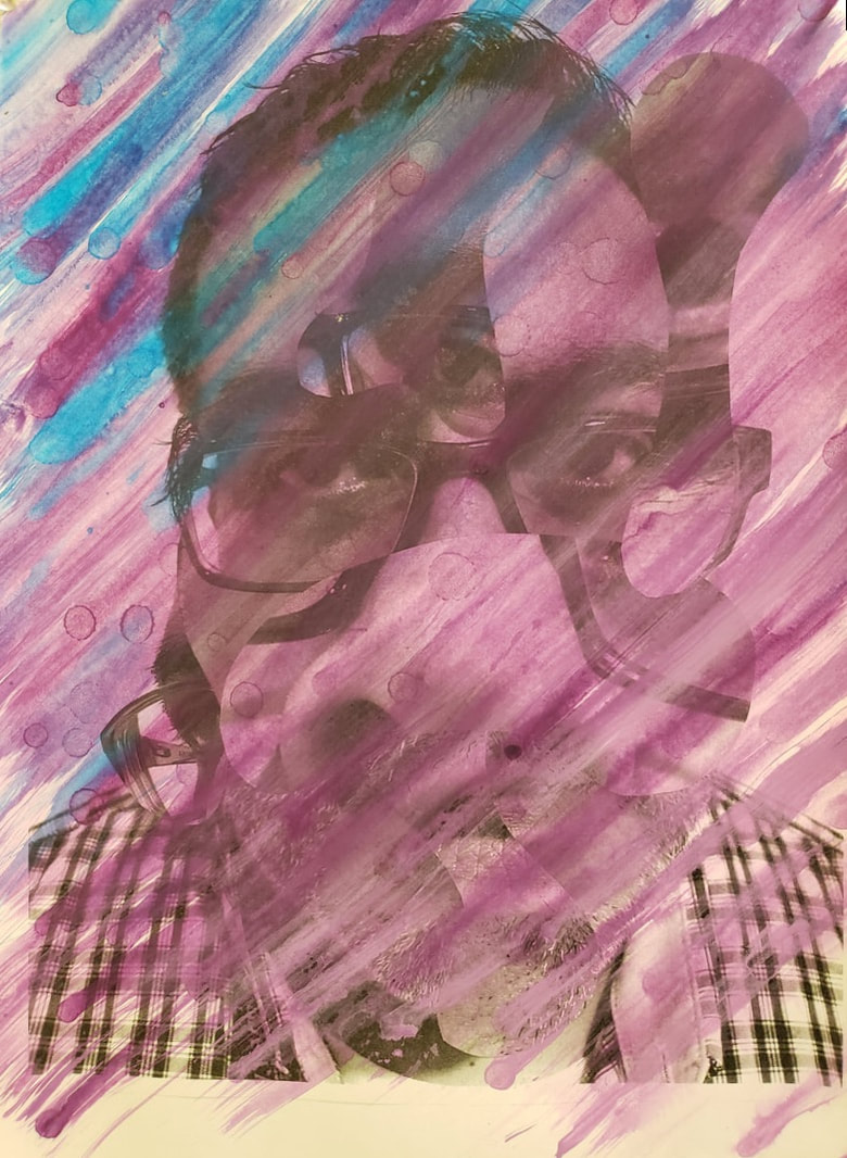
 This was my last final iteration that I liked and used. The following step we took the next day was to paint each image uses a color scheme. Below are both of my painting that I did.
This was a a one day assignment that we did that deal with photographic styles. The Creative strategy was "Explore the same subject in a variety of styles" We reviewed three different artists and learned new vocabulary that dealt with this assignment. Style Naturalistic style Photorealistic style Idealistic style Non-representational style Documentary-style photography Pictorialist photography New-vision style photography Varient/variation Scale Point of view Symmentrical balance Out of focus, or soft focus In focus or sharply focused Peter and Tim wanted us to partner with someone, to take photos of each other and try to recreate in picture style. My model for all photos was Amanda Miller. We tried many poses to achieve these styles. Studio Angelico provided a great area to take all of these photos. While taking all of the photos I found it challenging to to take the photo while keeping the requirements in mine. Once I placed my camera phone on her and then visioned the style I found it easier to do than think. I think the reason why is because I am familiar with shooting images. I do appreciate Pictorial and Documentary style the most, when it comes to new vision, I do not normally see a person that closely. As I write this and reflect, I think how this resembles shooting archeteture downtown. I focus on the details and angles to see a pattern, I feel this way about new vision too.
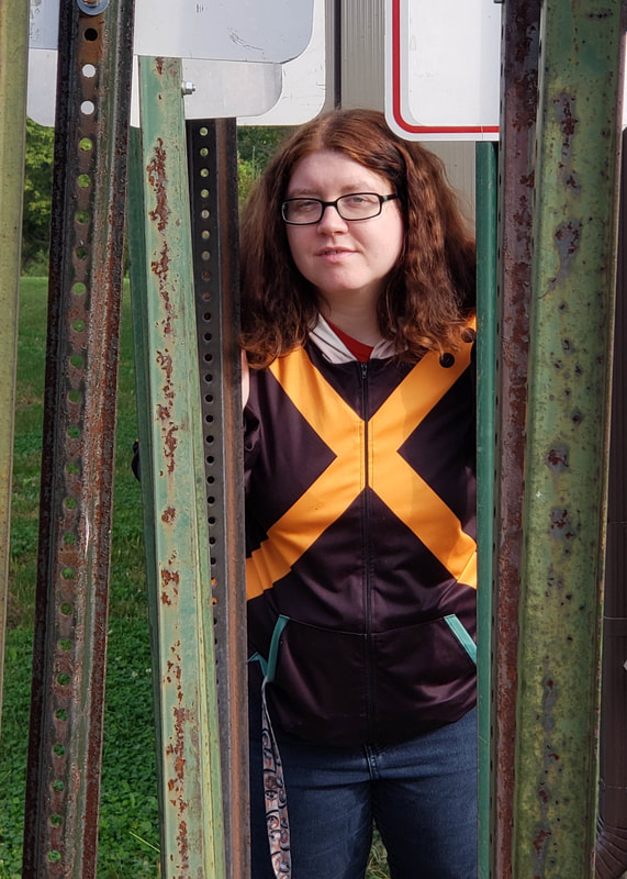 This last photo was to be in my own style, I looked for several minutes around me as we took photos to find the right angle with moving lines, I was not sure if I wanted Amanda in front or behind a fence at first. Then I saw this area that had the sign posts. I placed Amanda towards the back to show depth but at the same time the vertical metal posts I felt the changed the image to help with the depth. It reminds me of a metal forest of trees. I could do these type of assignments all day long! This assignment has helped me to think of taking photos from a different mind set that I normally do. I look forward to experimenting with this in the future.
Working this project took a different twist which follows our creative strategy of "Take an object / Do something to it / Do something else to it. [Repeat] (Jasper Johns, 1964) What we did in this assignment is we took a photo of our 2nd step of the tonal images and we took photos at an angle to on purpose apply a strong keystoning to it. Then after having a lesson on color theory we applied those ideas and used tints and shades. Our media was a 8x10 in masonite board that had a neutral grey primer on it. The goal was to take a photo that had at least 13 distinct shapes. I chose the color red to work from in creating my tints and shades according to the assignment. Some of the vocabulary learned in this assignment were : Hue, ROYGBIV, Saturation, intensity, prism, color wheel, palette, ryb, secondary color, tertiary color, tint and shade, complementary color, analogues color scheme, hard edge shape, emphasis, binder, thinner, support, pigment, opaque, and transparent. The biggest challenge because of using an expensive paint was creating enough of the color required to place two even coats. It was difficult to recreating the same color for the second coat. Below is an image of my final painted piece. 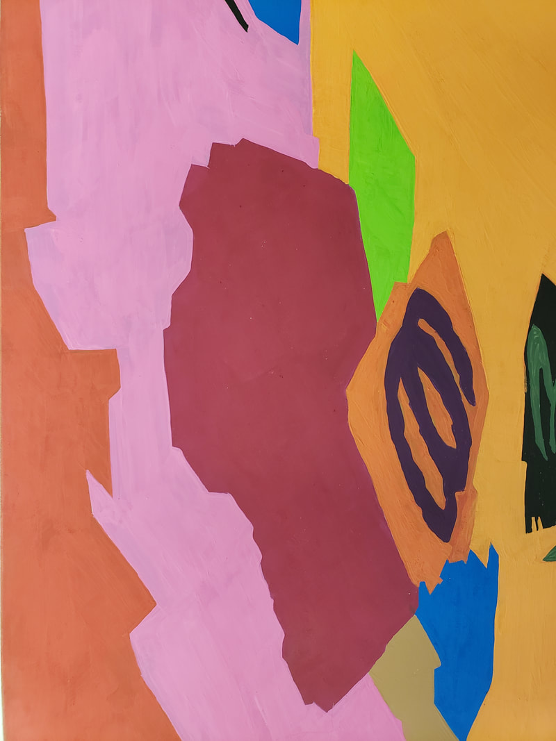 What I learned from doing this was to create an abstract that I was able to paint but what I realized when looking at my assignment and my fellow classmates. Our colors we so vastly different, even those that picked the same color red as mine. I felt that my color palette were warmer colors.
This has been an interesting project, I am realizing now at this stage how I am using these examples to morph original idea for my Senior show. Now going forward into the tonal college of our images in part one. I cut out copies of my images in 3 different tones for each of my images. New techniques and understanding of new vocabulary were introduced to understand this part of the assignment. These vocabulary terms are, Form, Content, Silhouette, Implied lines, Aspect ratio, Hybrid, Overlap, and Abstraction. The challenge for me was the requirement of asymmetrically balanced design. As with all assignments that involve glue, cutting out and pencils marks we had to make sure everything was clean. We also had to do several iterations before glueing down this final piece. After showing ouri terations to Peter and Tim for advice and making adjustments, I began to glue down my final design. This took a little longer to do than part 1 because I was trying to figure out how to make my images look farther or closer when I overlapped them. At the end of this part we were told to take a very extreme angle of our tonal pieces. 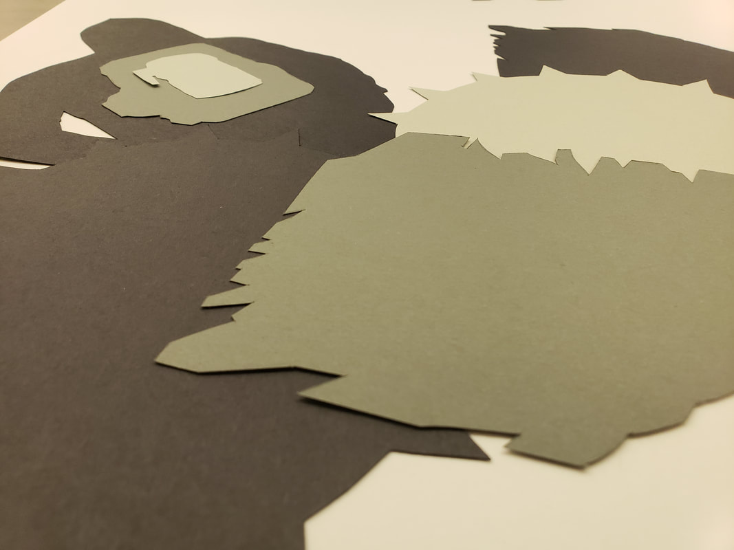 Here is my final piece.
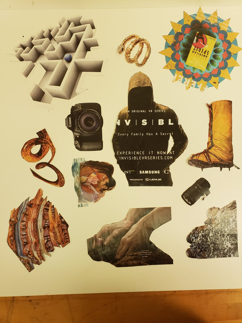
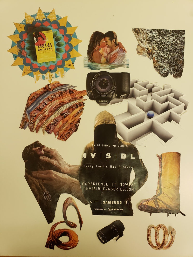
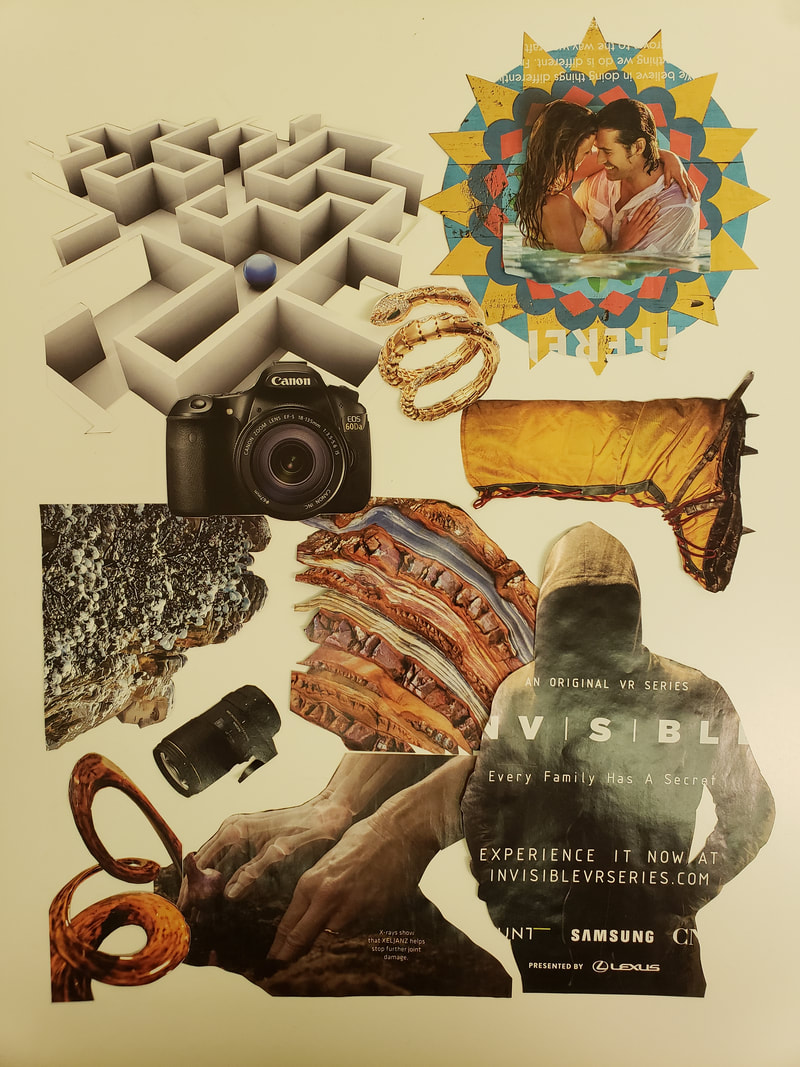
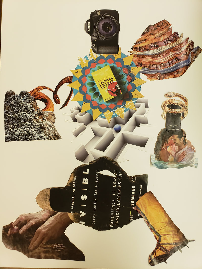
Cliche and Collage For this assignment we had to take the previous WORD assignment and take those words to images and avoid using images that were cliche. We took various images that were from a variety of magazines the reflected our original three words. The biggests help was using google to find synonyms. The total words that I was able to come up with were 20 words. New vocabulary for this part of the assignment is Implied Motion, Picture Plane, Position perspective,Color perspective, Figure (Positive space) and Ground (Negative space). I had to do iterations of my cut out images on a large 11x17 paper. After creating all iterations I consulted Peter and Tim for advice on the layout and flow, Creating motion for me was the most difficult to achieve. After I was able to create an image that had implied motion, I then focused on slight adjustments for the negative and positive space. I did this by overlapping more or less in certain areas. 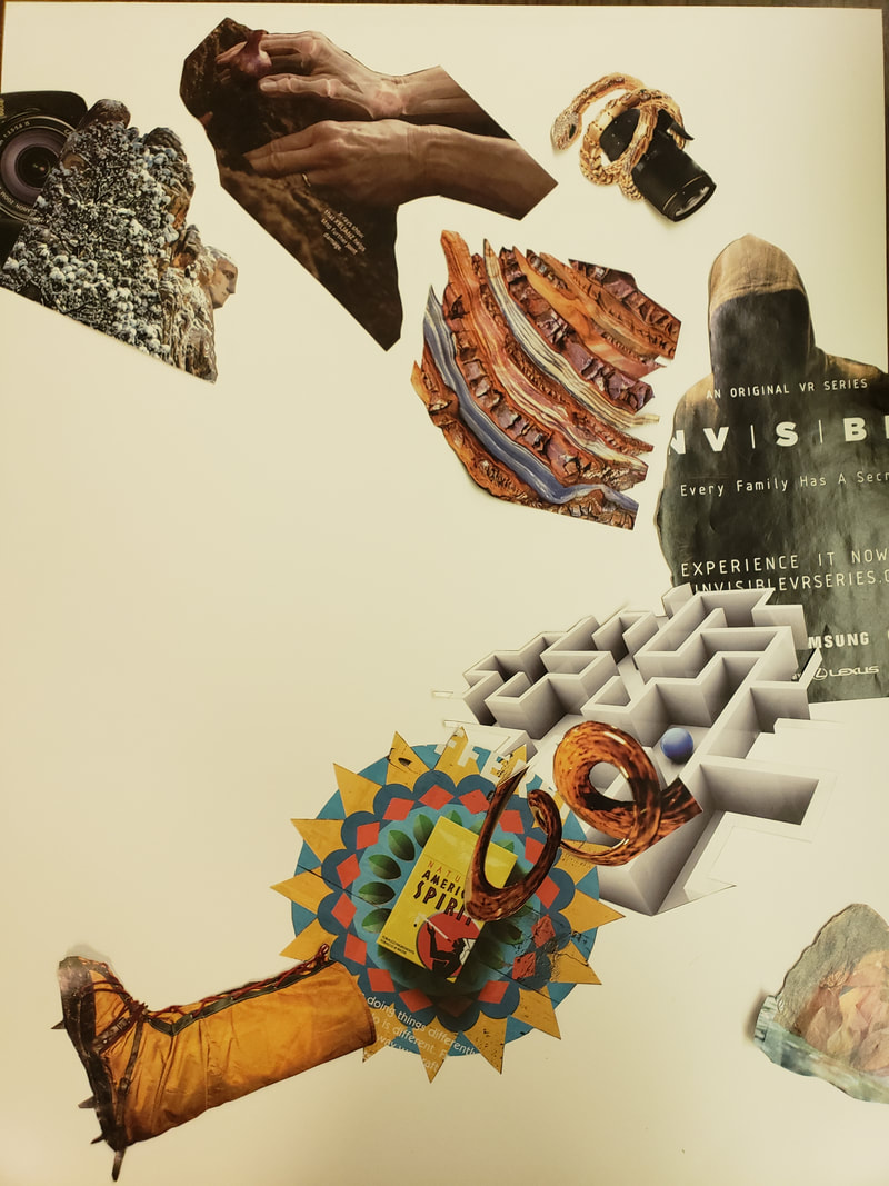 The image above was my final iteration that I glued in place.
|
AuthorMy Name is Steve Gonzalez, coming back to school after a lot of years. I am determined to get this done. Sometimes I wonder if I will make it. Archives
November 2018
Categories
All
|


 RSS Feed
