|
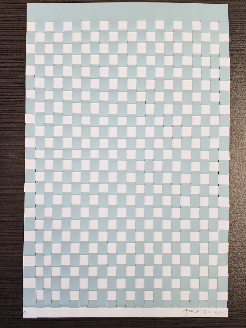
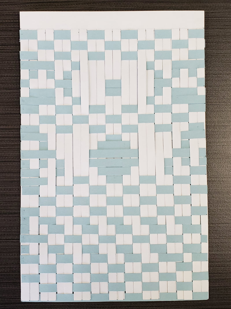
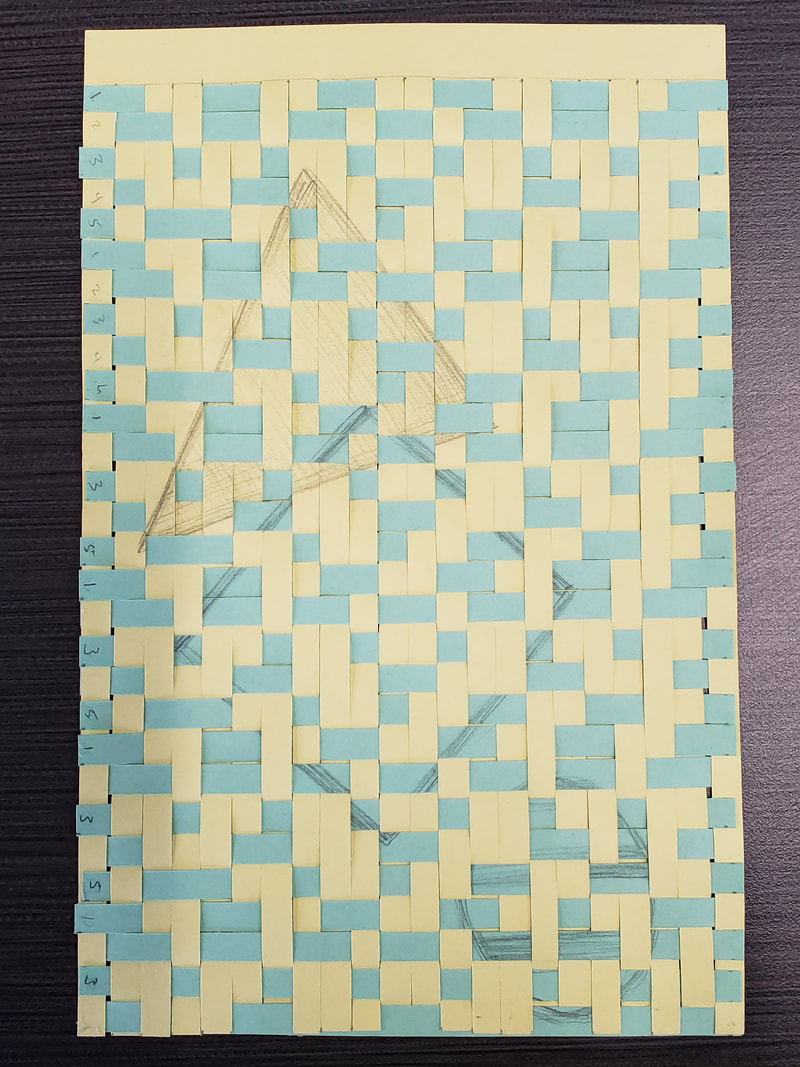
This assignment focused on Dihn Q Le works of art. We learned the process the work of weaving and learned quite a few new vocabulary terms. Weaving: warp and weft Repetition Pattern: simple pattern, and complex pattern Emphasis Shape integration This project took several class hours to complete the 3 type of practice patterns. I felt that weaving came easy to me in seeing the pattern I wanted to create. The first pattern on the left was just to get used to weaving, the second was making a spot stand out among the pattern. With this one I tried to make an eyeball and large circle teardrop. This is where I learned to do a teardrop I would need to do finer warps and smaller wefts to get that pattern. The third weave I drew on the yellow paper a triangle and on the blue paper I drew a square and a circle. By the time I got to the third assignment I started to figure out other problems like having left over wefts, when weaving you do not use them all because of the small gaps. So I wanted to merge my shapes and I removed some strips to make the triangle and square overlap. Then I realized I needed to take one more out to make sure my circle would stay on the image completely.
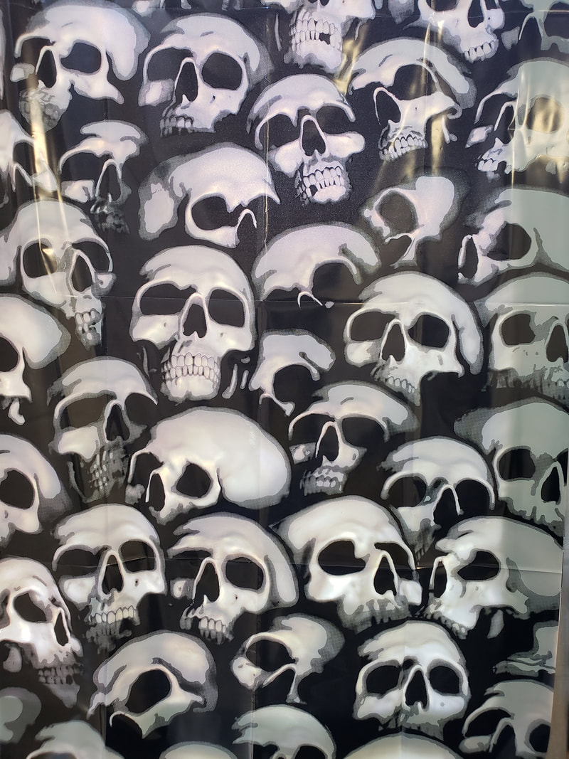
Going this far we then had to give Tim 2 images, one in color and one in black and white to have printed for our 3rd class and to put into practice the techniques we have learned into our final project. So in keeping Halloween and thinking of the assignment of the future, I figured I could be dead in 20 years so this seemed to be appropriate. This assignment was a lot of fun for me.
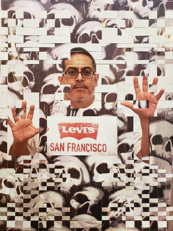 Here is this final combine image, I worked with making three large warps and three different weft sizes. I wanted to show the presence of feeling trapped and using the smaller wefts to give a smoky feeling of rising through the skulls that represented death, never really gone.
0 Comments
This is a continuation of working with color and seeing the monochromatic and analogous color schemes. I went to the grocery store and played with the variation of colors, I took several photos or variations until I found a pattern and design I liked. When it came to the Dr. Peppers I really wanted to stack them taller. The problem was that the 12 packs would not stack taller and would fall. The traditional packs are not sold and there were not very many to use. Then I combined two liters of the same. 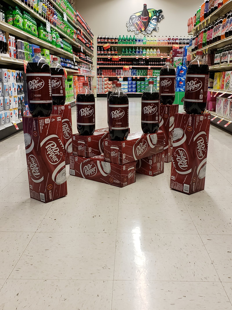 This one I used an Analogous scheme and I did not have many options available, next time don't try to do this after a weekend. I was nice to see that at the same time the other pop and brands on the shelfs helped these images and it might have been worth getting a photo of just the aisle in itself. 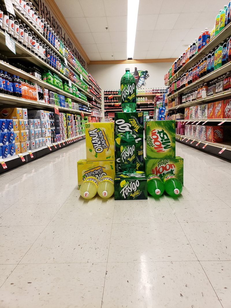 This was a fun assignment that extended the color theory lessons a little deeper. I think it might have helped to do this before the other assignments as a foundation to understanding this a little better.
This project involved artists styles of Barbara Kruger, Jenny Holzer, and Jaume Plensa. The creative strategies was to "Take an object/Do something to it/Do something else to it. Key Terms/Vocabulary Elements
After that was completed we laid out the three pieces onto the same paper with the three words to create unique variations and shot different angles by using a light source and changing the shadows. Below are my iterations to my design before moving onto the next process. Once I found the correct image I then cropped in slightly to remove table. The next step was to redraw the image using a lines with a pencil. We would mimic darker areas by cross hatching lines to make it look denser or lighter. 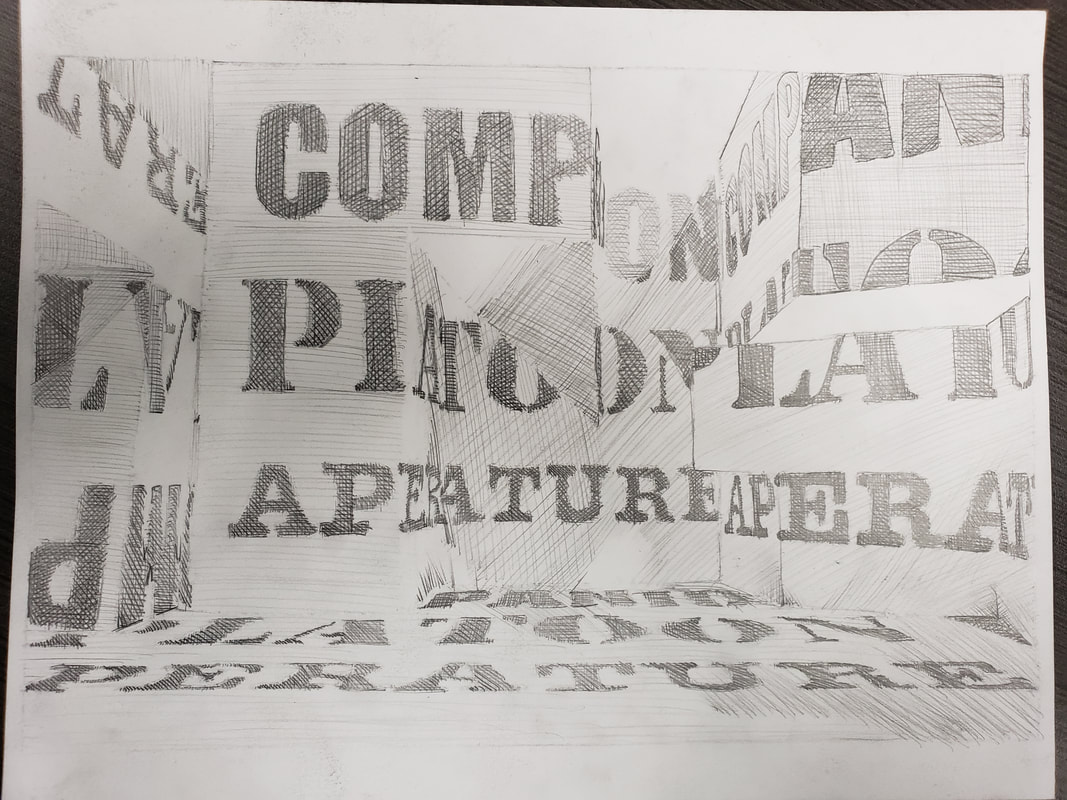 The goals were to find 3 meaningful words, work from a 2D design to a 3D design and back to a 2D design. The struggle I found was to create a sculpture that was standing to show words or parts of words.
|
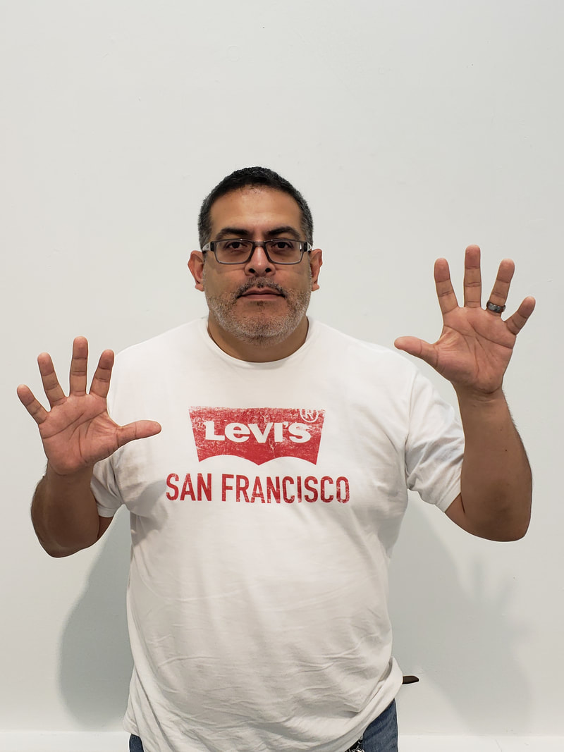
AuthorMy Name is Steve Gonzalez, coming back to school after a lot of years. I am determined to get this done. Sometimes I wonder if I will make it. Archives
November 2018
Categories
All
|
 RSS Feed
