|
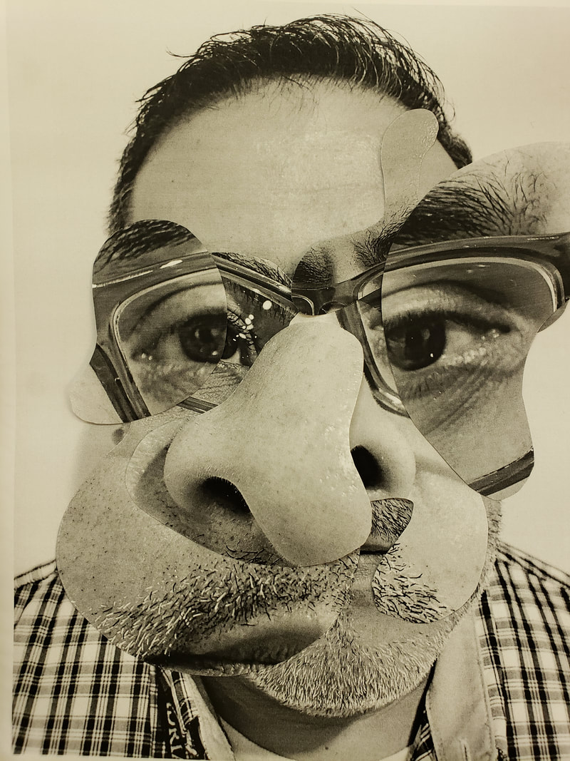
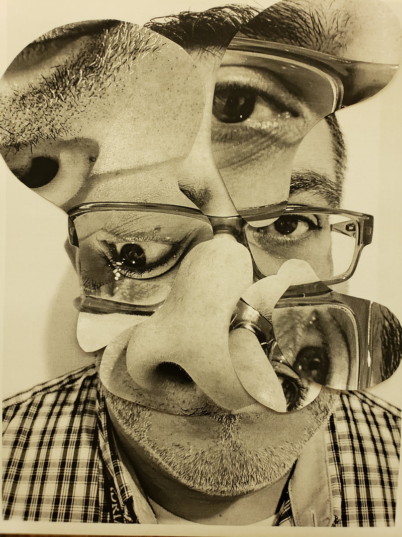
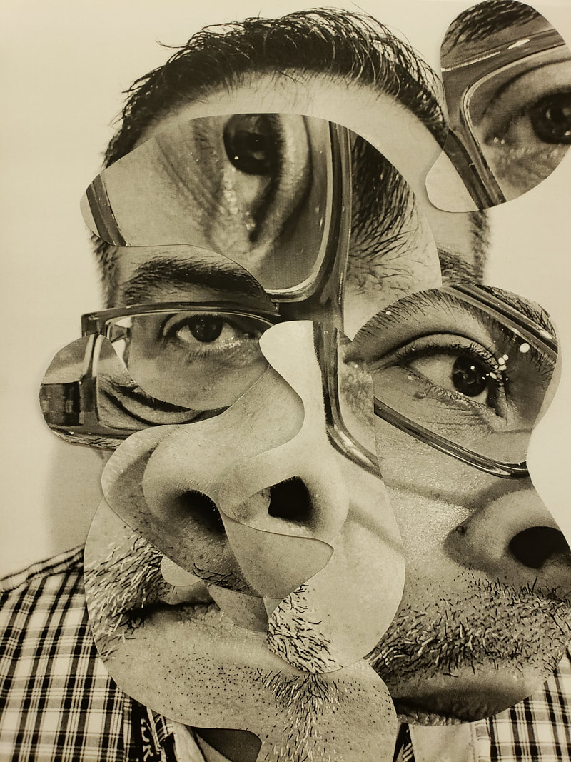
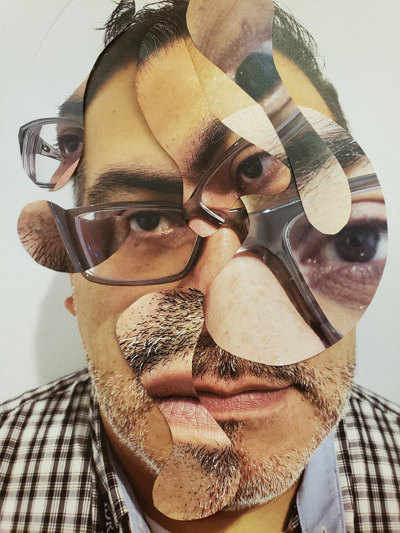
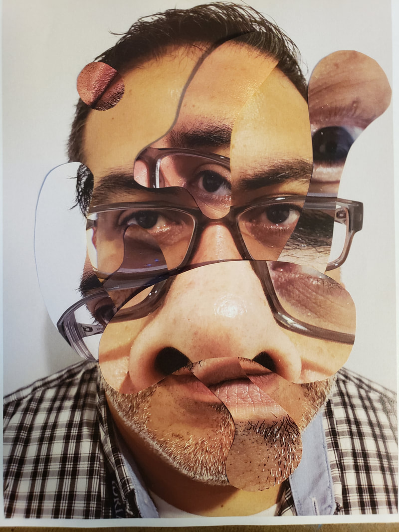
Let me say that I really liked this idea of art, I feel a connection with this and what I hope to pull off in my show, kind of at least. The hardest part of this assignment was to draw the biomorphic shapes with not looking at the front. This as an artist I felt left too much for chance. Yet on the other spectrum with past assignments too many constraints felt like my hands were tied. I think its funny because we want the right amount of chaos and guidelines in making art. Well at least I do. New vocabulary learned was Biomorphic Unity Chance operation Repetition Fragment Below are the photos I took of myself with one close up that I would use as my base. I used 3 other photos and turned them over and created my biomorphic shapes and then cut them out. I did this in black and white and in color.
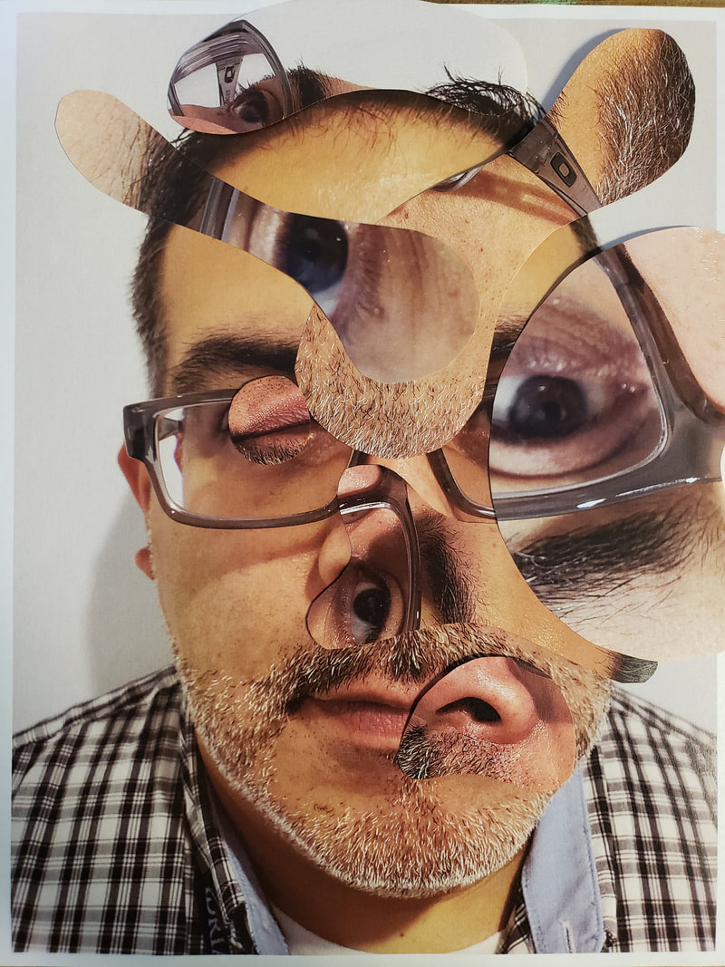
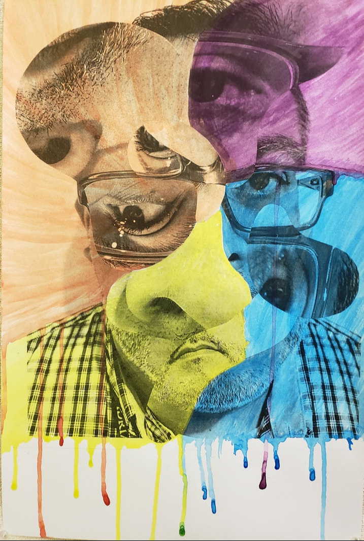
The images above were my black and white iterations that I created with my shapes. By doing this over 3 times I found one that I preferred over the other one. 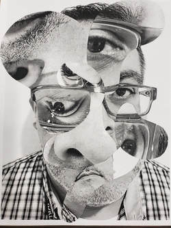 The image above was the one I used and used double sided tape to hold my shapes in place. The photos below are my color iterations.
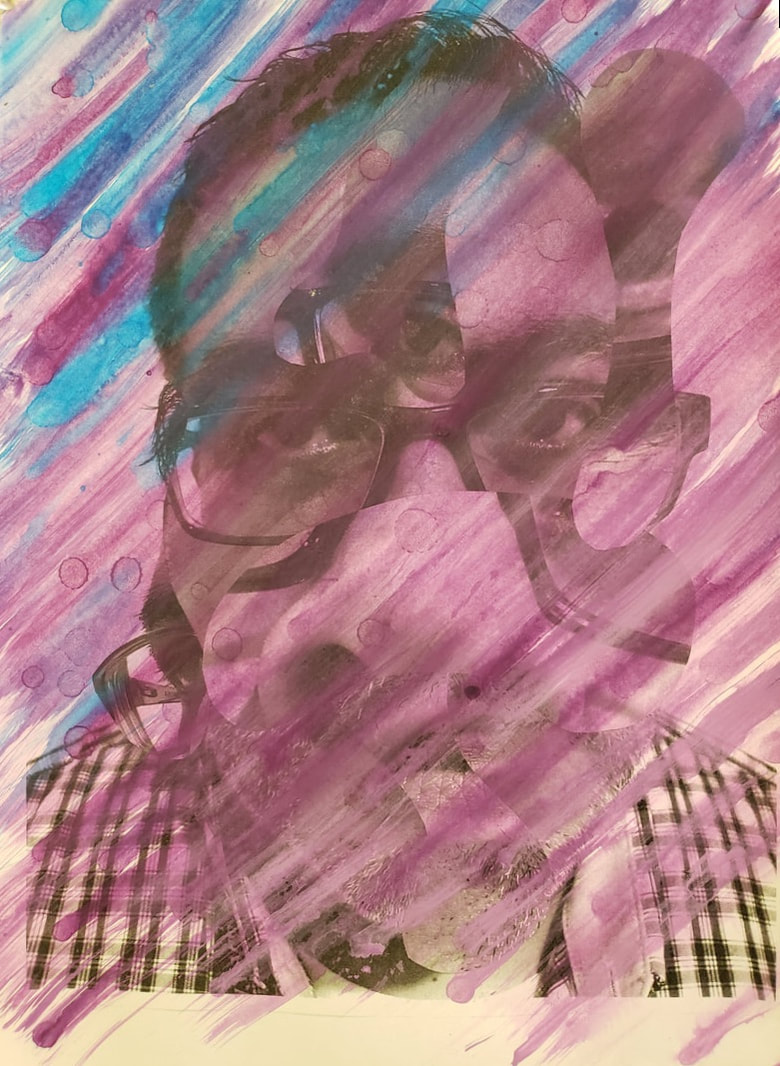
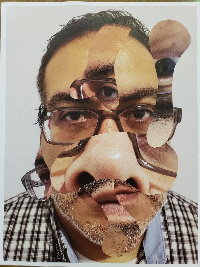 This was my last final iteration that I liked and used. The following step we took the next day was to paint each image uses a color scheme. Below are both of my painting that I did.
0 Comments
Working this project took a different twist which follows our creative strategy of "Take an object / Do something to it / Do something else to it. [Repeat] (Jasper Johns, 1964) What we did in this assignment is we took a photo of our 2nd step of the tonal images and we took photos at an angle to on purpose apply a strong keystoning to it. Then after having a lesson on color theory we applied those ideas and used tints and shades. Our media was a 8x10 in masonite board that had a neutral grey primer on it. The goal was to take a photo that had at least 13 distinct shapes. I chose the color red to work from in creating my tints and shades according to the assignment. Some of the vocabulary learned in this assignment were : Hue, ROYGBIV, Saturation, intensity, prism, color wheel, palette, ryb, secondary color, tertiary color, tint and shade, complementary color, analogues color scheme, hard edge shape, emphasis, binder, thinner, support, pigment, opaque, and transparent. The biggest challenge because of using an expensive paint was creating enough of the color required to place two even coats. It was difficult to recreating the same color for the second coat. Below is an image of my final painted piece. 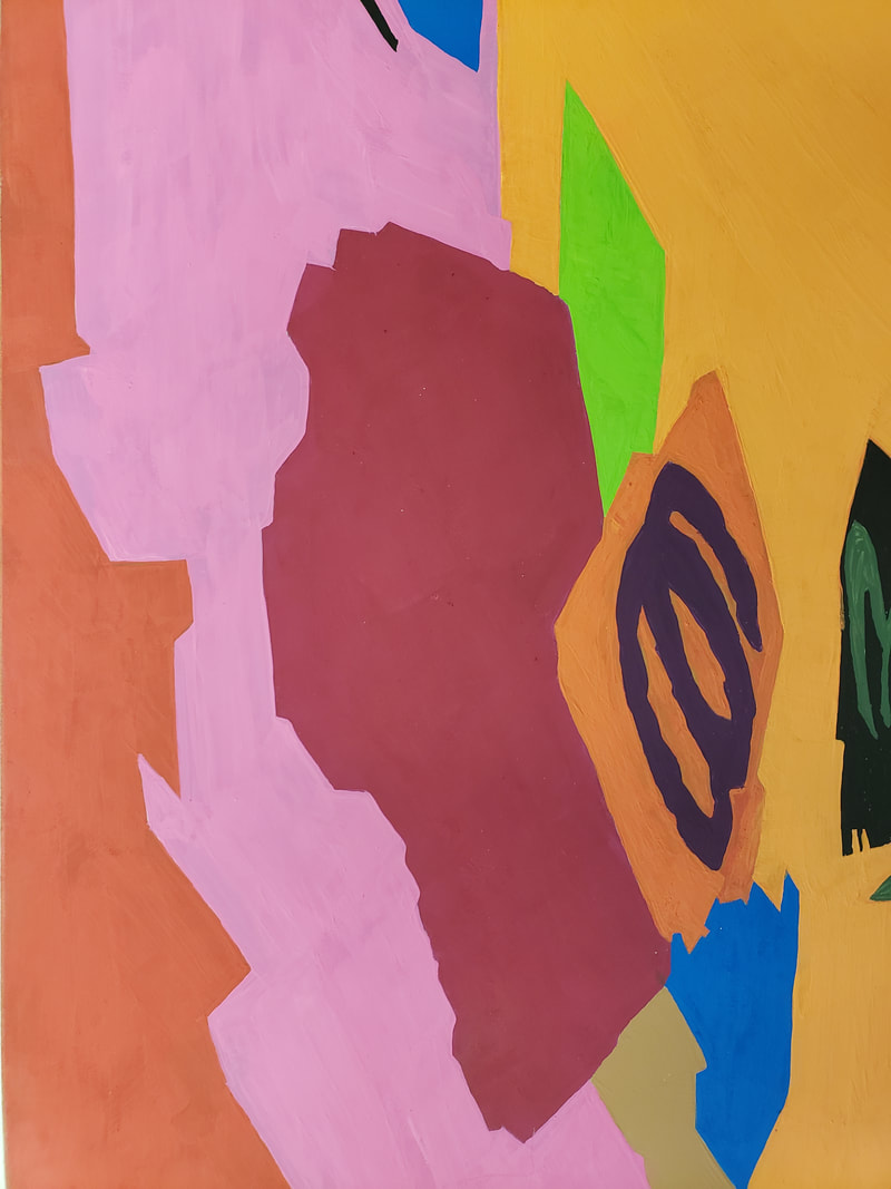 What I learned from doing this was to create an abstract that I was able to paint but what I realized when looking at my assignment and my fellow classmates. Our colors we so vastly different, even those that picked the same color red as mine. I felt that my color palette were warmer colors.
This project involved artists styles of Barbara Kruger, Jenny Holzer, and Jaume Plensa. The creative strategies was to "Take an object/Do something to it/Do something else to it. Key Terms/Vocabulary Elements
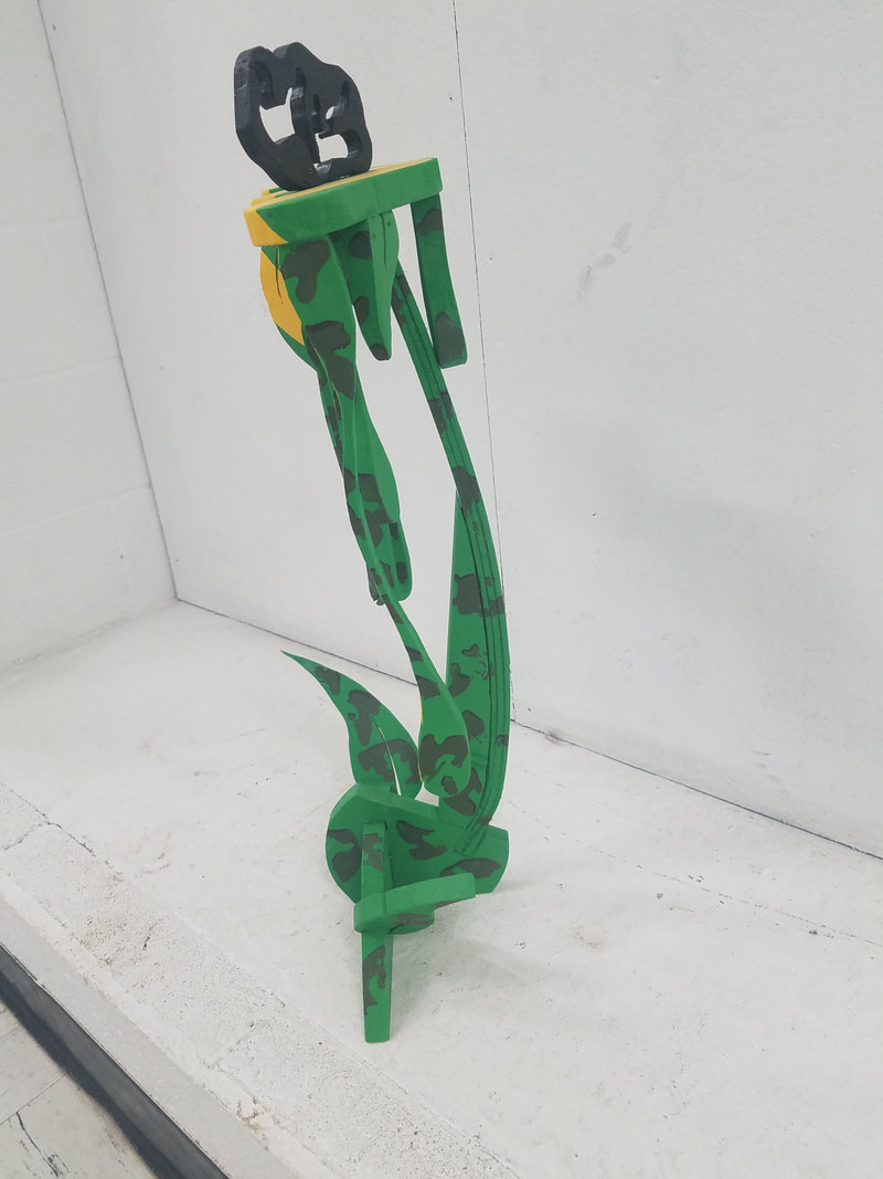
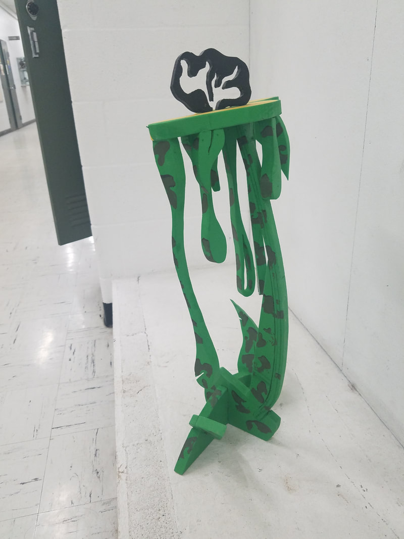
After that was completed we laid out the three pieces onto the same paper with the three words to create unique variations and shot different angles by using a light source and changing the shadows. Below are my iterations to my design before moving onto the next process. Once I found the correct image I then cropped in slightly to remove table. The next step was to redraw the image using a lines with a pencil. We would mimic darker areas by cross hatching lines to make it look denser or lighter. 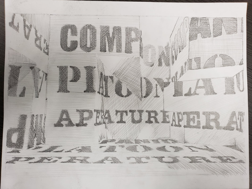 The goals were to find 3 meaningful words, work from a 2D design to a 3D design and back to a 2D design. The struggle I found was to create a sculpture that was standing to show words or parts of words.
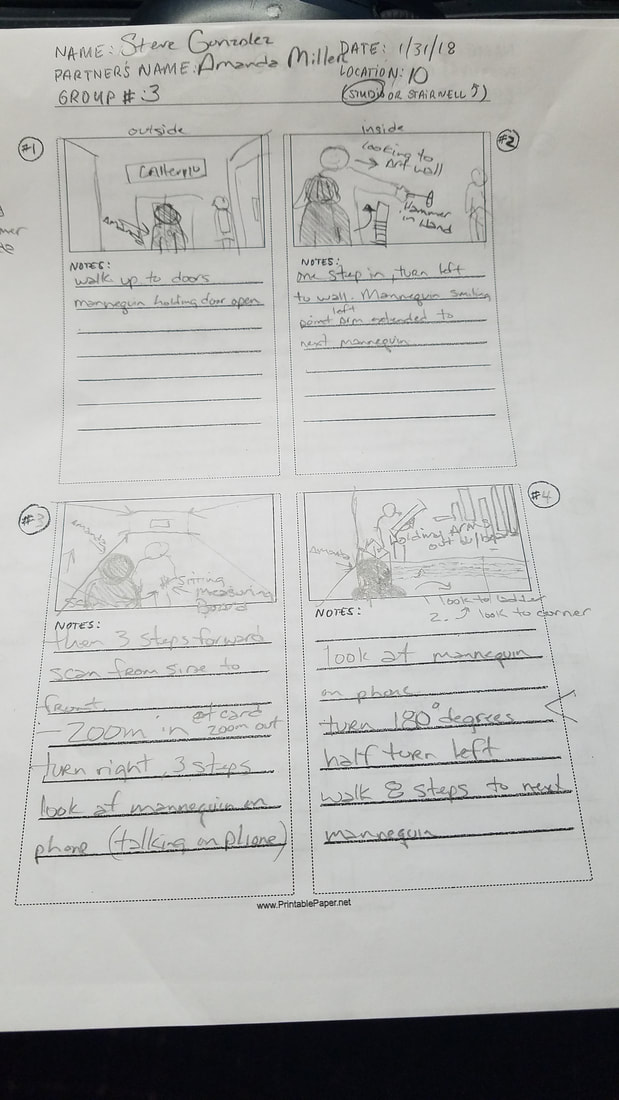
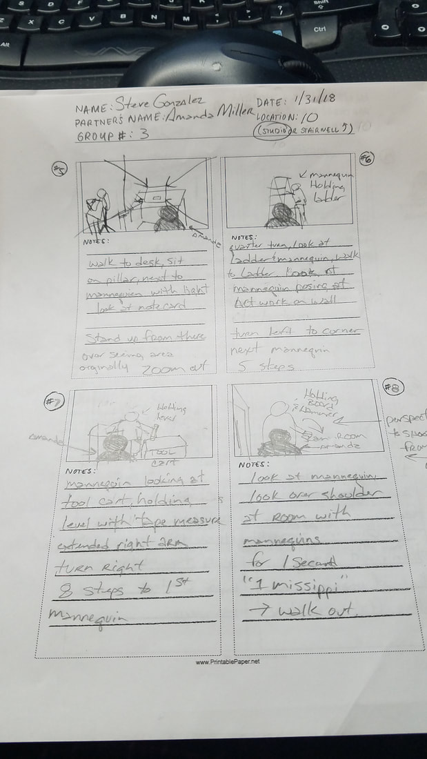
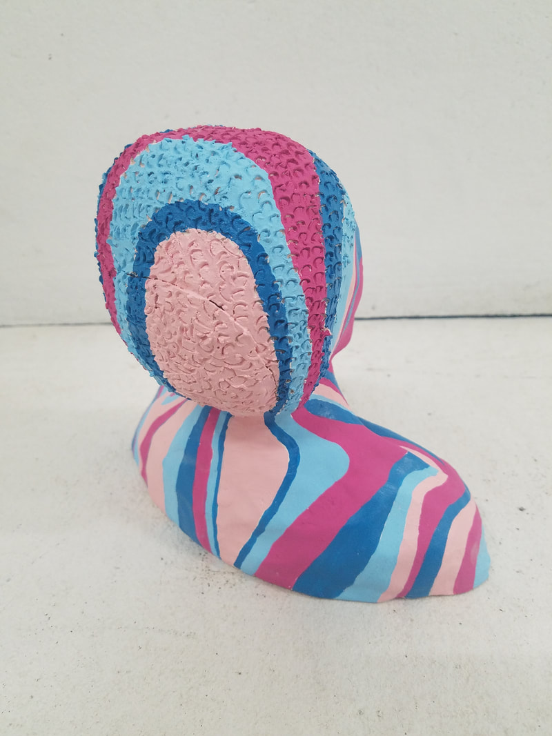
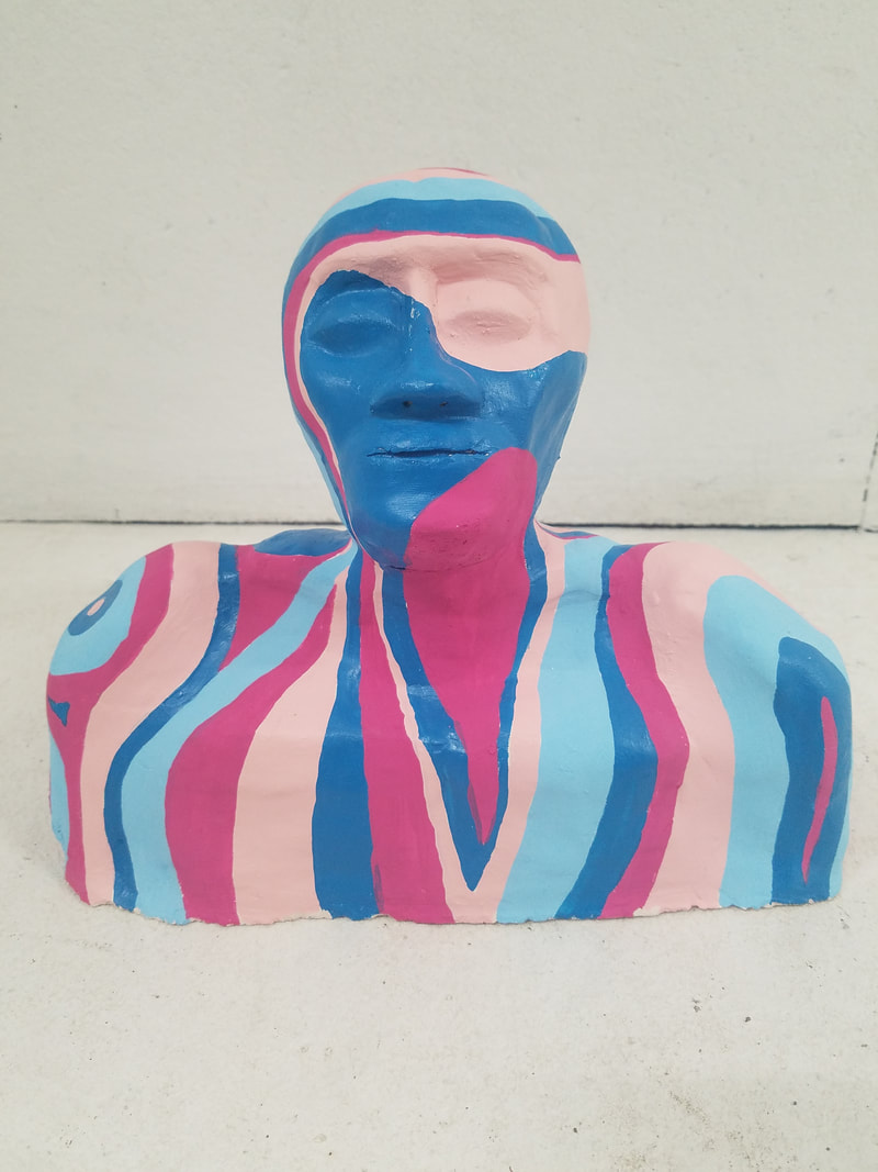
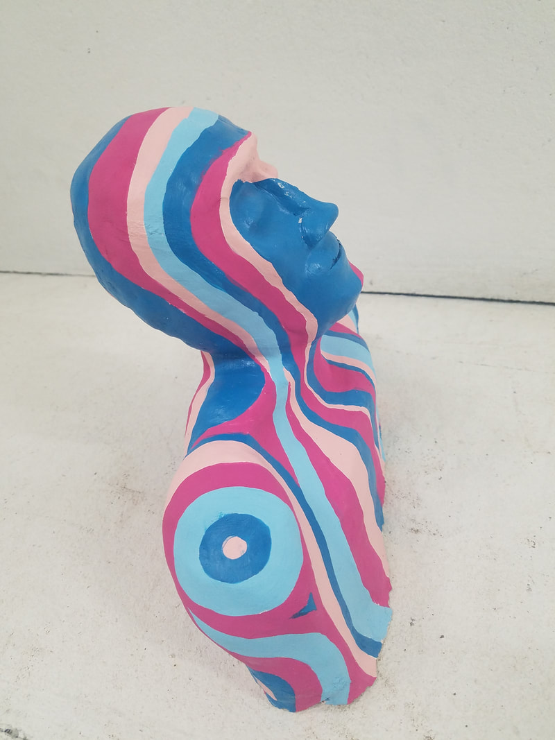
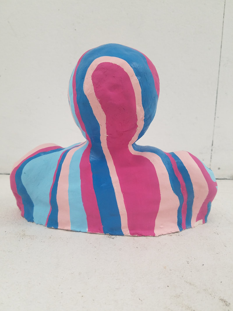
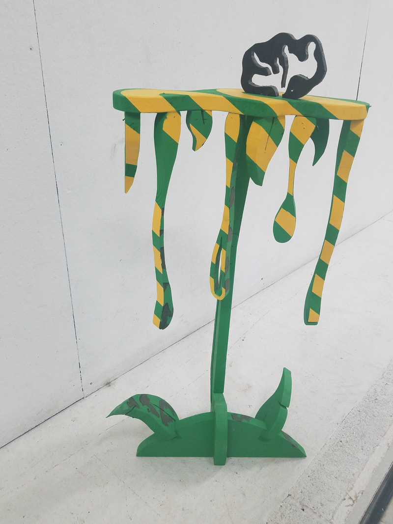
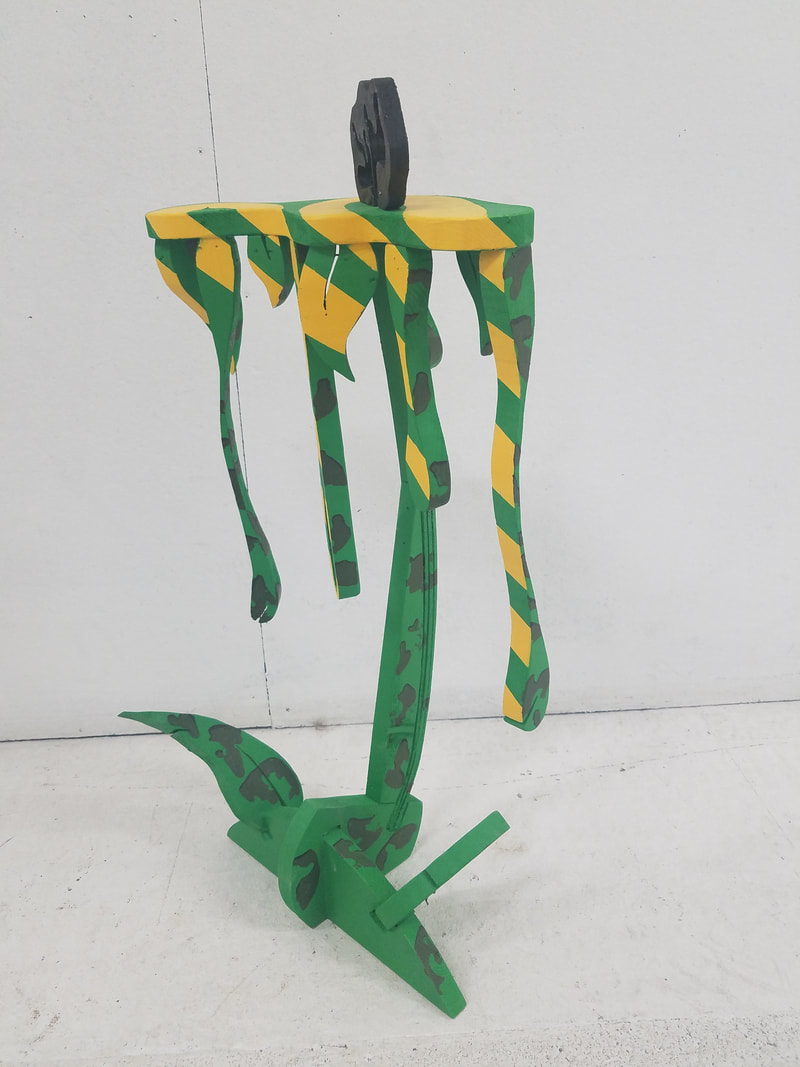
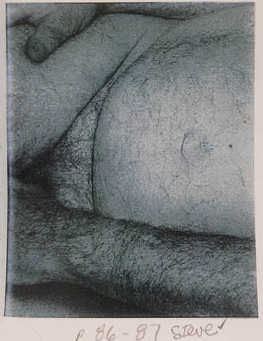 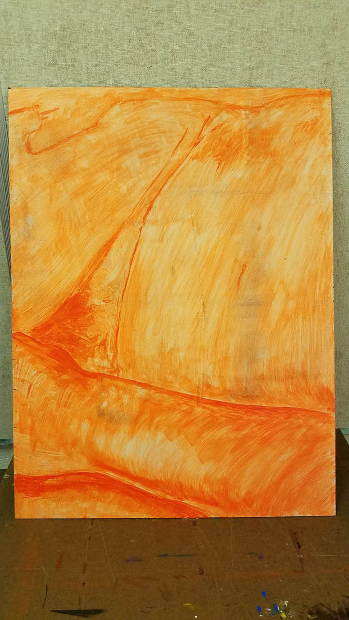 The assignment starts off with getting a section from John Coplans reclining figure, page 86-87. We painted a orange undertone to get the outline of the figure and tonal shading. The panels next to me on my left and right all had to line up so that unity was felt across all of the panels. with the body image. I was absent that day and my two classmates that were assigned on each side of me hashed marks with pencils to help me know where the arm and hands were. I then gridded my image and I gridded my medium to scale the drawing on to it to keep it proportion. *Note, just like with the other things we have done in all classes, we had to erase all pencil marks, to keep the image clean. 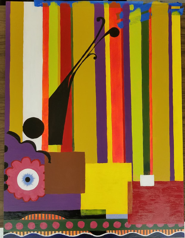 Each student received a different artist to mimic and use the artists style on their panels. This should look really cool because of the variety. The Artist I was assigned was Beatriz Milhazes. I had to mimic her style but keep the continuity of the body so it could still line up with the panels next to me. This had some challenges because of her style with geometric shapes. I had to research many different examples of her work to find the right elements she used to give the implied lines so my painting would match the other panels next to me. Beatriz Milhazes used vivid colors that had strong saturation. She did use white and blacks in her paintings also. This helped me to try to use those colors to form the implied lines of the lower section. I used Acrylic, which I thought was helpful to maintain vivid colors easier, it felt easier to mix. Finished work below. 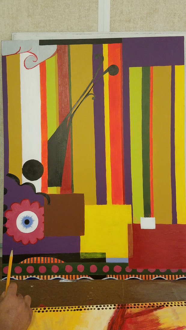 Here is the video link to the video for the Mannequin Challenge, done with Amanda Miller. I also did video with Maddie Laroy. A story board had to be created that had enough details to understand the flow of each scene. It is surprising how much information can be added. It took 8 panels to display what was needed. Some of the things that I learned about this type of video from the perspective of shooting was retracing my steps. Very hard because of the gallery room size and keeping proportion in a tight room was hard to work around Amanda. We had to be creative and use the ladder. There was not enough texture to get that sense of touch to hit a 3 minute minimum time. By using the ladder, it did. This made the timing more difficult. A tough challenge. I also assisted Maddie Laroy with hers too. I did not create a story board for hers because I was not part of the initial day we worked on that. Maddie was missing a partner that day I think. Worked on this project with Kendall. She is a good partner, just saying. So after reviewing Yoko Ono and Allan Kaprow, we created a 40 photo video with Mad and Peter's help. We created actions and did a classroom selection to narrow down the pieces we will use. The Action I was given Tape a fly to the whiteboard. Then mourn. The four actions I wrote were: Music Look at a pretty scene, Close your eyes and take a picture. Open Palm Make a fist, see the mountain and valleys. Open your hand and recreate. The Camera Look at something beautiful find a flaw then zoom out. Erase the Ugly Draw lots of lines erase the ugliest first until one remains. This had to involve the human body, take less than 10 seconds to perform, be associated with life more than art, require no props or very simple props and must be able to be performed by anyone. Some of the vocabulary learned was Frame rate, Persistance of vision, Time Lapse, Shape in reference to video work, Point of viewProportion, and scale. Many steps to this project. I could not upload my video as directed but found out in class that there were issues with Weebly. I still can not upload to view yet. I recreated my previous YouTube account and my video is still being processed as I wrote this. VIDEO LINK BELOW This was my first hands on class. I got a chance to explore other type of art work instead of Graphic Design. I did enjoy this class a lot. I knew I could express myself with other materials and I am glad I had a chance to test it out. I plan on doing more with wood when summer approaches. What really has me excited is that I get to share this with my Granddaughter Mya, who also is very artistic. More photos coming soon... 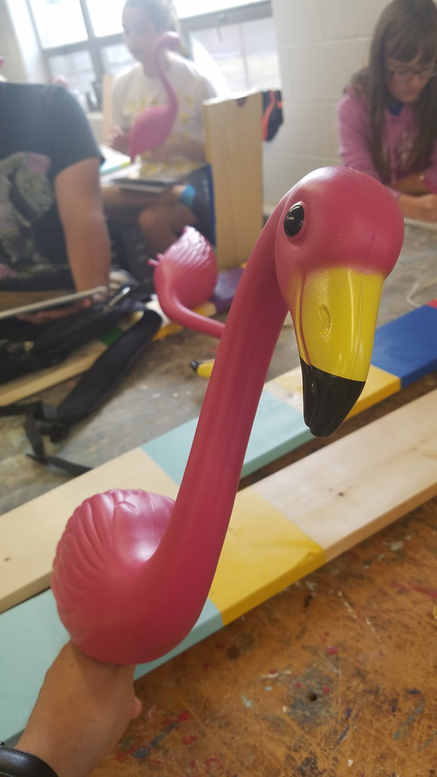 Had to convert flamingo to something else. I tried the dragon but I didn't understand how clay would dry, so I ended up doing something else with Styrofoam. It still looked cool. 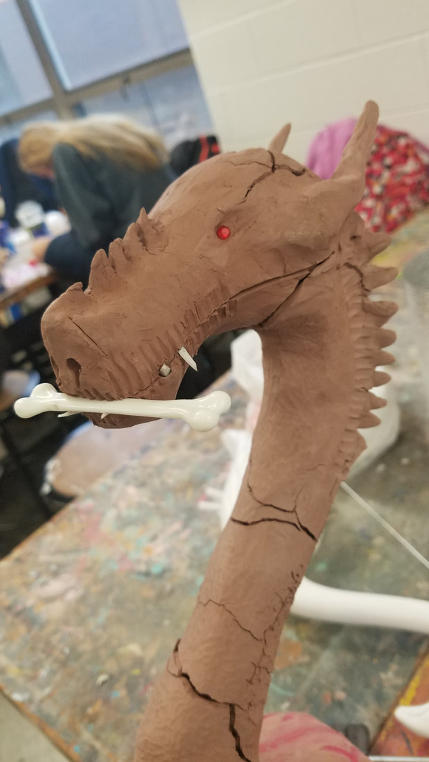 Another project from sculpture class. It represented us as numbers. Our Siena Heights student identification numbers. Guess which one I am? You cant "WE ARE ALL NUMBERS!" hahaha. 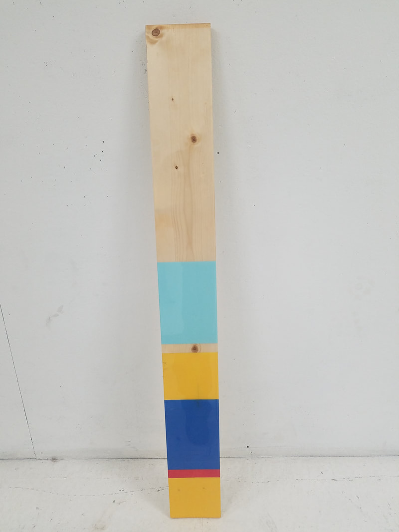 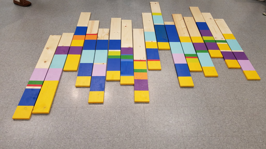 2 Head bust assignment. 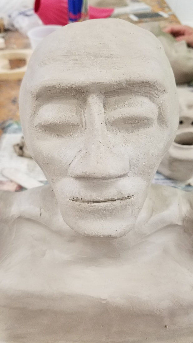 Wood sculpture process. |
AuthorMy Name is Steve Gonzalez, coming back to school after a lot of years. I am determined to get this done. Sometimes I wonder if I will make it. Archives
November 2018
Categories
All
|


 RSS Feed
