|
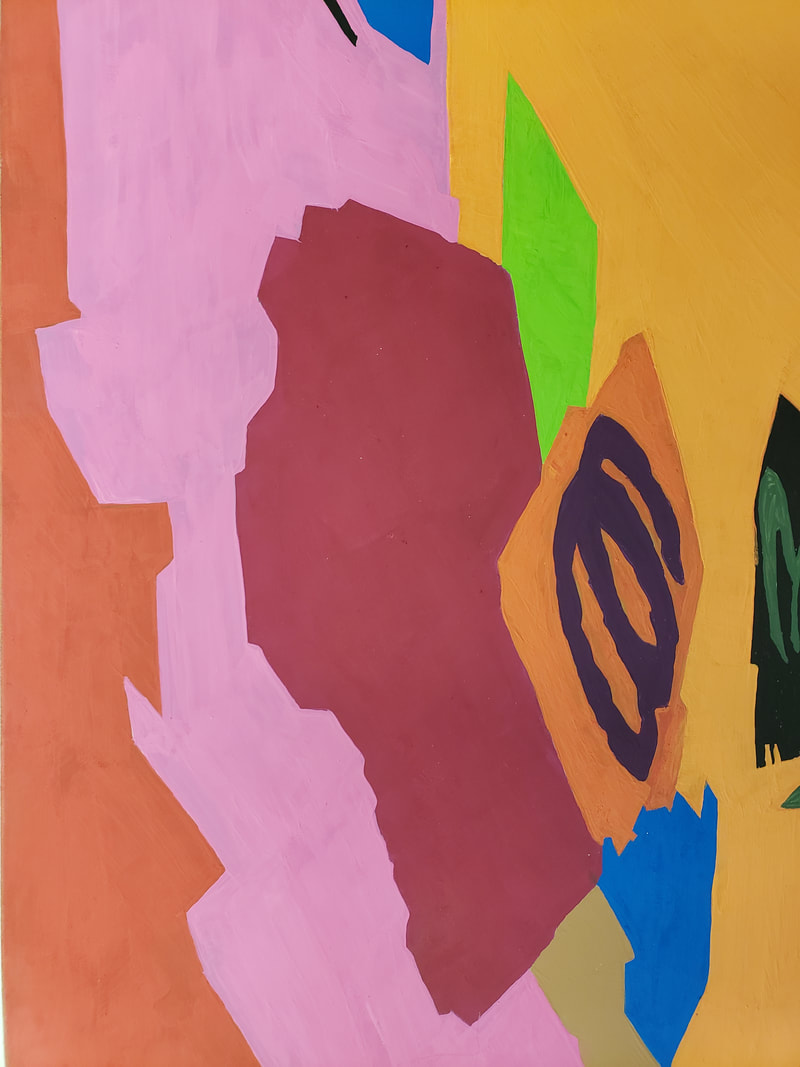
Working this project took a different twist which follows our creative strategy of "Take an object / Do something to it / Do something else to it. [Repeat] (Jasper Johns, 1964) What we did in this assignment is we took a photo of our 2nd step of the tonal images and we took photos at an angle to on purpose apply a strong keystoning to it. Then after having a lesson on color theory we applied those ideas and used tints and shades. Our media was a 8x10 in masonite board that had a neutral grey primer on it. The goal was to take a photo that had at least 13 distinct shapes. I chose the color red to work from in creating my tints and shades according to the assignment. Some of the vocabulary learned in this assignment were : Hue, ROYGBIV, Saturation, intensity, prism, color wheel, palette, ryb, secondary color, tertiary color, tint and shade, complementary color, analogues color scheme, hard edge shape, emphasis, binder, thinner, support, pigment, opaque, and transparent. The biggest challenge because of using an expensive paint was creating enough of the color required to place two even coats. It was difficult to recreating the same color for the second coat. Below is an image of my final painted piece. What I learned from doing this was to create an abstract that I was able to paint but what I realized when looking at my assignment and my fellow classmates. Our colors we so vastly different, even those that picked the same color red as mine. I felt that my color palette were warmer colors.
0 Comments
Leave a Reply. |
AuthorMy Name is Steve Gonzalez, coming back to school after a lot of years. I am determined to get this done. Sometimes I wonder if I will make it. Archives
November 2018
Categories
All
|

 RSS Feed
