|
Working this project took a different twist which follows our creative strategy of "Take an object / Do something to it / Do something else to it. [Repeat] (Jasper Johns, 1964) What we did in this assignment is we took a photo of our 2nd step of the tonal images and we took photos at an angle to on purpose apply a strong keystoning to it. Then after having a lesson on color theory we applied those ideas and used tints and shades. Our media was a 8x10 in masonite board that had a neutral grey primer on it. The goal was to take a photo that had at least 13 distinct shapes. I chose the color red to work from in creating my tints and shades according to the assignment. Some of the vocabulary learned in this assignment were : Hue, ROYGBIV, Saturation, intensity, prism, color wheel, palette, ryb, secondary color, tertiary color, tint and shade, complementary color, analogues color scheme, hard edge shape, emphasis, binder, thinner, support, pigment, opaque, and transparent. The biggest challenge because of using an expensive paint was creating enough of the color required to place two even coats. It was difficult to recreating the same color for the second coat. Below is an image of my final painted piece. What I learned from doing this was to create an abstract that I was able to paint but what I realized when looking at my assignment and my fellow classmates. Our colors we so vastly different, even those that picked the same color red as mine. I felt that my color palette were warmer colors.
0 Comments
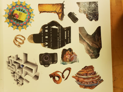
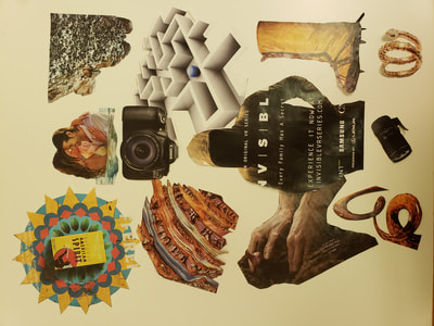
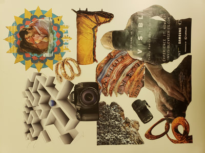
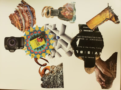
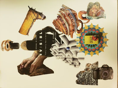
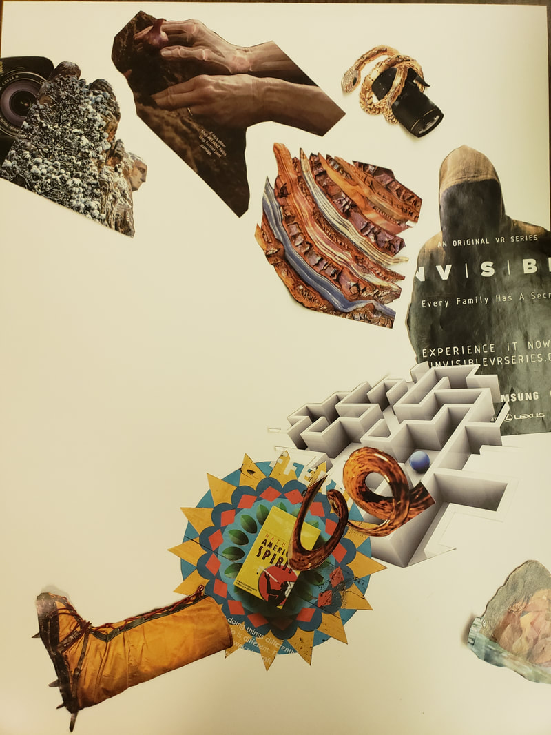
Cliche and Collage For this assignment we had to take the previous WORD assignment and take those words to images and avoid using images that were cliche. We took various images that were from a variety of magazines the reflected our original three words. The biggests help was using google to find synonyms. The total words that I was able to come up with were 20 words. New vocabulary for this part of the assignment is Implied Motion, Picture Plane, Position perspective,Color perspective, Figure (Positive space) and Ground (Negative space). I had to do iterations of my cut out images on a large 11x17 paper. After creating all iterations I consulted Peter and Tim for advice on the layout and flow, Creating motion for me was the most difficult to achieve. After I was able to create an image that had implied motion, I then focused on slight adjustments for the negative and positive space. I did this by overlapping more or less in certain areas. The image above was my final iteration that I glued in place.
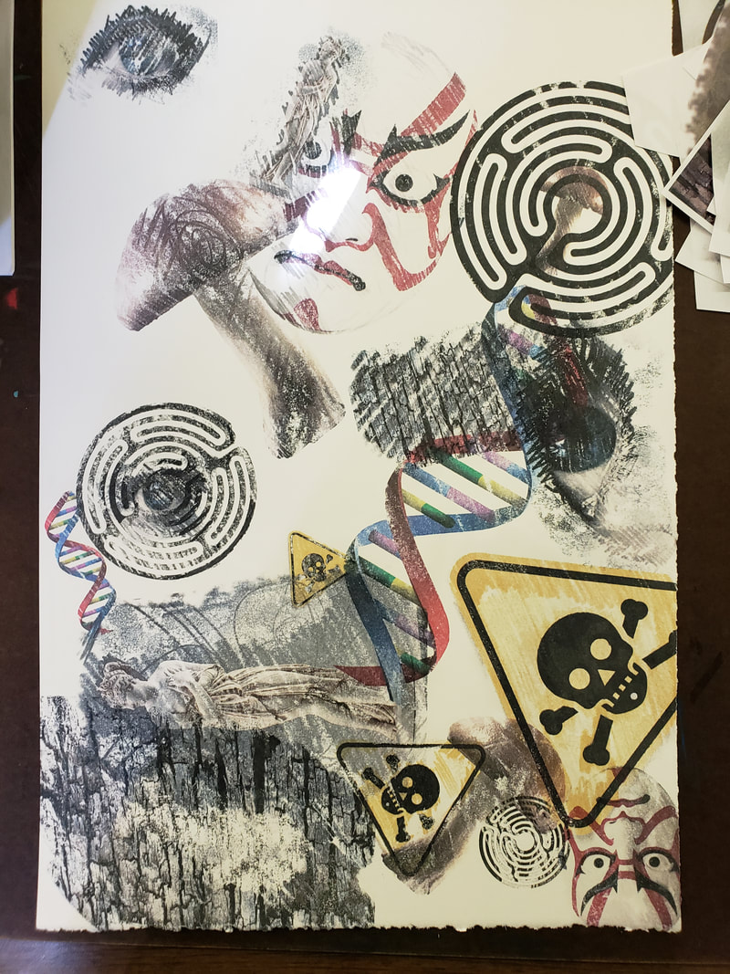
Gall Bladder This assignment had a few set backs, I was lucky to print this right at the start of this assignment and citra-solv it at the start of class. I was fortunate to also use the right printer to get a good transfer. The design concept to creating this image was from learning about Wu-Xing, a Taoist theme but creating it in the style of Robert Rauschenberg's Yellow body.
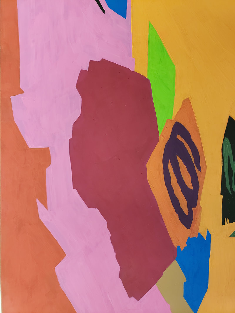
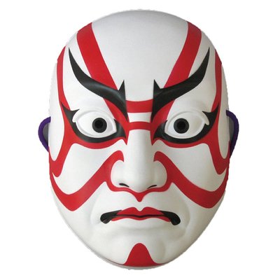
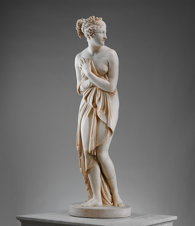
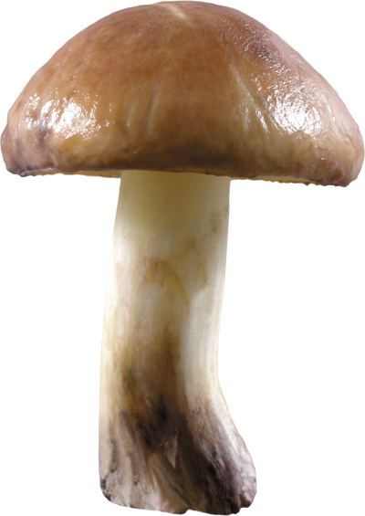
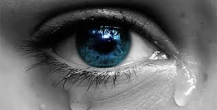
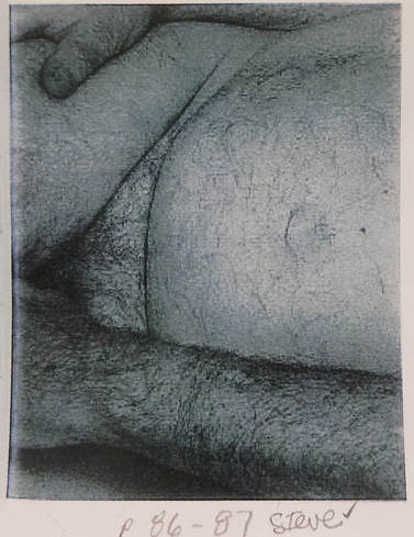
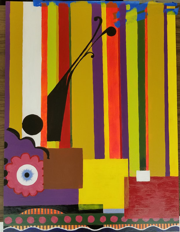
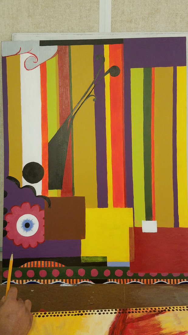
I had to find two elements from each phase of the five phases in Wu-Xing. Wood - Gall bladder, Tears Fire - Small intestine, Pulse Earth - Anxiety, Dna Metal - Venus, Old age Water - Fear, Death After I found two images on the internet I then printed three different sizes of each of the total 10 images to have 30 total images to Citra-Solv *NOTE, That all images should be reviewed and consider if the should be flipped horizontally if words or numbers were showed. That way everything would read correctly on the transfer was completed. The meaning had to be our own and we must avoid using copyrighted material, if we did it must be used in a new meaning that we could explain, If we did we must be able to cite the source with some sort of labeling to give credit to the original artist. The use of pre-existing work should be avoided but using the style of another artist with your own meaning is better to do. Before creating our Citra Solv transfer we had to examine Robert Rauschenberg's Yellow Body (1968) In reviewing the Yellow body There is a travel theme that seems to be a glimpse of a memory. In this piece you see a Plane a semi truck a woman singing which was Janis Joplin. You can see a 1960's rock band a Credit card, Wilt Chamberlain and a bicycle. All of these images refer to travel that he must have done. A lot of these images are iconic like Janis Joplin and Wilt Chamberlain. It was very interesting how he framed everything in a Yellow and centered it. The lines that go across from the left to the right, which gives this image movement to go along with the theme. After all of this was taken to account I picks different images that expresses time through beauty and aging, along with pain. I used images that had eyes in some of them. This would give a sense of unity but not wanting to have eyes in all my images. I was very focused on how I citra solved my images because of pain they had to go pressed with different angles and semi circular strokes. I was trying to express pain. Juxtaposition was an easy thing to arrnage my images at first but them after 5 images it became more difficult because of using the space correctly and making sure I had a vision of the end result ahead of time. I was worried about the overall balance and knew that I wanted to express the pain by having one side free of images to express the pain of not being able to stand upright because of pain. My perspective was straight forward, which is why I didn't use my last image. It was angled with a deep perspective and did not use it. Peter said that I did not have to use all of my images, so I chose not to use it. Lastly when it came to repetition I used my images and spread them out based on a triangular composition. This seems to be something that I try to see with my graphic design process and it photography. This is probably the first thing I have created that I will frame and place in my work room! Artist: Steve Gonzalez Title: Gall Bladder Year: 2018 Citra Solv on 15" x 22" Deckle Edge Stone Hedge paper. 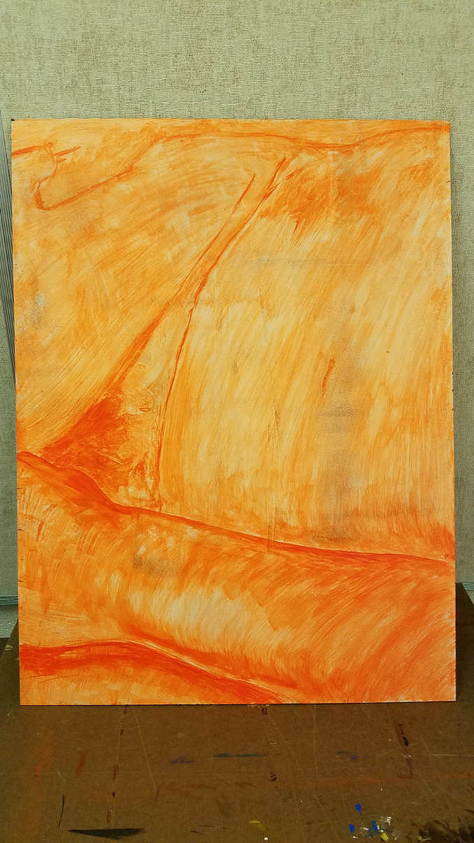 The assignment starts off with getting a section from John Coplans reclining figure, page 86-87. We painted a orange undertone to get the outline of the figure and tonal shading. The panels next to me on my left and right all had to line up so that unity was felt across all of the panels. with the body image. I was absent that day and my two classmates that were assigned on each side of me hashed marks with pencils to help me know where the arm and hands were. I then gridded my image and I gridded my medium to scale the drawing on to it to keep it proportion. *Note, just like with the other things we have done in all classes, we had to erase all pencil marks, to keep the image clean. Each student received a different artist to mimic and use the artists style on their panels. This should look really cool because of the variety. The Artist I was assigned was Beatriz Milhazes. I had to mimic her style but keep the continuity of the body so it could still line up with the panels next to me. This had some challenges because of her style with geometric shapes. I had to research many different examples of her work to find the right elements she used to give the implied lines so my painting would match the other panels next to me.
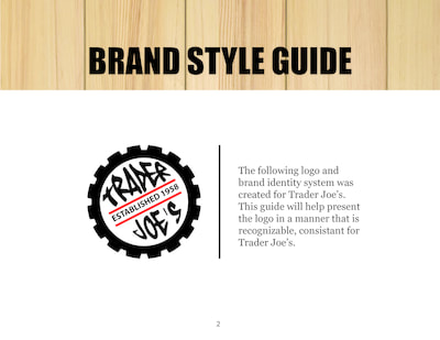
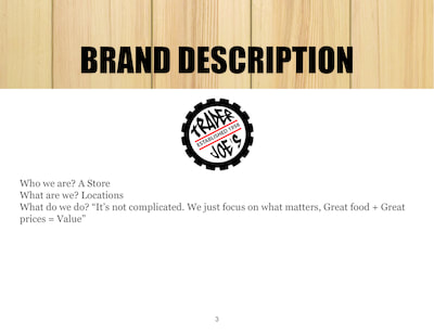
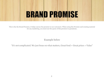
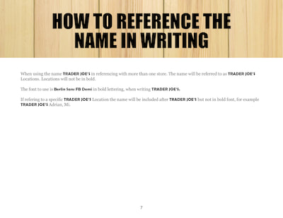
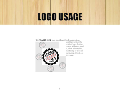
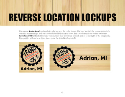
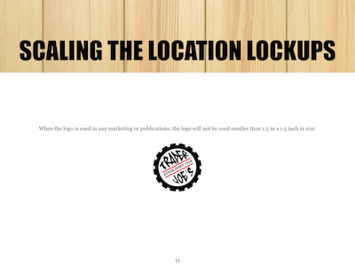
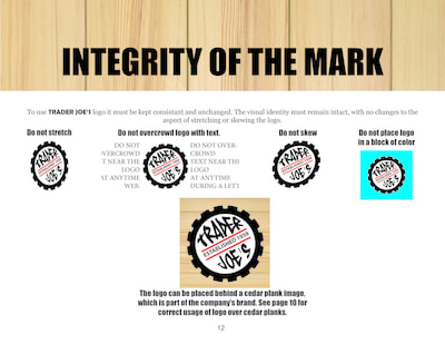
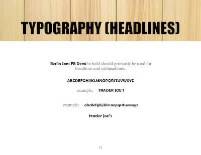
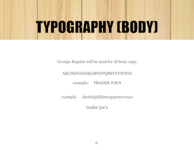
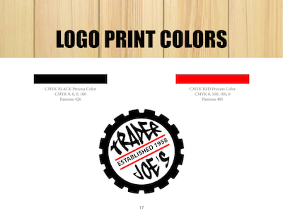
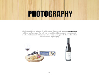
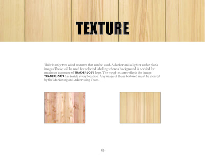
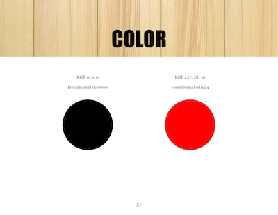
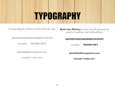
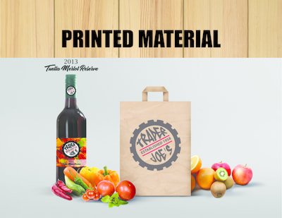
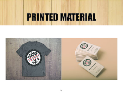
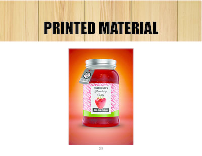
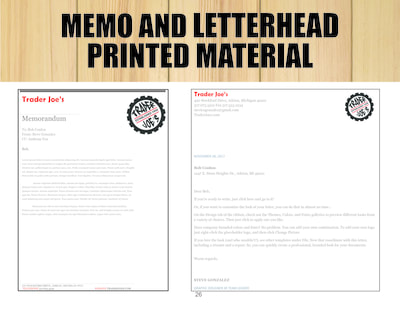
Beatriz Milhazes used vivid colors that had strong saturation. She did use white and blacks in her paintings also. This helped me to try to use those colors to form the implied lines of the lower section. I used Acrylic, which I thought was helpful to maintain vivid colors easier, it felt easier to mix. Finished work below. Here is a project that took the entire class to complete, we reviewed elements of each page with Bob. Figured a way to apply some of those items to our Style Guide. I used my logo that I created in another class for Trader Joe's Style guide.
|
AuthorMy Name is Steve Gonzalez, coming back to school after a lot of years. I am determined to get this done. Sometimes I wonder if I will make it. Archives
November 2018
Categories
All
|






 RSS Feed
