|
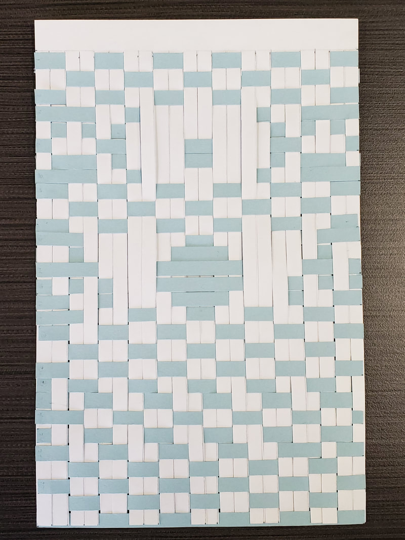
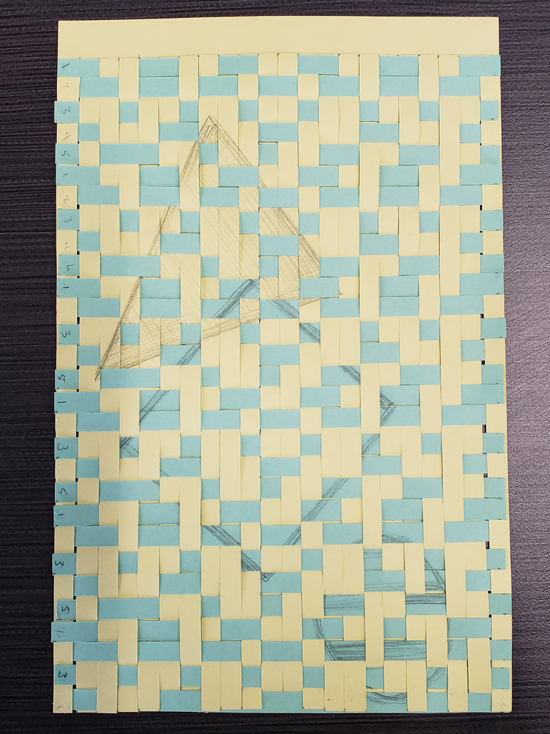
This assignment focused on Dihn Q Le works of art. We learned the process the work of weaving and learned quite a few new vocabulary terms. Weaving: warp and weft Repetition Pattern: simple pattern, and complex pattern Emphasis Shape integration This project took several class hours to complete the 3 type of practice patterns. I felt that weaving came easy to me in seeing the pattern I wanted to create. The first pattern on the left was just to get used to weaving, the second was making a spot stand out among the pattern. With this one I tried to make an eyeball and large circle teardrop. This is where I learned to do a teardrop I would need to do finer warps and smaller wefts to get that pattern. The third weave I drew on the yellow paper a triangle and on the blue paper I drew a square and a circle. By the time I got to the third assignment I started to figure out other problems like having left over wefts, when weaving you do not use them all because of the small gaps. So I wanted to merge my shapes and I removed some strips to make the triangle and square overlap. Then I realized I needed to take one more out to make sure my circle would stay on the image completely.
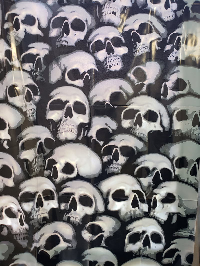
Going this far we then had to give Tim 2 images, one in color and one in black and white to have printed for our 3rd class and to put into practice the techniques we have learned into our final project. So in keeping Halloween and thinking of the assignment of the future, I figured I could be dead in 20 years so this seemed to be appropriate. This assignment was a lot of fun for me.
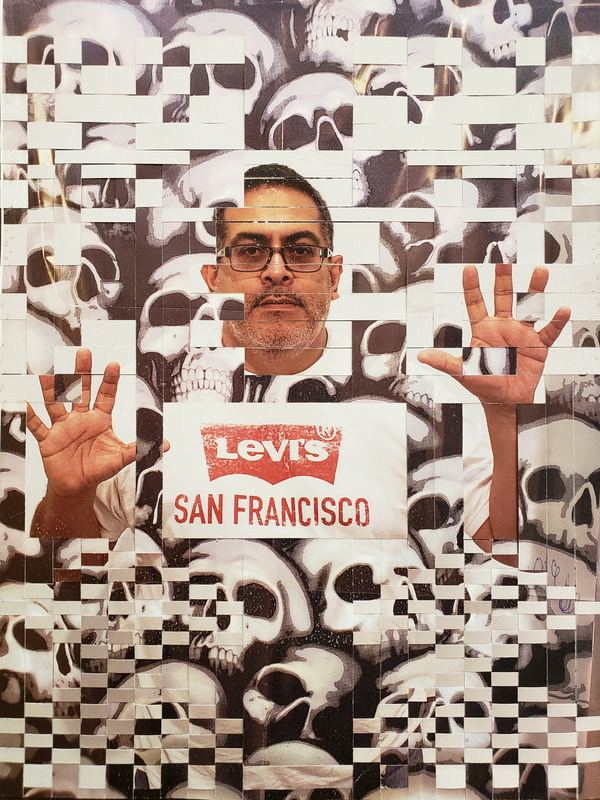 Here is this final combine image, I worked with making three large warps and three different weft sizes. I wanted to show the presence of feeling trapped and using the smaller wefts to give a smoky feeling of rising through the skulls that represented death, never really gone.
0 Comments
Working this project took a different twist which follows our creative strategy of "Take an object / Do something to it / Do something else to it. [Repeat] (Jasper Johns, 1964) What we did in this assignment is we took a photo of our 2nd step of the tonal images and we took photos at an angle to on purpose apply a strong keystoning to it. Then after having a lesson on color theory we applied those ideas and used tints and shades. Our media was a 8x10 in masonite board that had a neutral grey primer on it. The goal was to take a photo that had at least 13 distinct shapes. I chose the color red to work from in creating my tints and shades according to the assignment. Some of the vocabulary learned in this assignment were : Hue, ROYGBIV, Saturation, intensity, prism, color wheel, palette, ryb, secondary color, tertiary color, tint and shade, complementary color, analogues color scheme, hard edge shape, emphasis, binder, thinner, support, pigment, opaque, and transparent. The biggest challenge because of using an expensive paint was creating enough of the color required to place two even coats. It was difficult to recreating the same color for the second coat. Below is an image of my final painted piece. 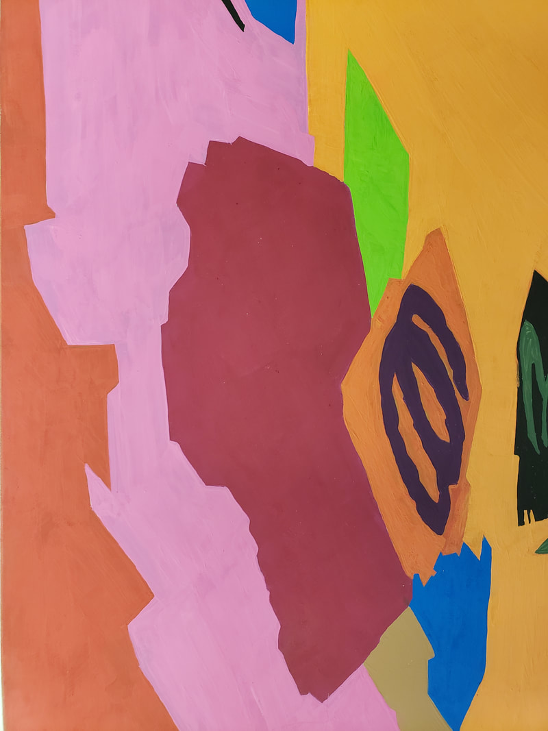 What I learned from doing this was to create an abstract that I was able to paint but what I realized when looking at my assignment and my fellow classmates. Our colors we so vastly different, even those that picked the same color red as mine. I felt that my color palette were warmer colors.
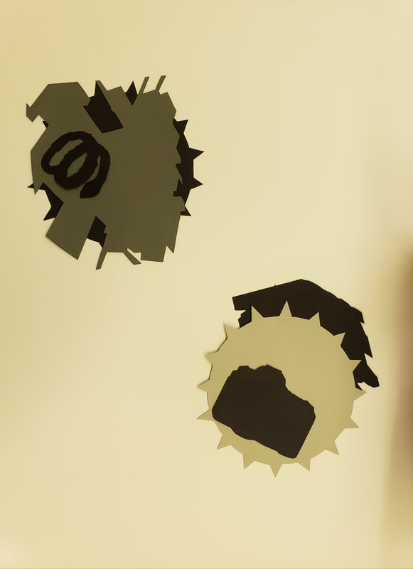
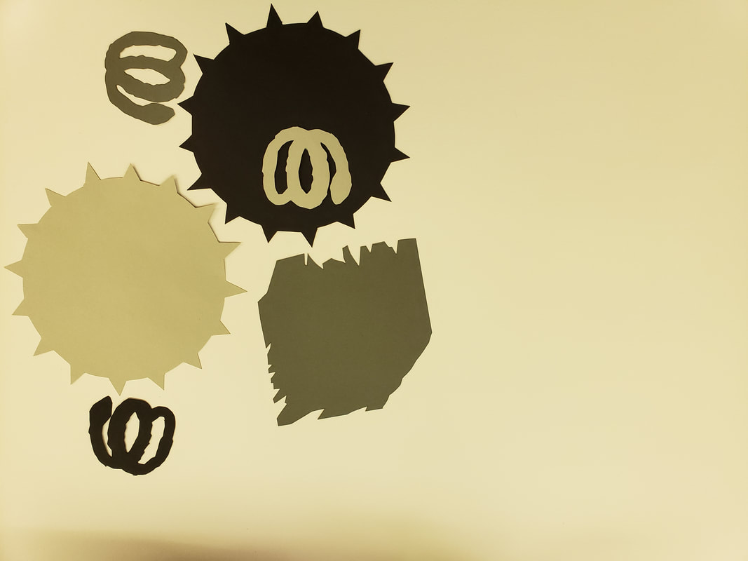
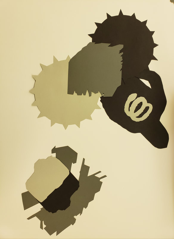
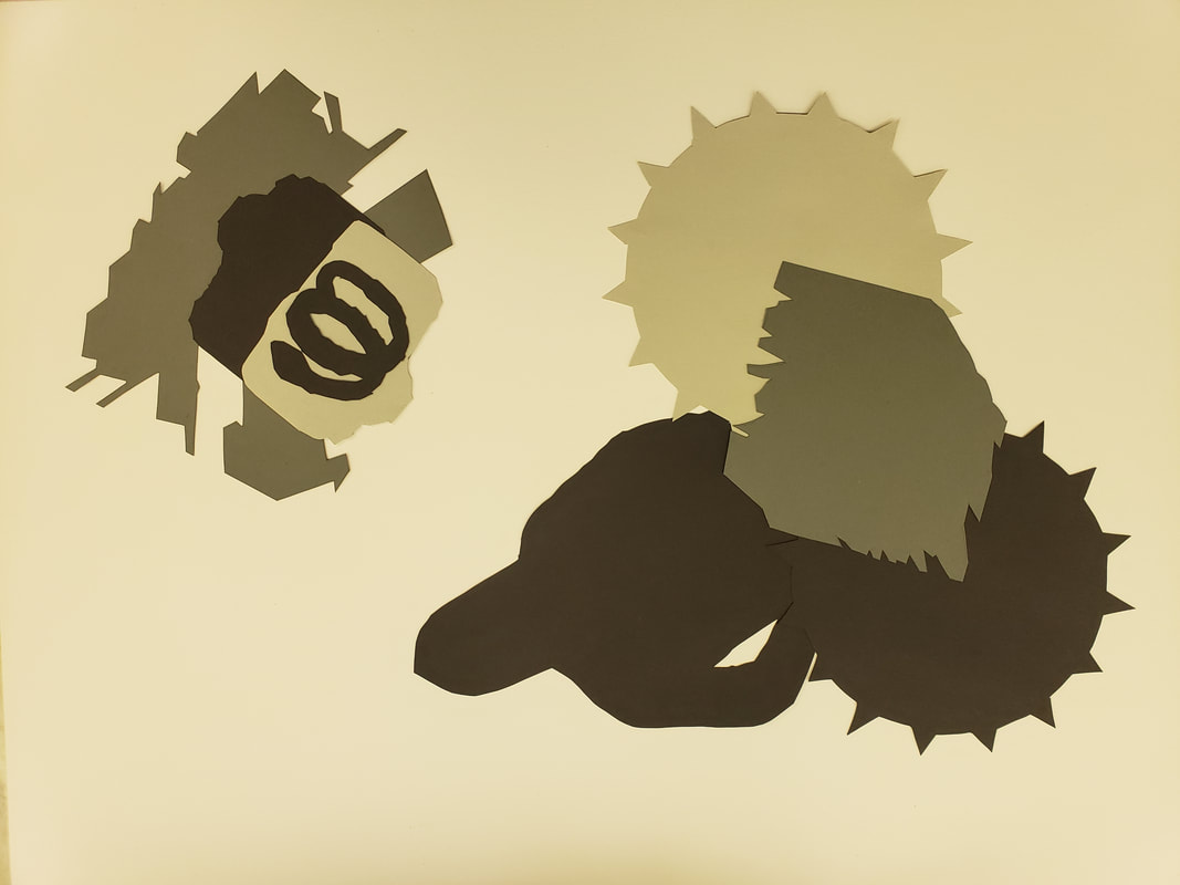
This has been an interesting project, I am realizing now at this stage how I am using these examples to morph original idea for my Senior show. Now going forward into the tonal college of our images in part one. I cut out copies of my images in 3 different tones for each of my images. New techniques and understanding of new vocabulary were introduced to understand this part of the assignment. These vocabulary terms are, Form, Content, Silhouette, Implied lines, Aspect ratio, Hybrid, Overlap, and Abstraction. The challenge for me was the requirement of asymmetrically balanced design. As with all assignments that involve glue, cutting out and pencils marks we had to make sure everything was clean. We also had to do several iterations before glueing down this final piece. After showing ouri terations to Peter and Tim for advice and making adjustments, I began to glue down my final design. This took a little longer to do than part 1 because I was trying to figure out how to make my images look farther or closer when I overlapped them. At the end of this part we were told to take a very extreme angle of our tonal pieces. 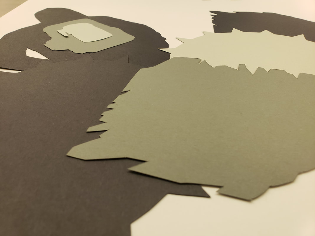 Here is my final piece.
Cliche and Collage For this assignment we had to take the previous WORD assignment and take those words to images and avoid using images that were cliche. We took various images that were from a variety of magazines the reflected our original three words. The biggests help was using google to find synonyms. The total words that I was able to come up with were 20 words. New vocabulary for this part of the assignment is Implied Motion, Picture Plane, Position perspective,Color perspective, Figure (Positive space) and Ground (Negative space). I had to do iterations of my cut out images on a large 11x17 paper. After creating all iterations I consulted Peter and Tim for advice on the layout and flow, Creating motion for me was the most difficult to achieve. After I was able to create an image that had implied motion, I then focused on slight adjustments for the negative and positive space. I did this by overlapping more or less in certain areas. 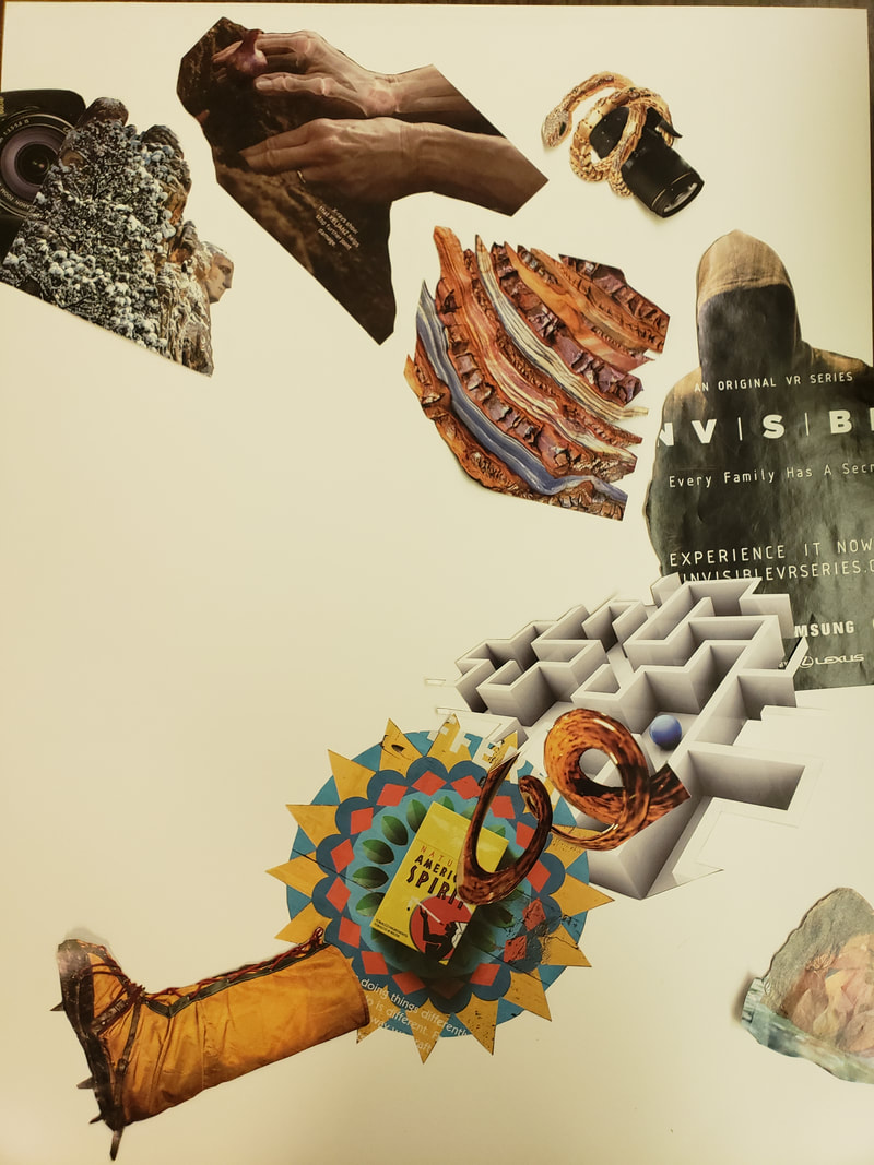 The image above was my final iteration that I glued in place.
This project involved artists styles of Barbara Kruger, Jenny Holzer, and Jaume Plensa. The creative strategies was to "Take an object/Do something to it/Do something else to it. Key Terms/Vocabulary Elements
After that was completed we laid out the three pieces onto the same paper with the three words to create unique variations and shot different angles by using a light source and changing the shadows. Below are my iterations to my design before moving onto the next process. Once I found the correct image I then cropped in slightly to remove table. The next step was to redraw the image using a lines with a pencil. We would mimic darker areas by cross hatching lines to make it look denser or lighter. 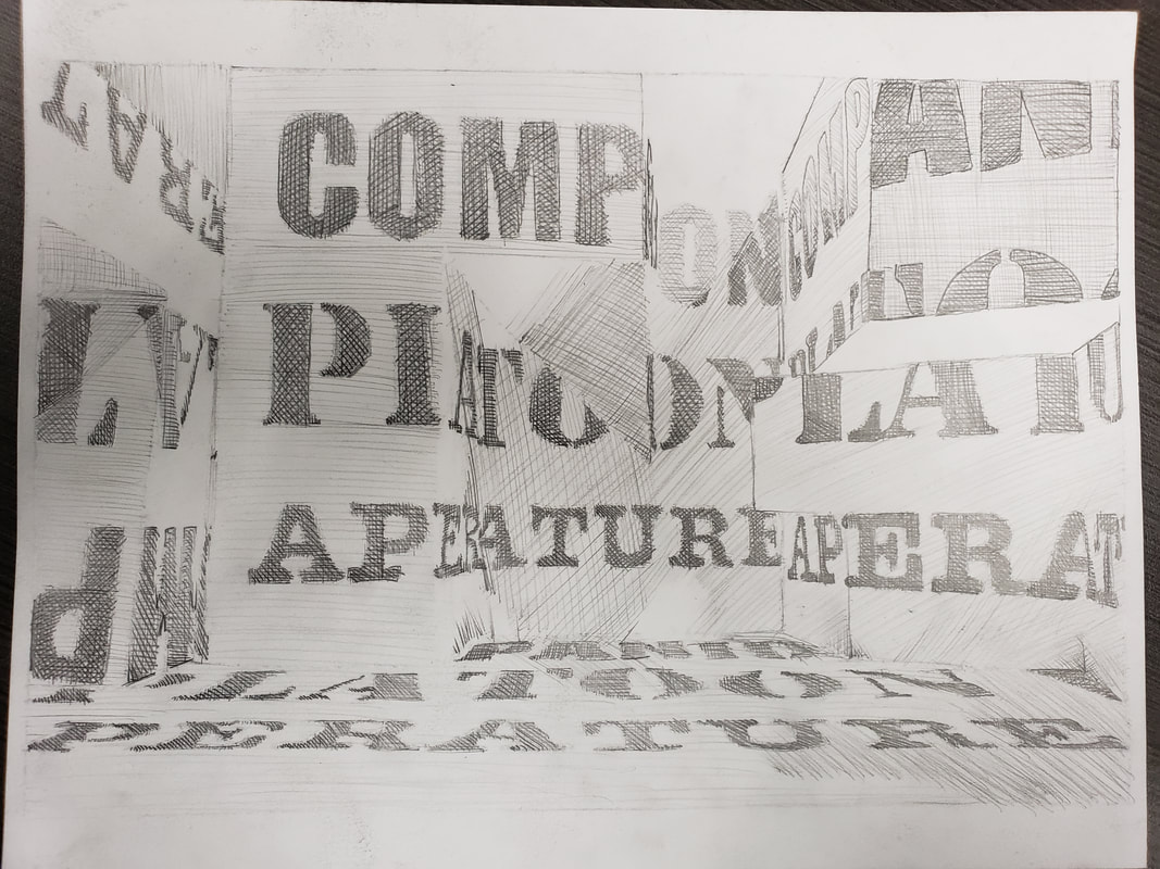 The goals were to find 3 meaningful words, work from a 2D design to a 3D design and back to a 2D design. The struggle I found was to create a sculpture that was standing to show words or parts of words.
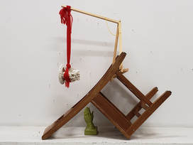 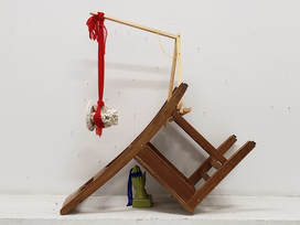 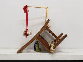 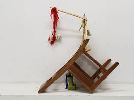 This was an assignment I conducted with Amanda. The project was in relation to Max Ernst's "Mechanism of Collage" essay. Amanda and I were given objects that we could use to create a form of installation art. We photographed several iterations and discussed several ideas and we came across these main four photos. Once we chose a location, we began taking a chair and objects that were provided to create a surrealism piece of work by taking two or more objects that do not belong with each other to make an assisted readymade piece of art. The piece ended up being a site specific piece of work, just because it requires a background. This idea relates to how Max Ernst placed things that do not normally go together to see what he could create. In reviewing this assignment I think the value I got was trying to think outside the box into how can two or more objects could create art. How this relates to me would be something with an urban perspective. Thinking off the top of my head would be taking a fire hydrant and placing it on its side on a wall.
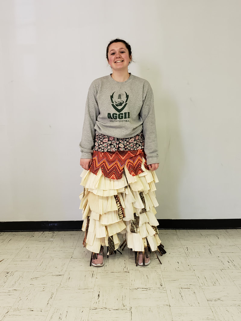
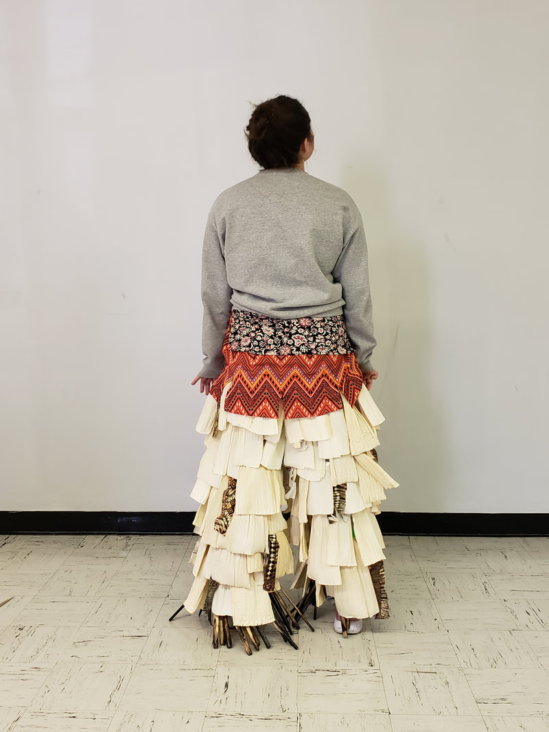
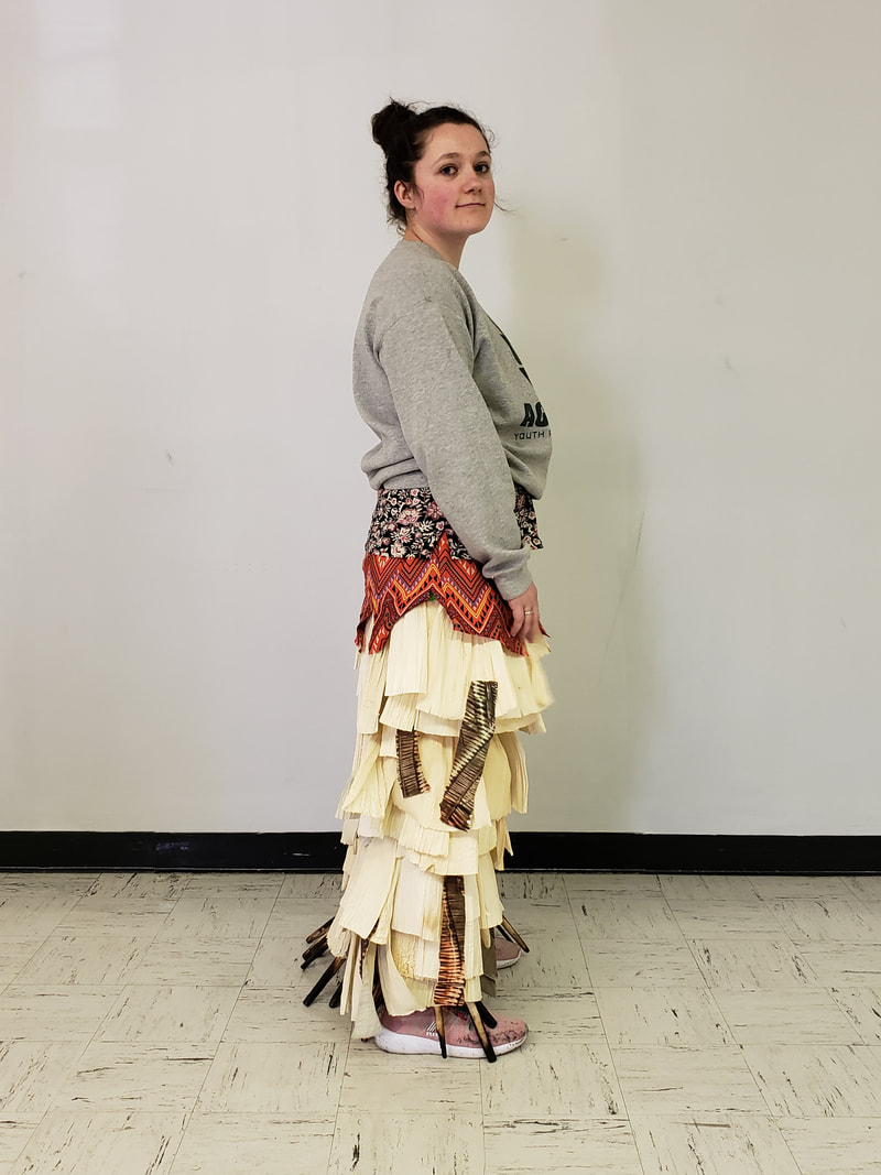
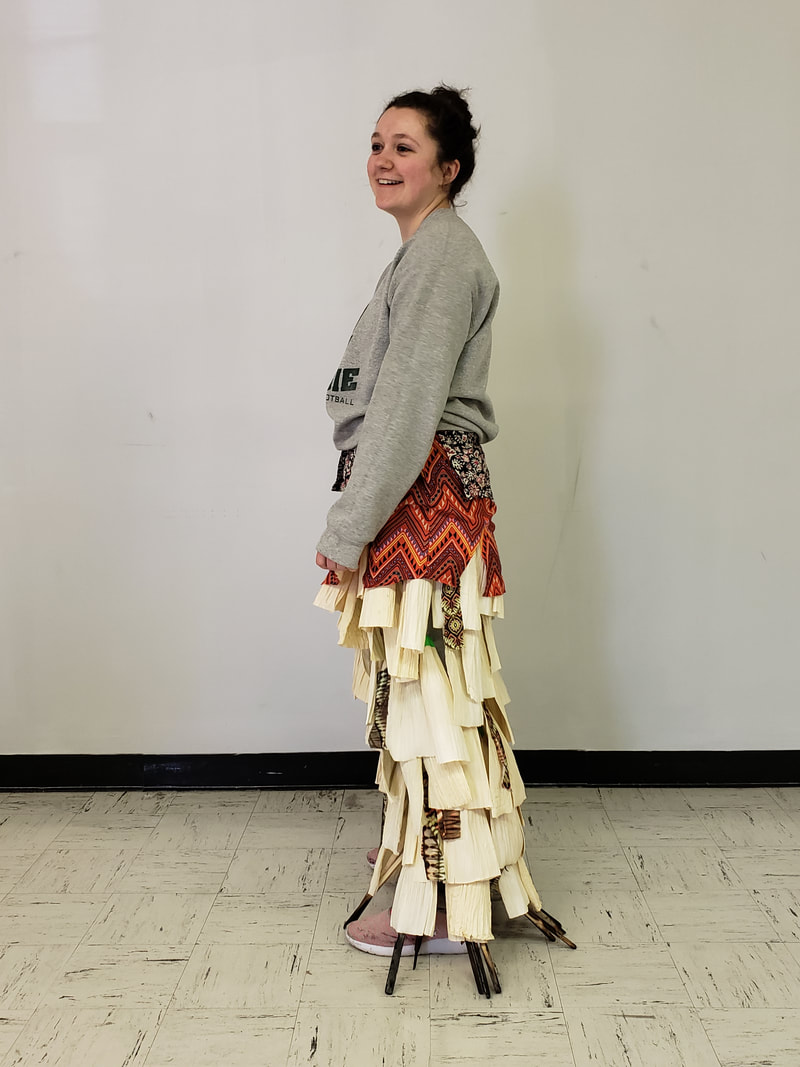
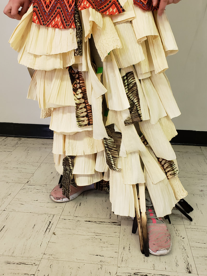
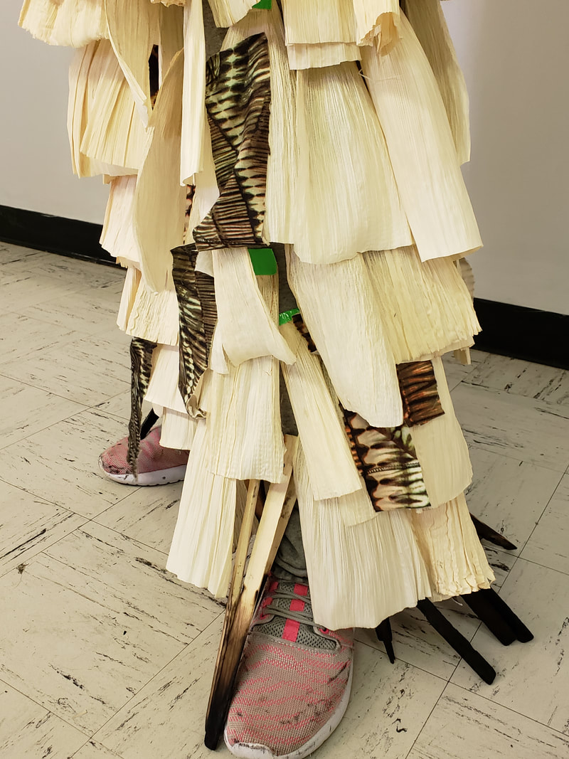
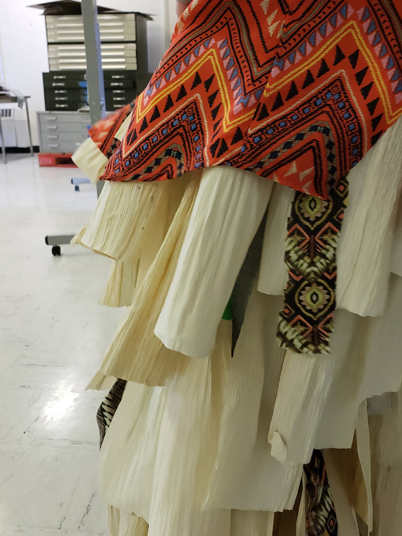
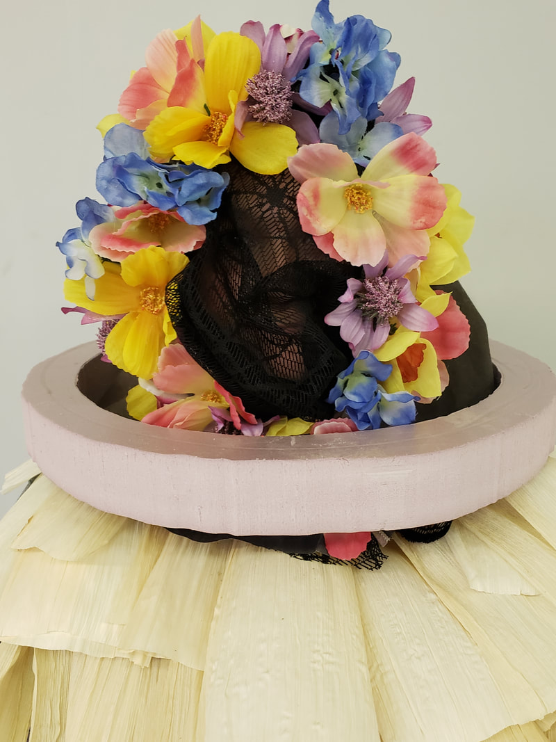
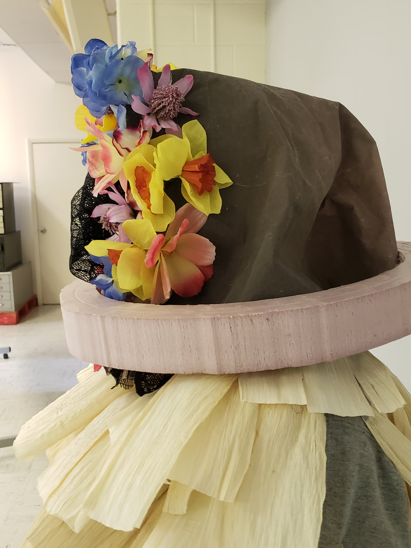
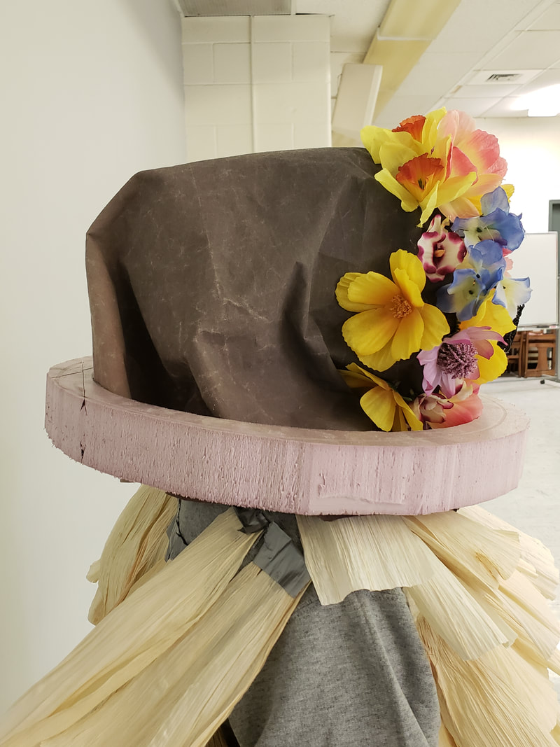
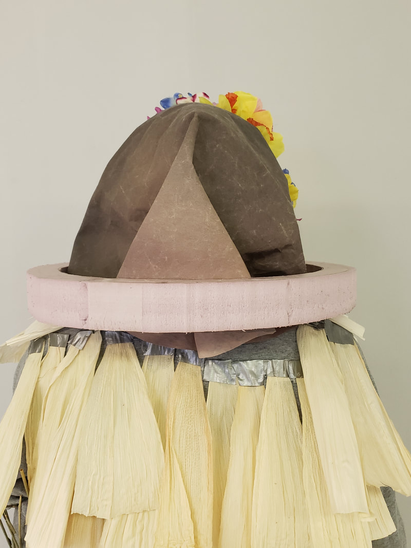
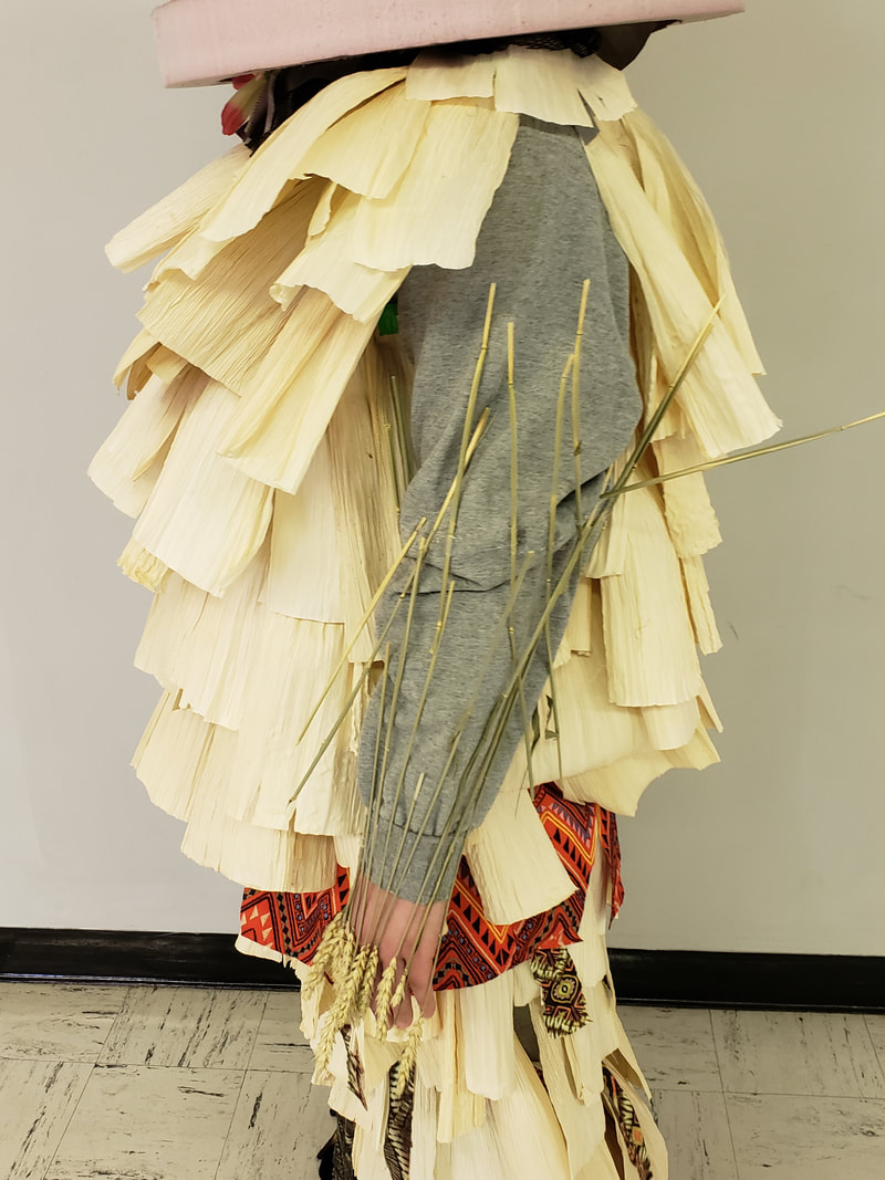
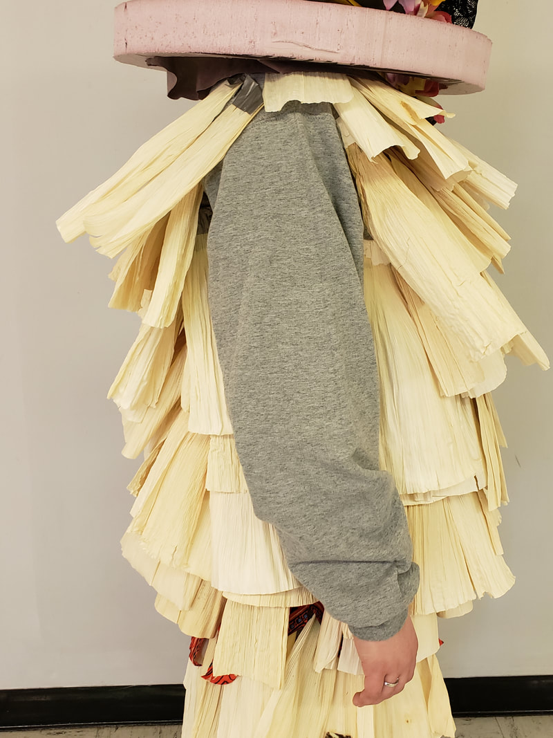
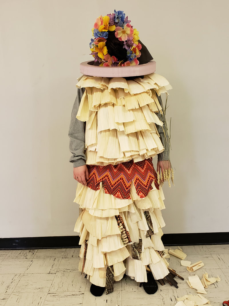
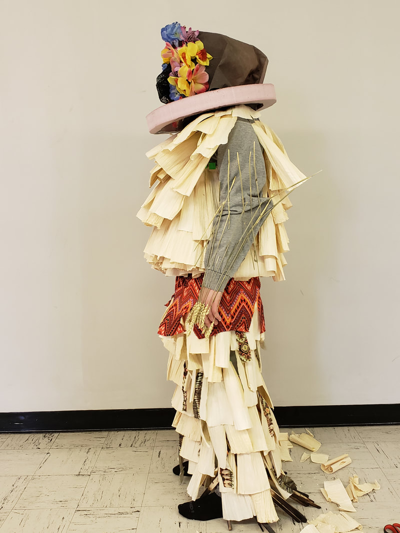
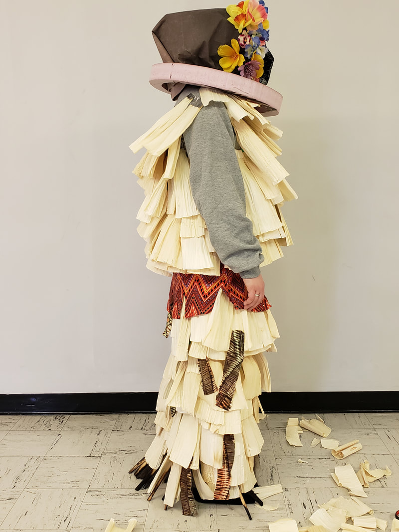
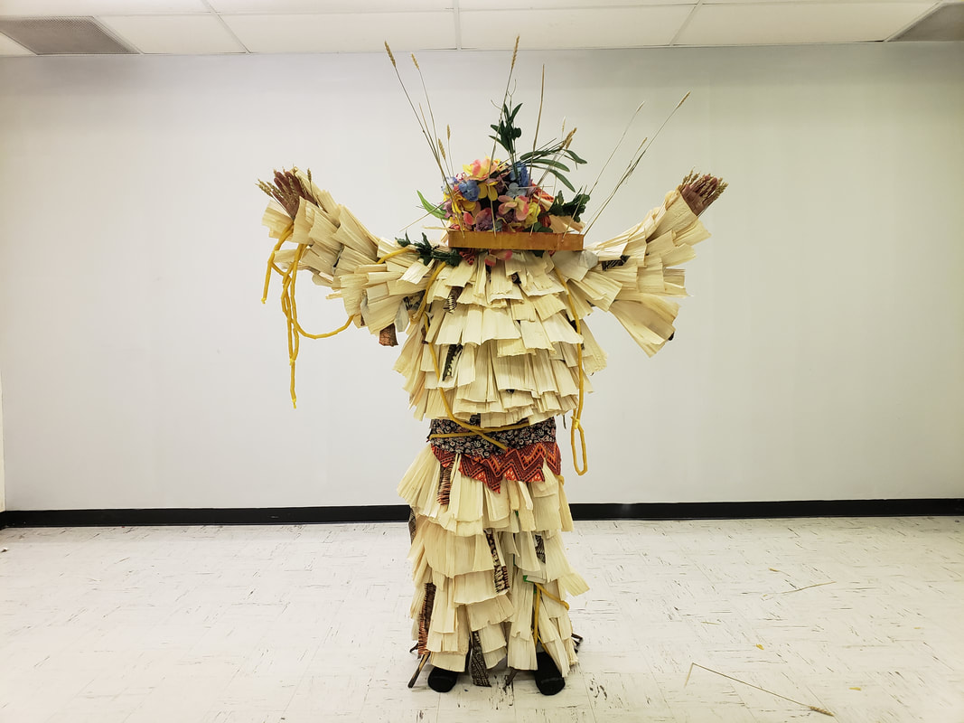
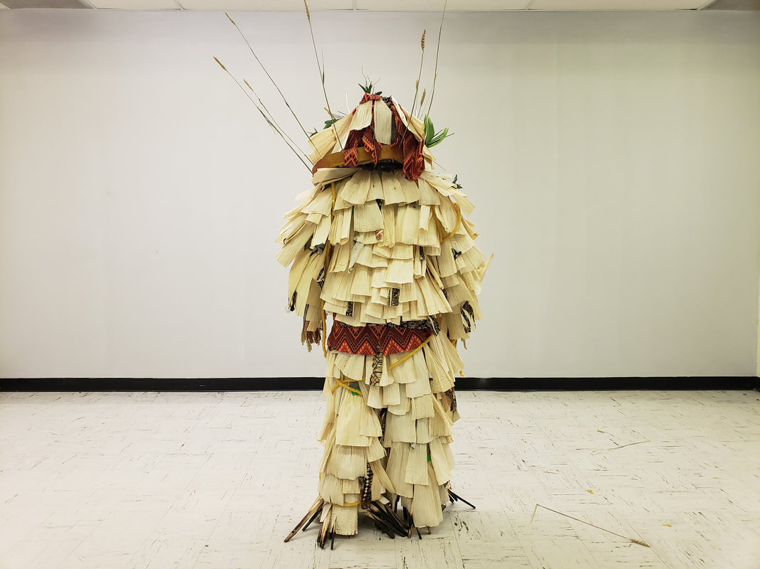
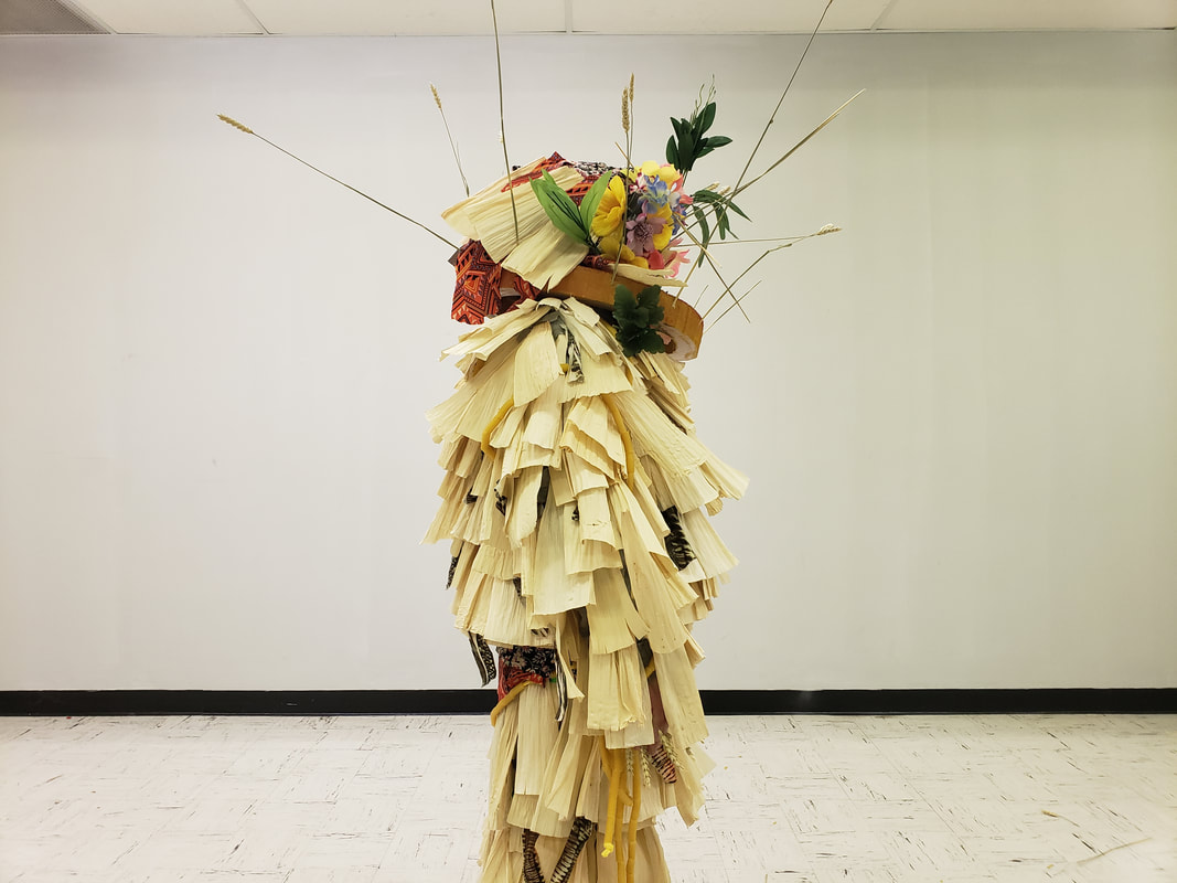
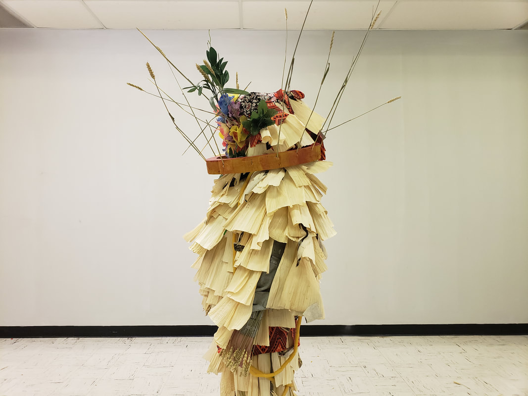
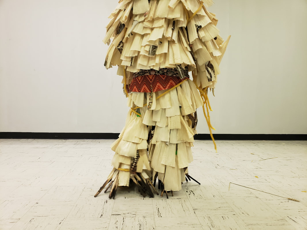
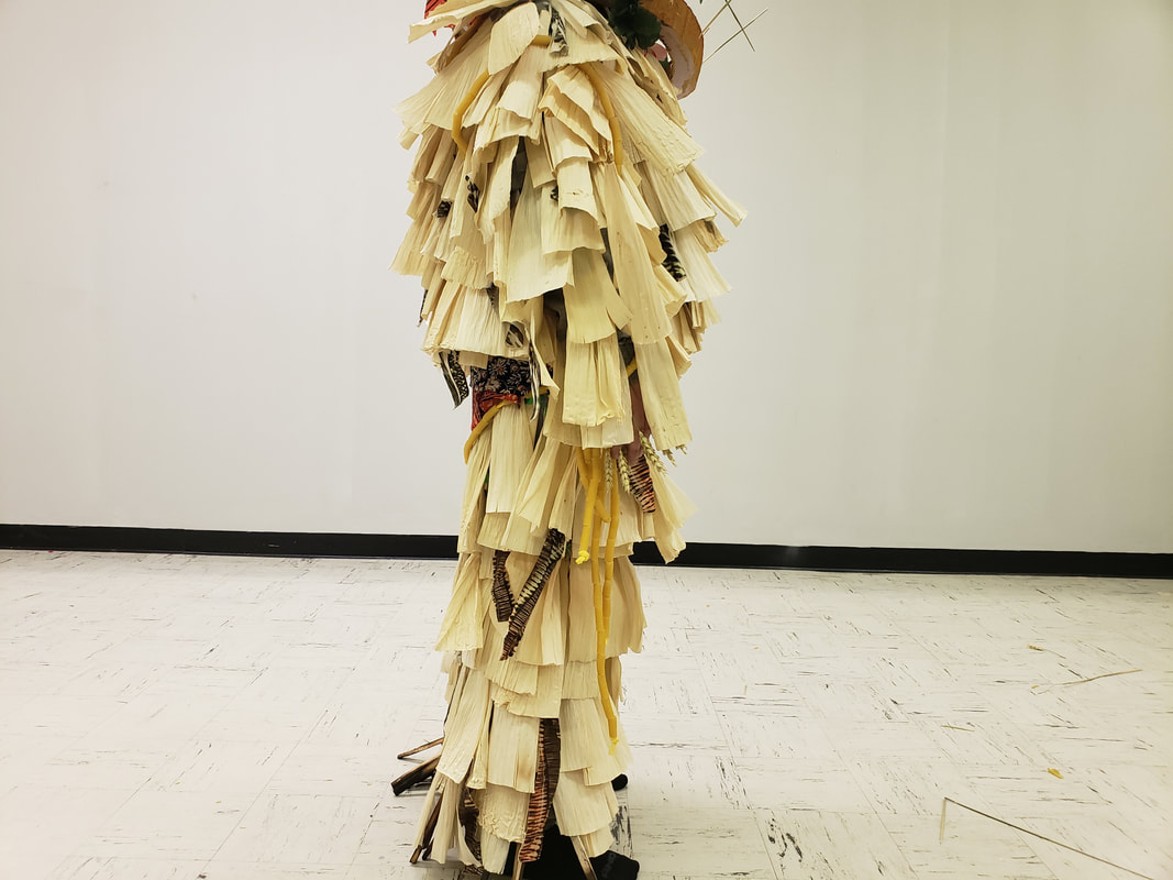
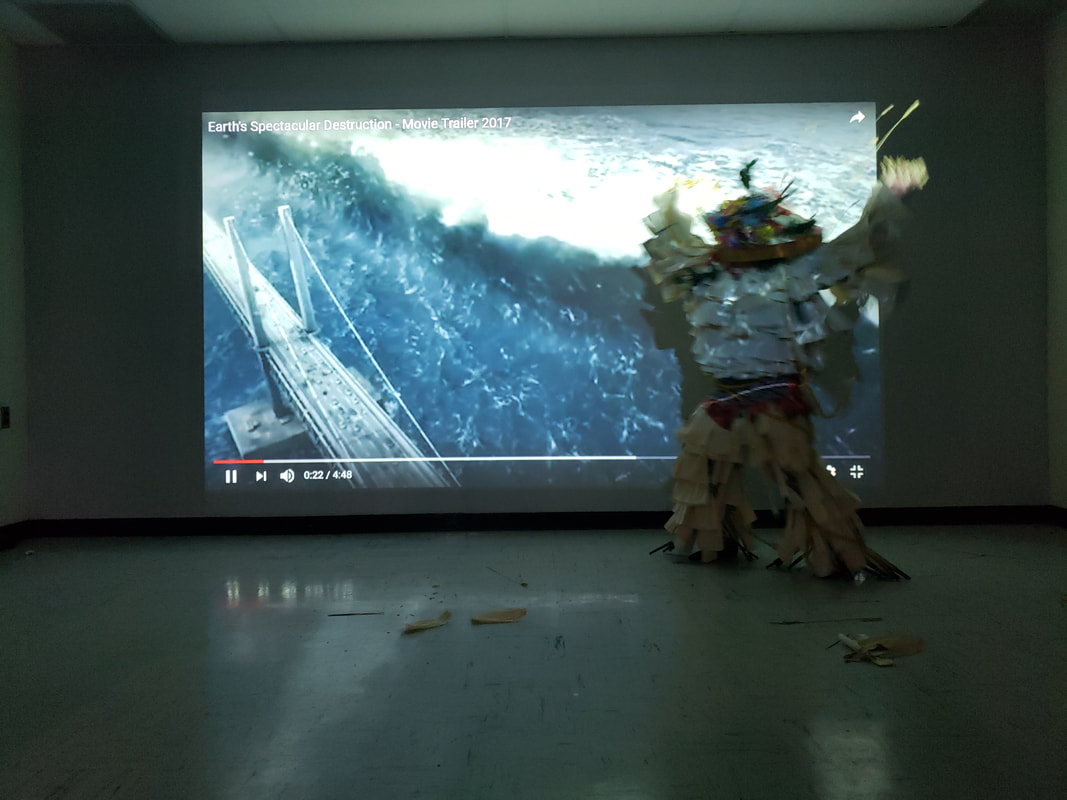
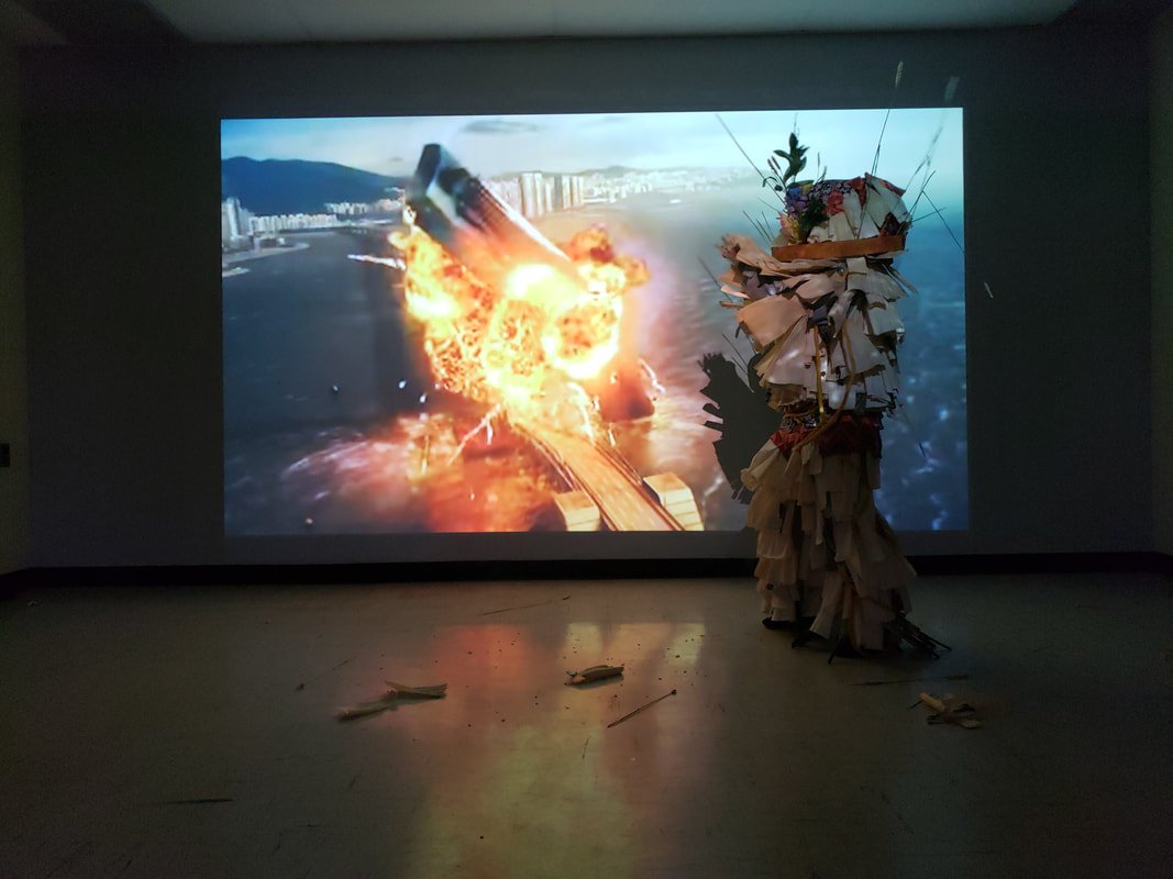
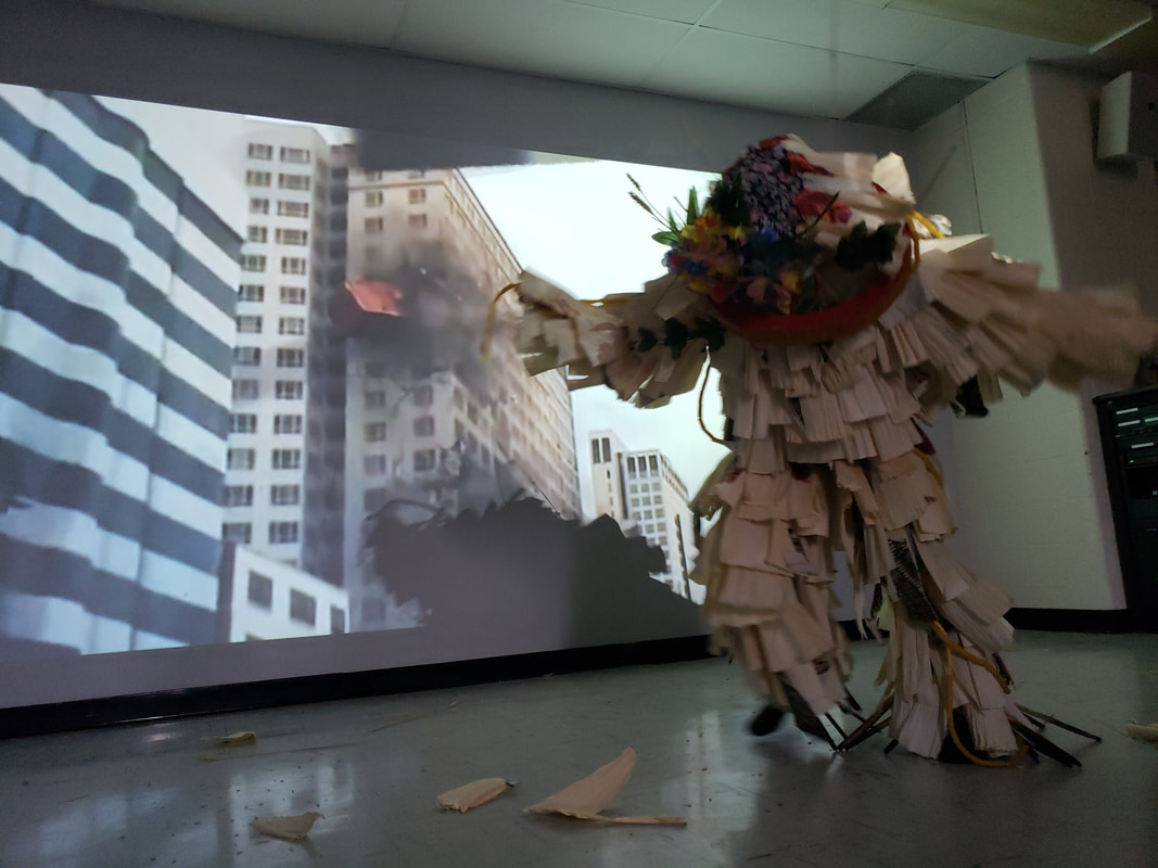
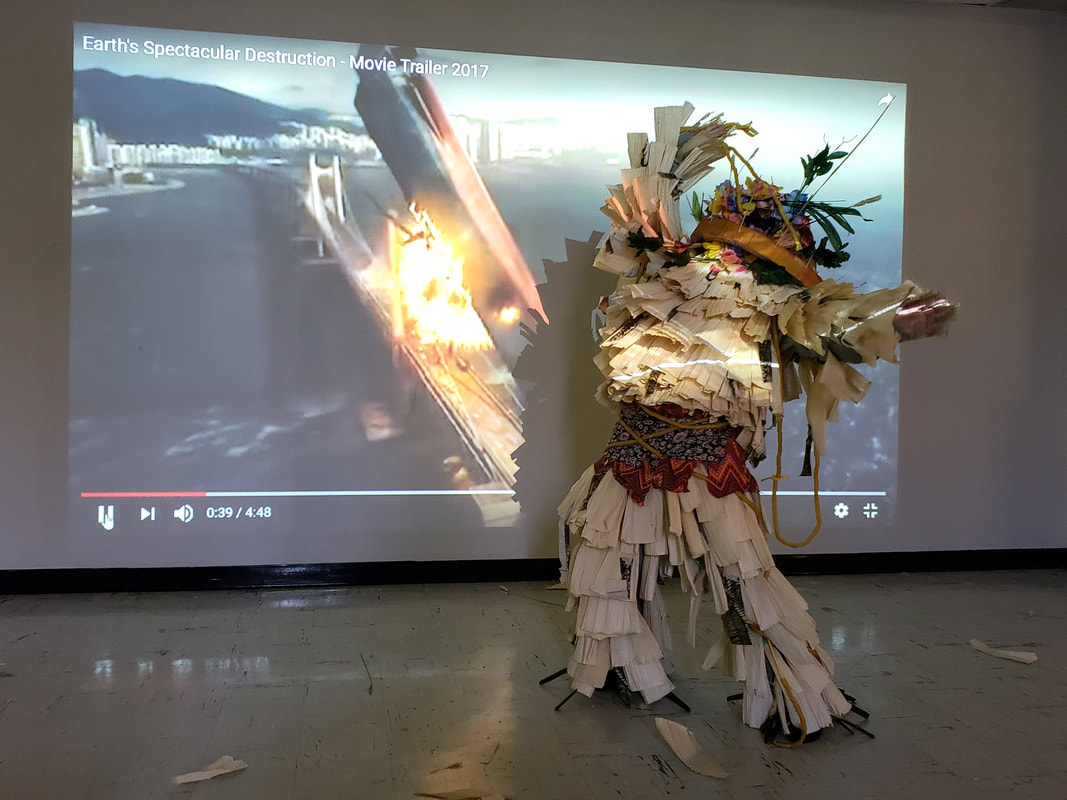
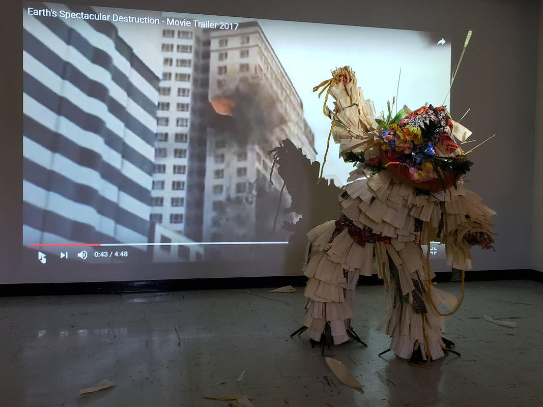
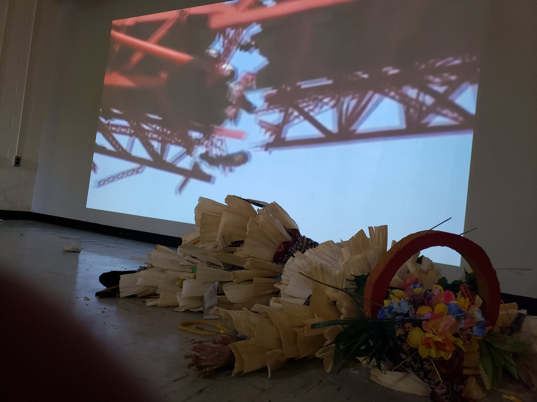
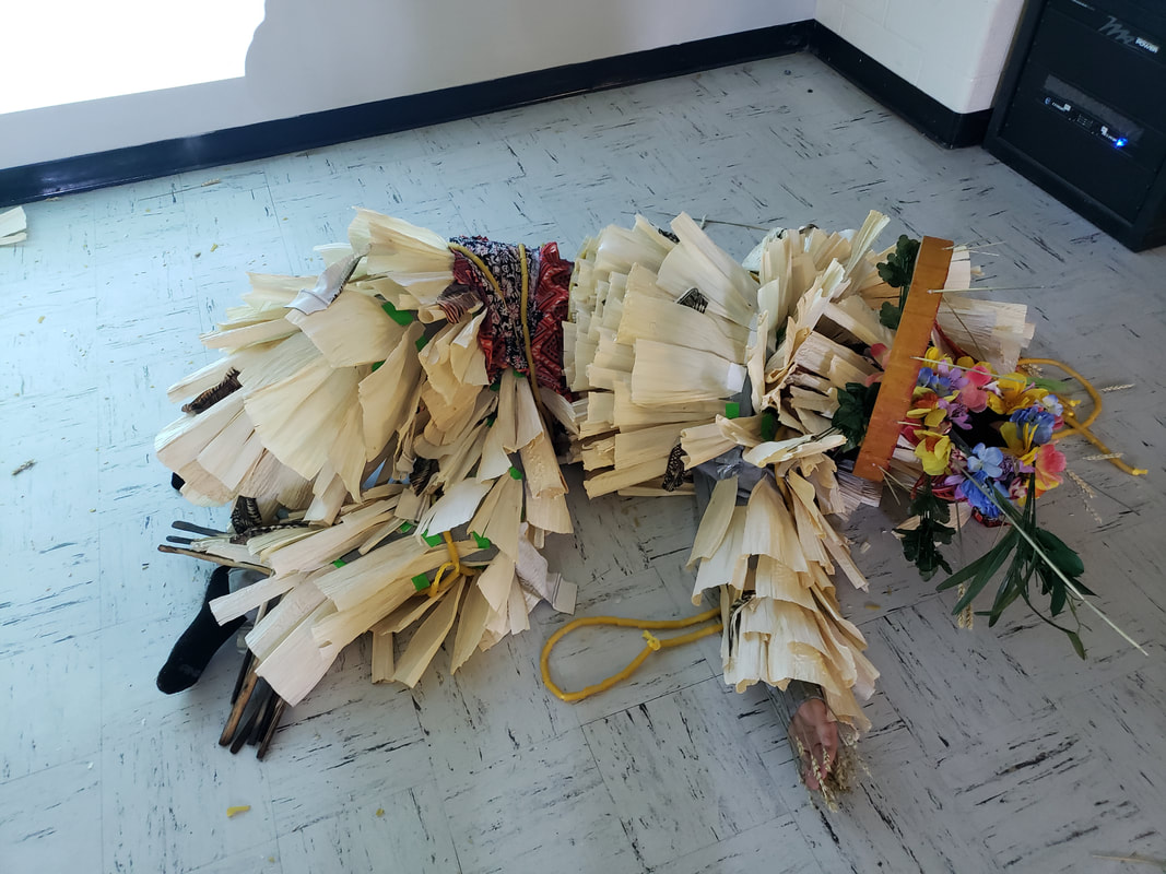
This project was a collaboration with Megan Serin, Jeremiah Davis and myself. This is my first iteration of our sound suit concept.This seemed like we could not cover the entire suit with wheat and tortillas. I felt that they would dry out and stink and could not think of a way to adhere it to the suit. Some of the concepts in creating this to consider was Variation to the suit, how to cover it and yet have some sort of Unity. Our overall theme was that of one race using our backgrounds from our three races. As we have heard that in the future we would be a mixture of all races, not sure how far in the future but our idea was for that to express time, how long would it take for all races to be blended together. We were all looking for a way to cover the entire suit from top to bottom. We came up with the idea of using Corn husks. The corn husks gave us the unity to the over all suit. In using the Wu-Xing chart our use of the body using the large intestine as rope with it covered by noodles. The Corn husks also gave a Texture that helped with creating sound. 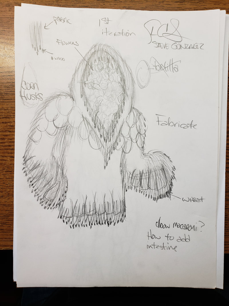 This is our 2nd iteration, our ideas with crossing all three of our cultures into the suit would help to cover this completely. The materials that we decided to get were: Corn Husks, fabric, rope, wheat, macaroni noodles. black tooling to cover face and backdrop material scrap to cover head. Some of the things to worry about was it possible to make it durable to hold up to testing it out and performing in it once in a dance performance. 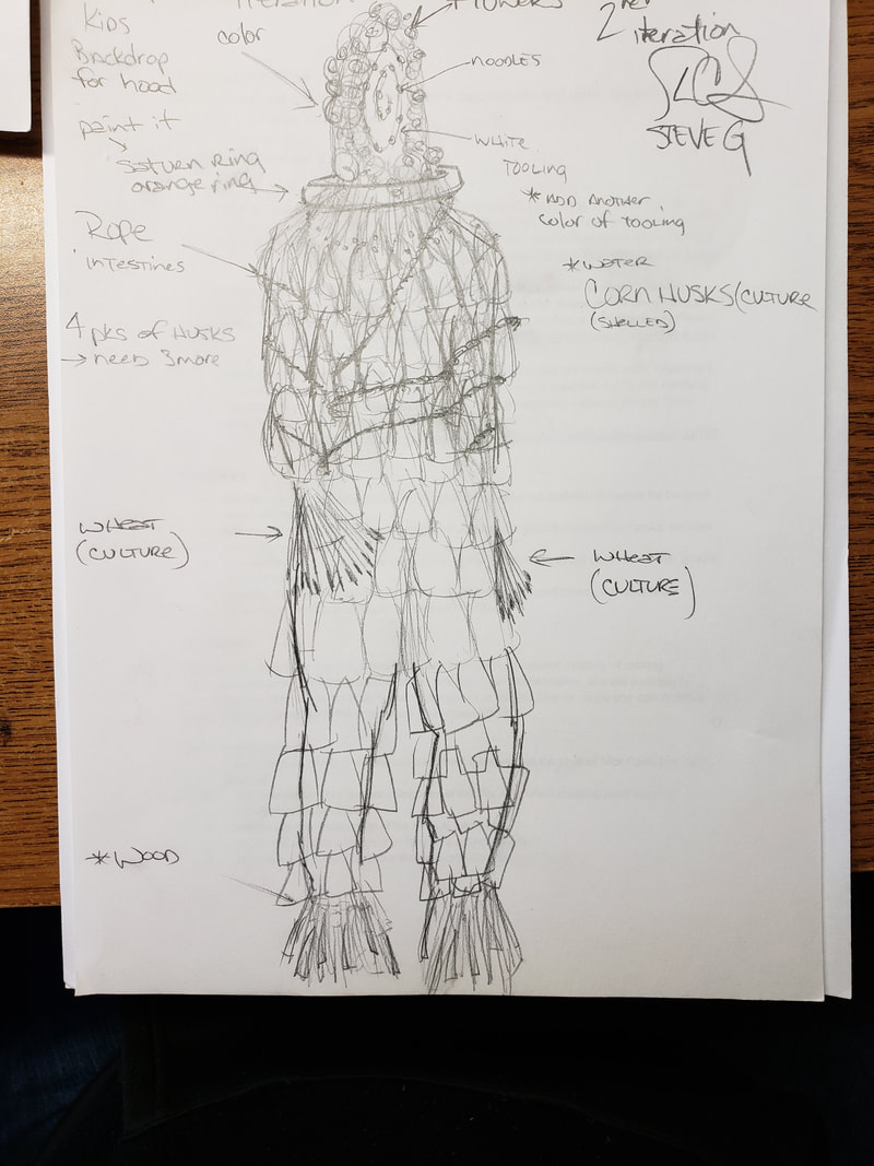 Of the five categories of Wu-Xing and our theme of one race with using the concept of time and that happening in the future. Wood - Flowers Fire - Burned wood Earth - Saturn's ring Metal - Large intestine Water - Corn husks This was a fast project once we chose the corn husks, we were easily able to apply it to complete the pants and front and most of the top. We were still figuring out how to present the head with Saturn's ring. 4/5/2018 The music, I came across at first was a native american instrumental being performed by Alexandro Querevalu, the last of the Mohicans, which is another symbol of time passing because of another lost type of people. Then we looked at what our suit represented we felt the need to express the destruction of the suit like the destruction of people over time. Below you will see the images of the suit and images of the video we ended up using in performing with the suit on, by Megan. The interesting thing of watching Megan perform this was you could see some of the corn husks falling off. I think this was very symbolic to the video as well. URL to video is https://youtu.be/JIlpk7GHlOA I collaborated with Jeremiah Davis and Megan Serin To conclude after you have been able to review the video. I would like to say that the Figure to ground relationship seemed to work well. Even though several parts we not to scale. Megan was in the foreground and was able to give the vantage point from looking this from a distance or from an angle. Megan gave a performing art narritive and during moments was part of the video. She occupied the space well and by the third video she really became part of the video which presented a nice overall Performance art piece. You could feel the time passing as destruction was occurring in the video, along with seeing part of the suit coming apart.
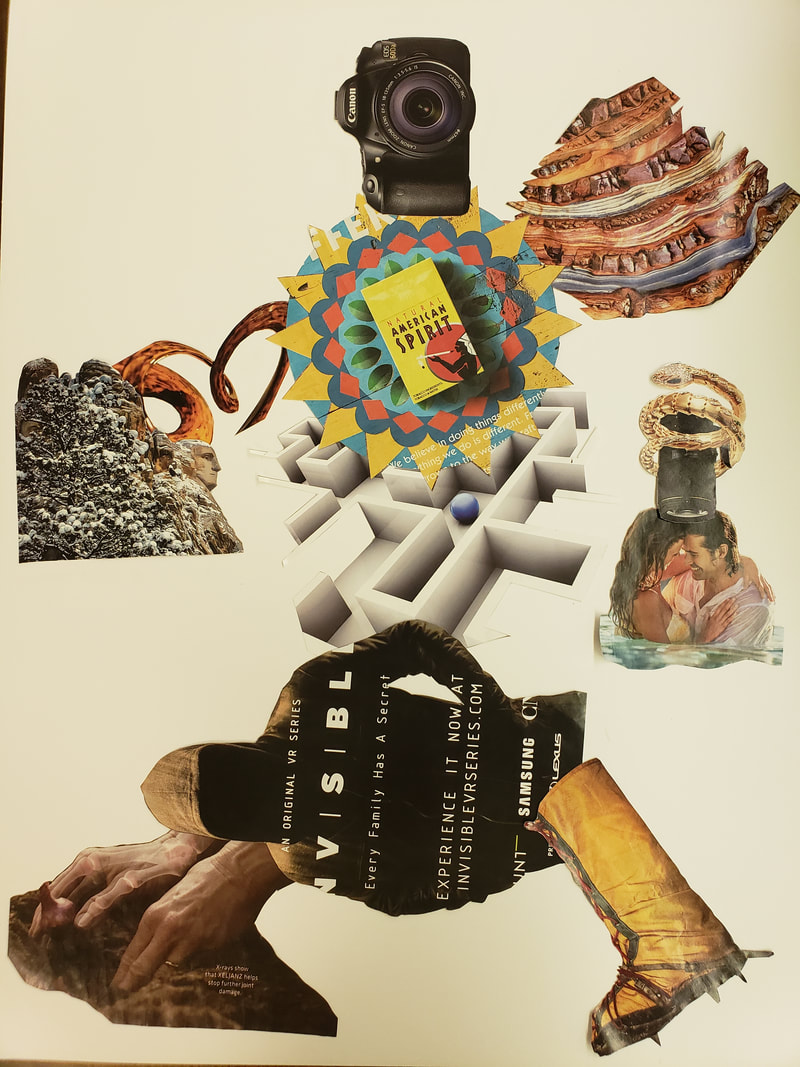
Gall Bladder 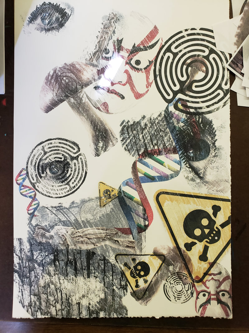 This assignment had a few set backs, I was lucky to print this right at the start of this assignment and citra-solv it at the start of class. I was fortunate to also use the right printer to get a good transfer. The design concept to creating this image was from learning about Wu-Xing, a Taoist theme but creating it in the style of Robert Rauschenberg's Yellow body.
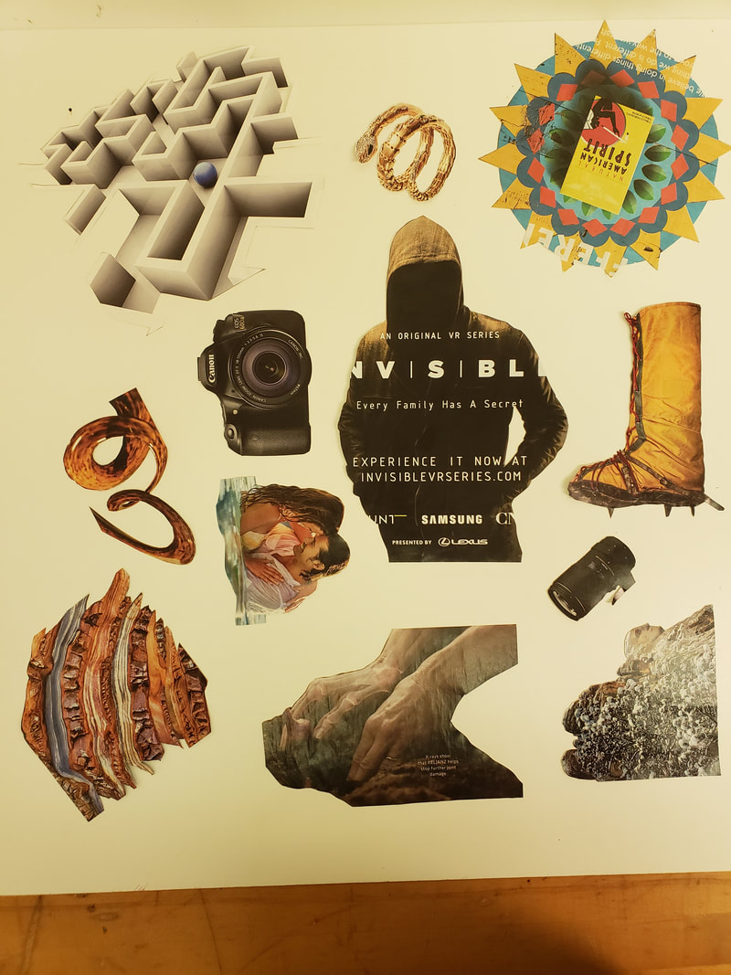
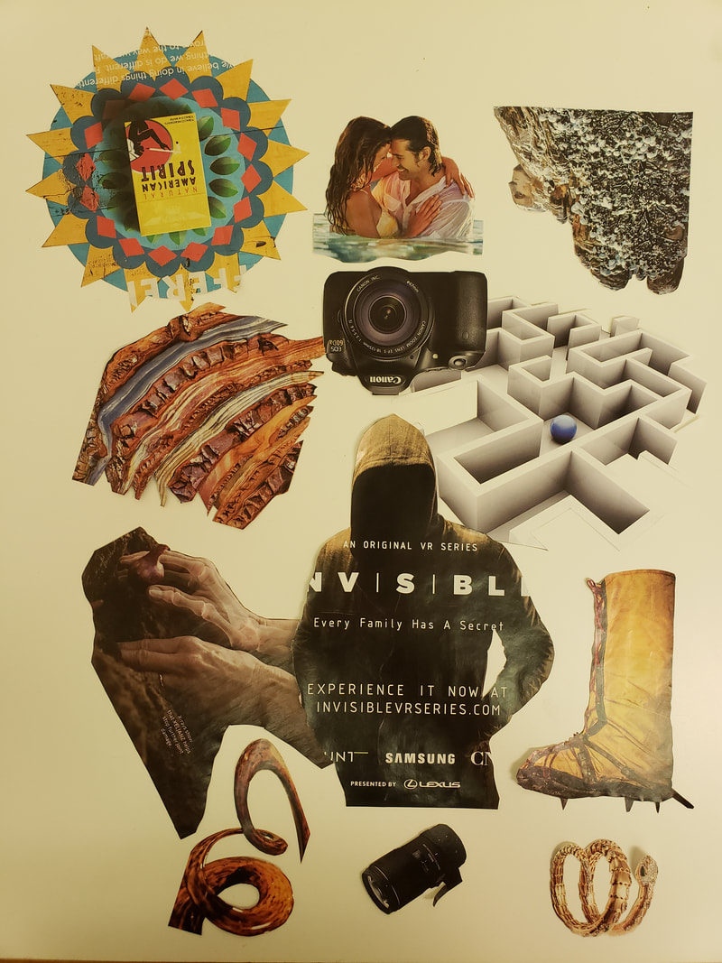
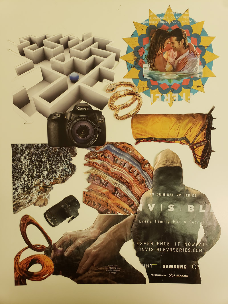
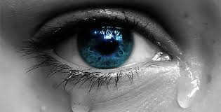
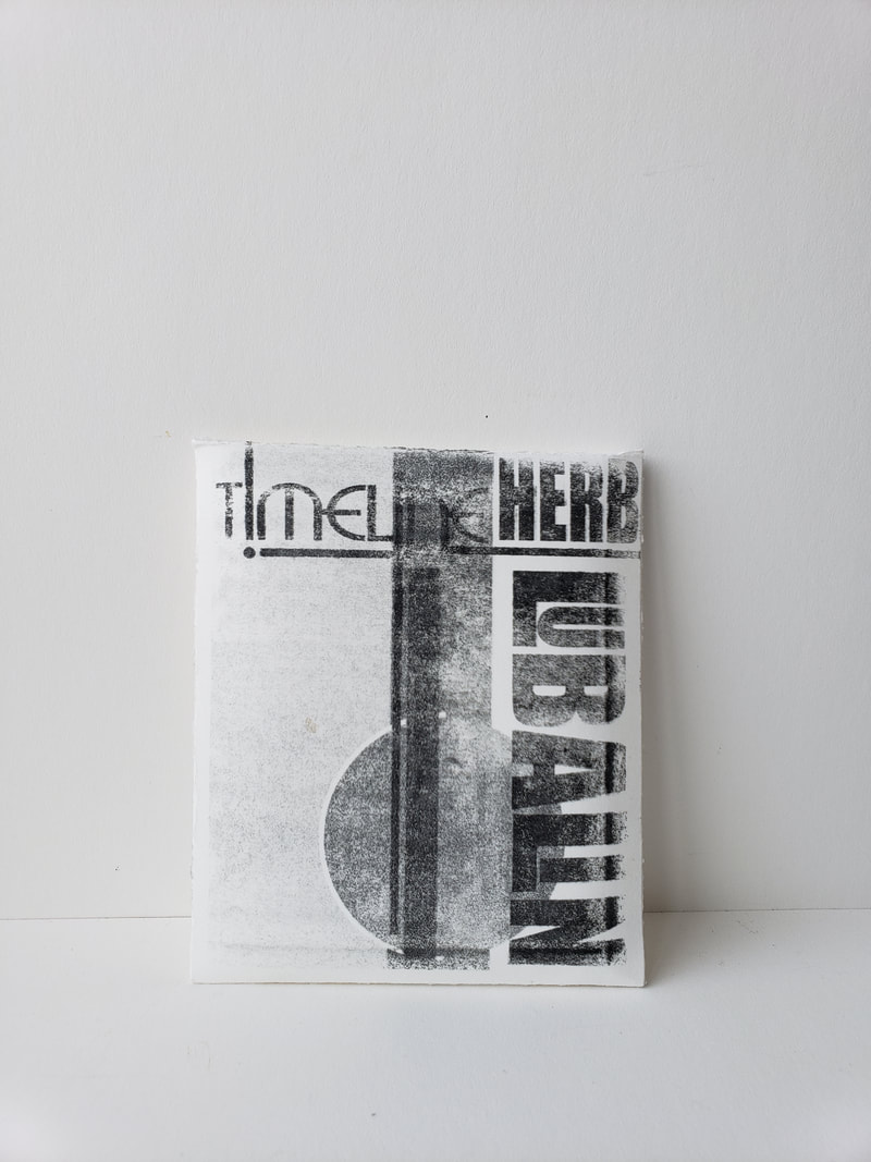
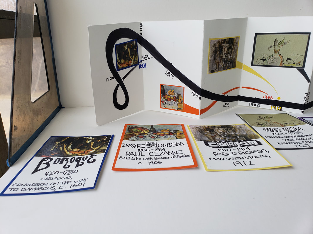
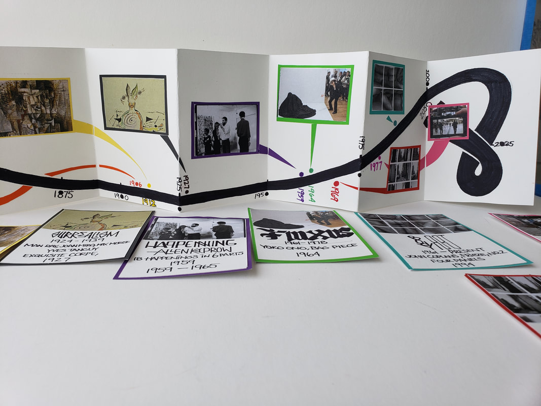
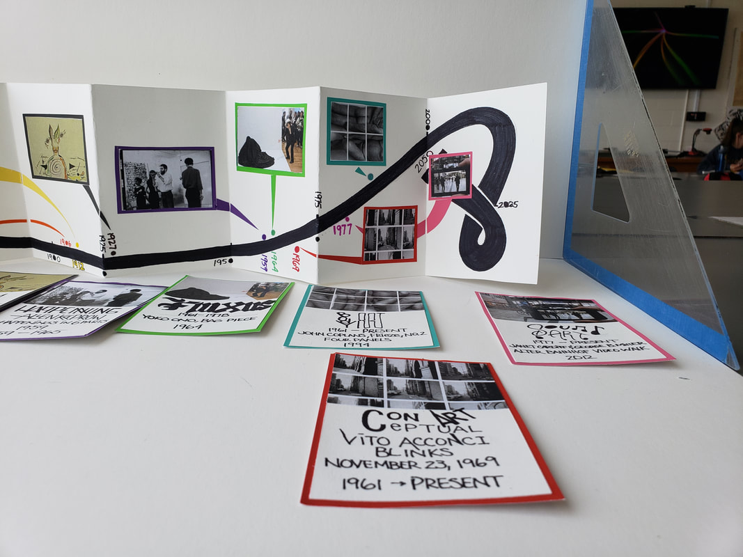
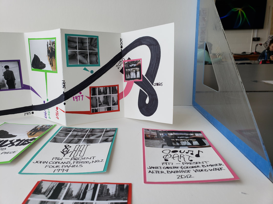
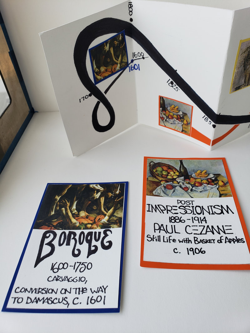
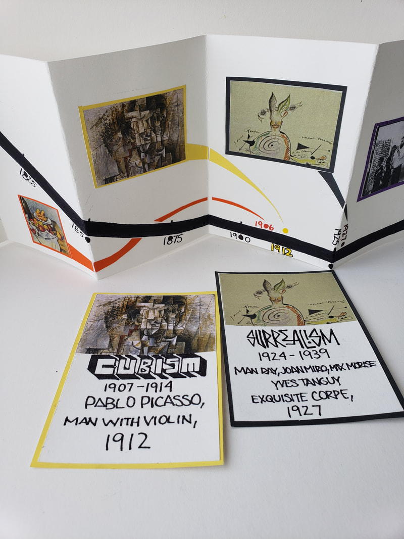
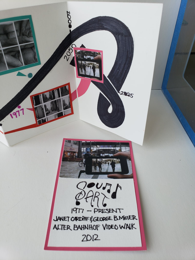
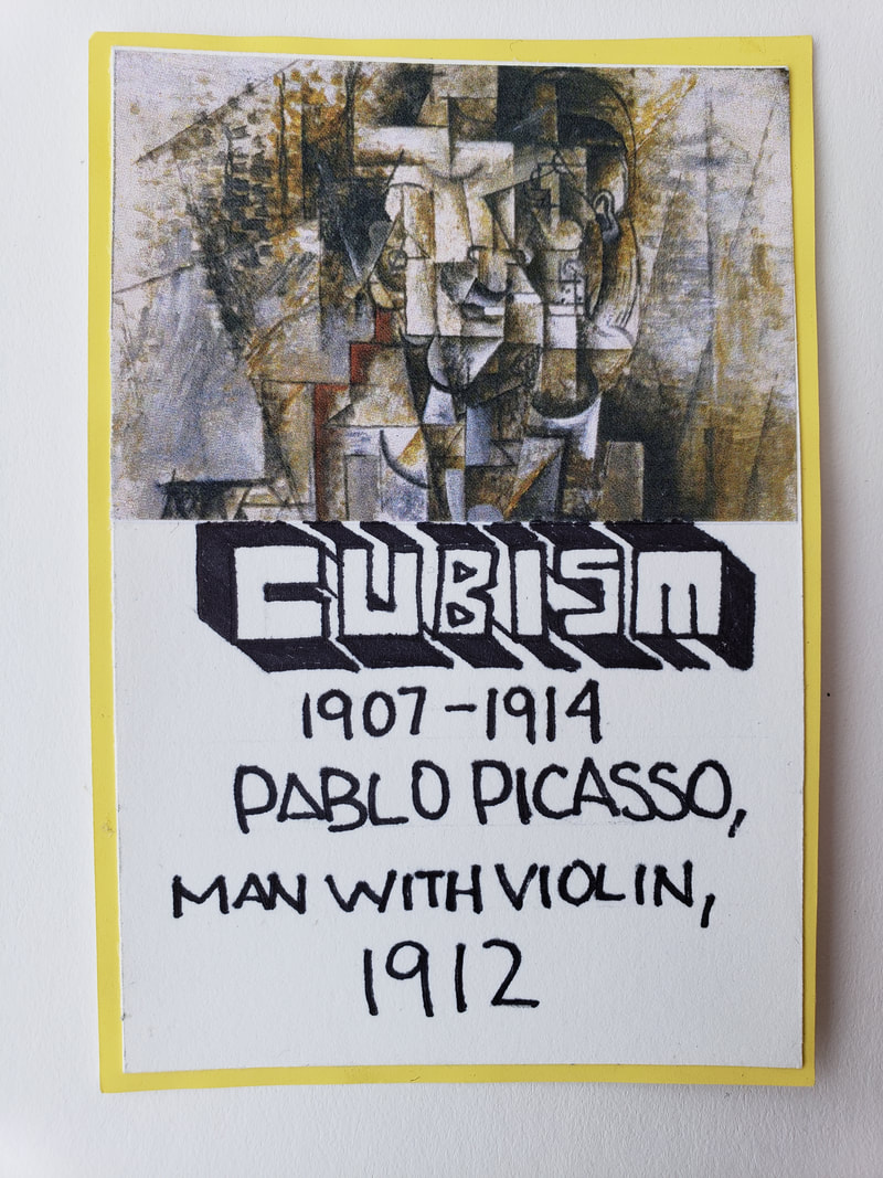
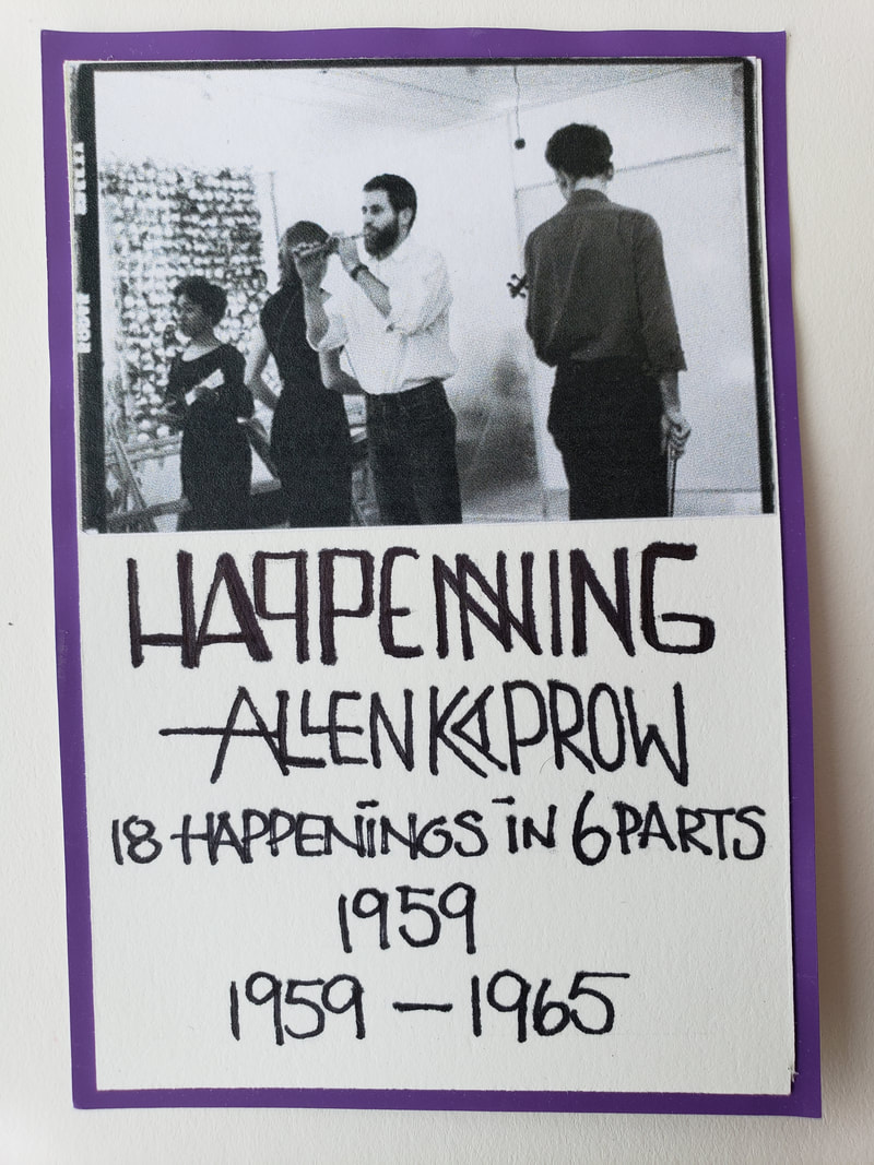
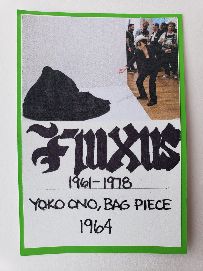
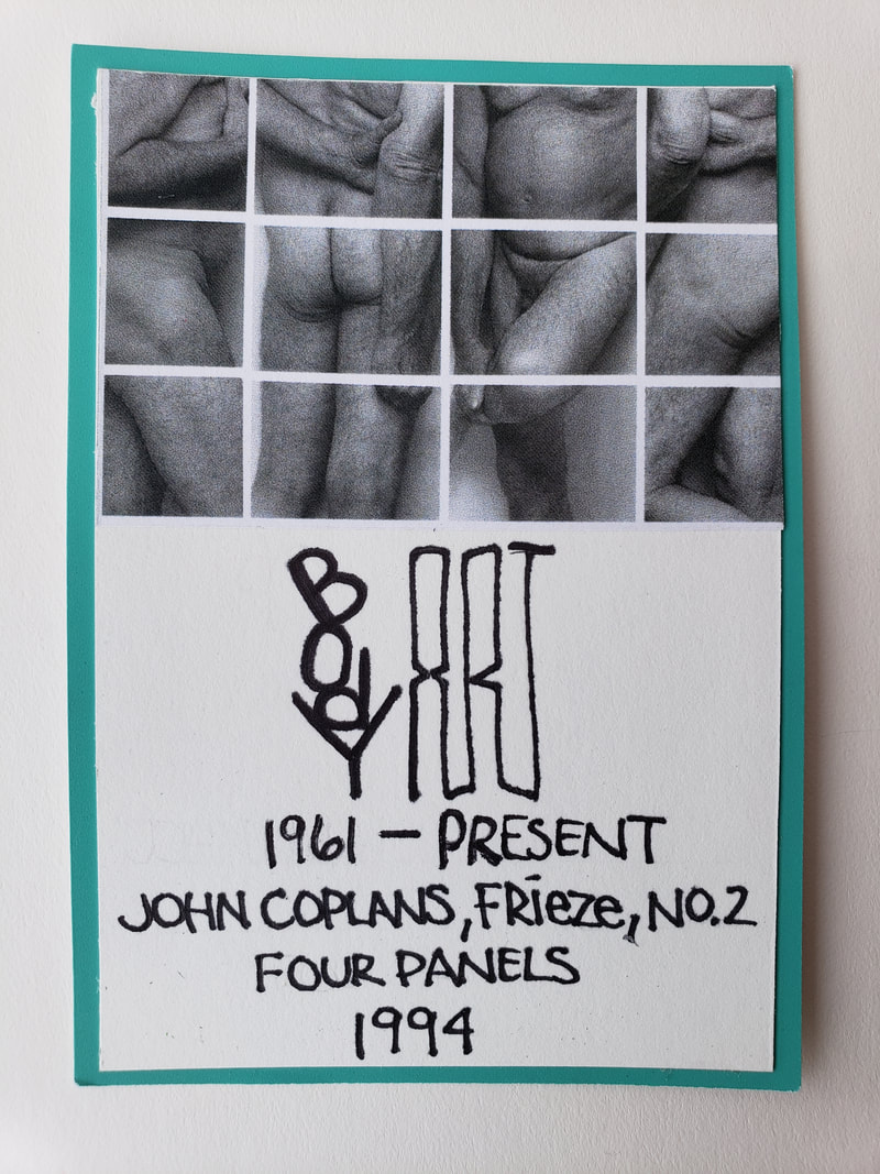
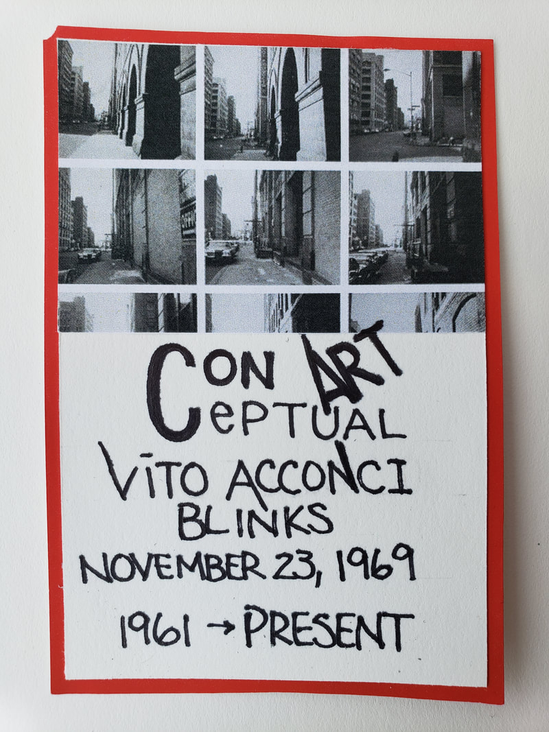
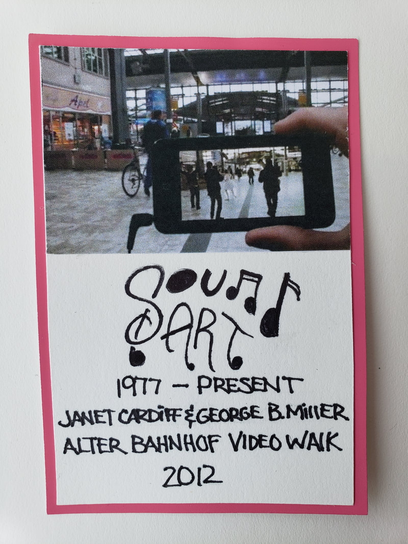
I had to find two elements from each phase of the five phases in Wu-Xing. Wood - Gall bladder, Tears Fire - Small intestine, Pulse Earth - Anxiety, Dna Metal - Venus, Old age Water - Fear, Death After I found two images on the internet I then printed three different sizes of each of the total 10 images to have 30 total images to Citra-Solv *NOTE, That all images should be reviewed and consider if the should be flipped horizontally if words or numbers were showed. That way everything would read correctly on the transfer was completed. The meaning had to be our own and we must avoid using copyrighted material, if we did it must be used in a new meaning that we could explain, If we did we must be able to cite the source with some sort of labeling to give credit to the original artist. The use of pre-existing work should be avoided but using the style of another artist with your own meaning is better to do. Before creating our Citra Solv transfer we had to examine Robert Rauschenberg's Yellow Body (1968) In reviewing the Yellow body There is a travel theme that seems to be a glimpse of a memory. In this piece you see a Plane a semi truck a woman singing which was Janis Joplin. You can see a 1960's rock band a Credit card, Wilt Chamberlain and a bicycle. All of these images refer to travel that he must have done. A lot of these images are iconic like Janis Joplin and Wilt Chamberlain. It was very interesting how he framed everything in a Yellow and centered it. The lines that go across from the left to the right, which gives this image movement to go along with the theme. After all of this was taken to account I picks different images that expresses time through beauty and aging, along with pain. I used images that had eyes in some of them. This would give a sense of unity but not wanting to have eyes in all my images. I was very focused on how I citra solved my images because of pain they had to go pressed with different angles and semi circular strokes. I was trying to express pain. Juxtaposition was an easy thing to arrnage my images at first but them after 5 images it became more difficult because of using the space correctly and making sure I had a vision of the end result ahead of time. I was worried about the overall balance and knew that I wanted to express the pain by having one side free of images to express the pain of not being able to stand upright because of pain. My perspective was straight forward, which is why I didn't use my last image. It was angled with a deep perspective and did not use it. Peter said that I did not have to use all of my images, so I chose not to use it. Lastly when it came to repetition I used my images and spread them out based on a triangular composition. This seems to be something that I try to see with my graphic design process and it photography. This is probably the first thing I have created that I will frame and place in my work room! Artist: Steve Gonzalez Title: Gall Bladder Year: 2018 Citra Solv on 15" x 22" Deckle Edge Stone Hedge paper. The timeline inspired by Herb Lubalin was what I had to create to show the different time periods of art that we have covered in Art107. We had to make a rough draft and a 2nd draft before moving on to the final version. The biggest challenge was to fit all of this within a 5.5 in by 30 in piece of paper. The book would be an acordian folded book.The timeline began from the 1600's to 2050. The difficulty was that there had to be balance even though from 1600 to 1885 the only period was the Boroque Period. The time line had to be represented equally across the entire 30 inch long piece of paper. Towards the end of the timeline there were about four periods that were very close to each other but still thinking about visual balance and always considering the Style of Herb Lubalin. The research of Herb Lubalin was easy, I could see that he focused on Typography, everything was clean and black and white. At that point once I could come up with a proper sequence to display my periods I then began to work on my final draft. I drew a ribbon and on the left side of the ribbon please notice how the line started under and then went over the line on the right. I was trying to represent time going forward from the 1600 to 2050. By using my method I was able to place a period on each fold and because there was 8 folds but there were nine periods. One period had two images on it. This was the best compromise to giving a visual balance along with showing all periods without cluttering or bunching it all together. The only part I felt that was not in the style of Herb Lubalin was the use of colorade paper. I wanted to use this to help me for my cards to show what images belong to which period. 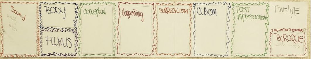 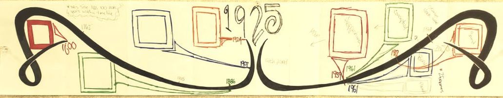 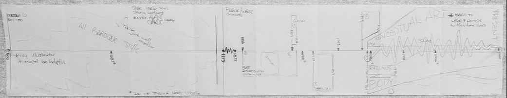 |
AuthorMy Name is Steve Gonzalez, coming back to school after a lot of years. I am determined to get this done. Sometimes I wonder if I will make it. Archives
November 2018
Categories
All
|


 RSS Feed
